Last Updated on by Jeremy
Disclaimers: Living the Dream uses demographic data, email opt-ins, display advertising, and affiliate links to operate this site. Please review our Terms and Conditions for more information. Listed prices and attraction details may have changed since our visit and initial publication.
When I redesigned my sites, I opted to go for a DIY approach with GeneratePress over getting a designer to work on a fully customized theme.
Part of this was the economics of it all- a fully customized site costs over $5,000 (and I have two sites with a third coming soon) and a DIY theme costs roughly $50 per year plus my own time in customizing. But the other part was that I am not convinced that aesthetics actually matter when it comes to the performance of your site- not for an extra $4,950 per site at least.
Sure, there are some things that are necessary in order to convey your expertise on a topic and to help with the user experience. But at the end of the day you can convey your expertise with text and social proof, and the most important aspects of user experience are based on site function, not site form.
Design aesthetics, which is what a customized theme really is, only minimally come in to play with any of these.
So if you are thinking of investing thousands of dollars to redesign your site under the thought that all the bells and whistles will get you more page views, you may need to think again. If it were up to us, we'd spend that money on a different outlet altogether: marketing.
Aesthetics Don't Bring People to Your Site
I do not have pretty websites. My websites are basic, have little to no graphics, and hardly look to be anything like web 2.0 (or 3.0 or 4.0 or whatever number we're up to these days) when you look at them.
I have no logo. I have no elaborate headers. I have no sliders. I have no videos or unusual animations. It is just a quick header, title, and straight into the content (with a few ads mixed in that help pay the bills). The powerful features of my site are not noticeable, and that is exactly how I like it.
If you are a website owner, you may look at this site and think it is drab. You may even think I don't know what I'm doing by not caring about the aesthetic aspect of web design. But I would pose this point of view another way- you are on my site reading these words right now (and seeing the ad that follows).
For me, the hard part is over.
You are not on a prettier site. You are not on a universally well-known site. You are on this one, and you are here for a reason- because my marketing efforts got you here. Now that you are here, you are reading these words and completely forgot the fact that my header is boring other than the fact that I'm reminding you in the text.
I did this on a $50/year theme, on a $100/month server ( BigScoots, shared on all my sites), and a bit of coding that I learned myself. Did that $5,000 do anything to a competitor to get you to their site? No. You're on my site right now, and that is the point. A good aesthetic can only do so much, and it isn't what you think.
Key Functions Required for Good Website Design

When it comes down to it, there are only a few core functions that a good website design needs to satisfy that would impact whether people reach and stay on your site. While these are only a few of the hundreds of things that go into topics like SEO and online marketing at large, they are still some of the most important for everyone to consider from a site design aspect:
- Load times - The general consensus is that if your site loads in > 3 seconds, more people will get frustrated and leave.
- Time on page - The longer people are on your site, the better it helps with SEO algorithms.
- Pages per visit - The more pages people visit, the better it helps with SEO algorithms (ties into previous point).
These are the three biggest things you can directly control with the design of your site that may influence how you get traffic in the future. While aesthetics do matter for these bullet points, core site design features (for point one) and quality content (for point two and three) matter more.
So let's break these down a bit more on the best practices for each.
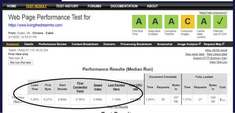
How can you fix your load times? A good server and a fast theme are a start. A blank page on our GeneratePress theme, server, and plugin-array loads in about 0.5 seconds (on page aesthetic accounts for the rest). Loading minimal images and scripts above the fold and lazy loading the rest offers huge gains. Replacing heavy plug-ins with lighter ones (or removing purely cosmetic ones altogether) goes a long way as well.
These points all inherently favor more basic and sleeker sites over one customized to the nines as most of the aesthetics and scripts run above the fold and cannot be optimized as much.
How can you fix your time on page? Have good, long content that people want to read to the end. Full stop. Distracting your reader with shiny objects along the way will hurt this. Not satisfying user intent with your content will hurt as well. One could argue that ads on your site are also a distraction, but we accept these as a trade-off of making income.
You want to keep your readers engaged on your words as long as possible. Aesthetics may offer some tricks for this (such as increasing font size), but at the end of the day good content satisfying user intent will win out every time.
How can you increase your pages per visit? Give your users opportunities to find related content wherever possible. Link to relevant articles within your posts and at the end. Have read more options in the footer. Hit them with options to find tangential content as much as you can.
My hierarchy on my site is set up that I want you to read my articles and then either 1) click an affiliate link and buy something (when relevant) or 2) click another link to stay on my page. If I cannot satisfy these I have option 3) click a link to another site of mine and start the process over.
Do aesthetics come in to play with the above points? Absolutely. You still need to encourage those clicks and give readers reasons not to leave, but more often than not this can be done with simple coding and plugins and not dropping $5,000 on a unique theme to be a standout.
In fact, sometimes customized themes can even hurt you with the above points.
We've seen it time and time again with friends who go the fully customized site route that their performance often goes down with a customized theme. People wonder why they can't get to < 3 seconds when they load a 1 MB image as a header, or have a customized script for a menu feature, or even play a video in the first screen view. It looks great, but it is also a huge weight on your site overall no matter how much you look at it.
You cannot defer these things like you can with design elements below the fold, but only a minimal amount of custom site designs fall into this area.
When fast loading sites need to be < 1 MB in file size to load in a few seconds, anything and everything you do that is custom in a header (which is most of what custom site designs offer) will hurt you more than they help. And since users often scroll past this within a fraction of a second after arriving on your site, I really have to ask- is it worth it to be pretty?
To me, if you had $5,000 to blow on your site, you should put it into marketing. You know, what you have to do to get people to arrive at your site in the first place!
Marketing Brings Clicks, and Clicks Pay the Bills

I take a rather umbrella view of the term marketing. I define it as anything and everything I do to get you to click the link to my site. Whether that is SEO, copywriting, social media ads, you name it- it is all a part of my marketing effort to get you to give me a click.
Having a pretty site is not marketing. You've already got the reader there. Your marketing effort is now done. Is your pretty site doing anything to help them enjoy the content they came to read, or is it a distraction? The best you can do here is to provide an environment that allows the user to read to the end and, with any luck, click to read an additional article or buy something. That's it.
At the end of the day, if you have $5,000 to spend, I would put that into marketing channels over site design. Items like Facebook ads, hiring a Pinterest VA or using a scheduling tool like Tailwind, working on SEO using keyword research tools like Keysearch. Upgrading your server with Managed WordPress Hosting. Or optimizing themes and WordPress plugins (click to see the ones we personally use right now).
These are just a few of many things you can spend money on to effectively market your site that have a tangible influence on your inbound traffic.
While changing themes could certainly have an improvement on factors that do matter for your marketing effort (I cannot re-iterate enough how important site speed is), you really can do that by buying a premium theme and learning how to do the code/setting changes yourself. Even if your site does not look as aesthetically pleasing, like mine, it will get the job done, and that is all you really need.
Put that money to good use elsewhere and invest in your marketing efforts over site design if you have to choose!
A Final Caveat Worth Mentioning - Do You Have Time?
In this post, I lobby hard on you building your own site yourself as the benefits of having a fully customized site is more for aesthetics over function (specifically in elements that will result in more readers).
But there is one aspect where having a fully custom site design done for you makes the most sense, and that is simply if you cannot justify the time to do all of the above work yourself. Paying for a theme that runs into the thousands of dollars may make sense from a time value perspective, and is certainly a justifiable reason to do so.
Unfortunately, if you think you're going to get more out of it than simply getting a pretty theme that you don't have to work on yourself, well, you may be sadly mistaken.
Have you paid for a fully customized theme? What kind of site improvements did you see? Was it purely load time? Total page views? Pages per visit? Share any metrics you found improved from your change in the comments below!
Focus on your marketing over your aesthetics!Have an existing blog that is in need of an upgrade? Check out the following services we personally use!
Looking for tips? Read our Blog Your Trip series!
