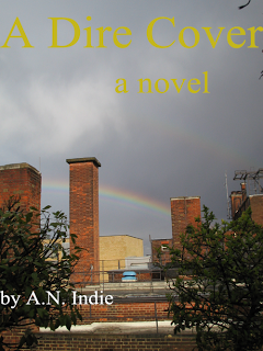
 Covers are probably THE most important selling tool for your book, because we are all more influenced by presentation than we think. As a designer, I'm well aware of this, but I still remember when my daughter was four coming across a delightful photo in the Mothercare catalog of a small girl on a beach wearing a banana-yellow tracksuit. I knew there was nothing exceptional about the garment, I knew I was being seduced by the image - but I ordered the tracksuit just the same.
A browsing reader will first be attracted by your cover; will then read the blurb, the reviews and the sample. If these all pass muster, you've got a sale.
I've always designed my own covers because it's fun, and boy, were the first ones bad. As I've got my eye in and developed my Photoshop skills they've improved (I was thrilled when Joel Friedlander approved Ice Diaries' cover). I'm not sure I've mastered making the genre clear - but then my novels are cross-genre which makes them trickier. My earliest efforts weren't for publication, but for the peer review sites, YouWriteOn and Authonomy, so perhaps their poor quality is forgiveable. I'd have posted an example, embarrassing though they are, but seem to have deleted the early ones. I reckon I've made every newbie mistake going; red on black lettering, saving in jpeg (why has it gone all fuzzy?) and using Times New Roman as my title font. TNR over a muddy photograph or a DIY drawing screams indie, and not in a good way.
I'm all for doing everything you can yourself when you self-publish. You will move into profit more quickly, learn a lot, and often do a better job than paid professionals simply because you care more. But if you have no design background and don't find it interesting, then you are ill-advised to design your own cover. A well-meaning friend may offer to have a go, but do not accept unless you feel a) you can ask him/her for alterations if it's not quite right, and b) you won't feel obliged to use it if it's dire.
