 It's a bit like saying that the world only cares about how a person looks, that nobody cares about your Neurophysics PhD, your deep and wise thoughts, or even how funny you are.
And now I think about it, isn't it often like that in real life? We make snap judgements about people, decide within minutes of meeting them whether they will be our friends. Employers are rumoured to decide whether or not an interviewee will get the job within seconds of meeting them. We even marry people who physically resemble our parents (guilty of that one, though I didn't realize it till I looked at old photos of my Dad.)
Nowadays, when so many books are sold online, how a cover looks is even more important. Potential readers can look at dozens of books all at once. But they can't flick through the pages of an ebook the way they might in a shop. Sure, on some sites they can "look inside" or download samples, but to get them to do that the cover needs to be enticing enough for them to make that first click. At the Smashwords homepage, readers do get a few lines of blurb to entice them, but after a year on Smashwords, I'm seriously considering removing my novel because it sells so few copies there. Amazon displays books with covers, titles and author name only. To read anything more of what the book is about, readers need to click on the image. Same for Barnes and Nobel. Same with Waterstones. So covers matter a lot.
However, most readers probably don't buy independent books by browsing on-line stores. If you click on a book on Amazon, below it a row of thumbnail sized book covers along with the phrase:
"Customers who bought this item also bought…"
Once again, to get that click, you need an eye-catching cover.
Even seasoned publishers are not always getting this right. One of the most hideous book covers I've ever seen was the first cover for J. K. Rowling's novel The Casual Vacancy. I guess I wasn't the only person who thought so because it's been changed. Recently I read about an author who had reasonable ebook sales in the USA, but almost none in the UK. Her publisher change the book cover, and the sales doubled in the USA and went up to 400 a month in the UK. So covers matter a lot.
Sales of my novel Drawings in Sand are steady, but not exactly what you'd call high. Up to now, most readers have probably come through personal contact or word of mouth, and while that's great, it would also be great to reach a wider audience. With that in mind, I've been re-thinking the cover.
Drawings in Sand is the story of a mother whose drunkenness puts her at risk of losing both her young daughter and her job, and whose search for healing takes her deep into disturbing secrets in her family’s past. I think I can safely say it's not a frothy read, and the cover needed to reflect that.
The main character in Drawings in Sand is an art teacher, and I briefly worked as one. I also worked as a designer for several years and my degree included graphics. So I figured I could come up with ideas, though I don't have the technical skills on Photoshop to produce the cover. For that I rely on my daughter, Melissa.
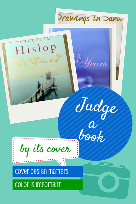
For the original design I went to my book shelves and studied covers. I also took classes in self-publishing that included cover design. I looked at covers online. Then I went to my local book store and studied covers. I even bought a few books while I was at it. I noticed a lot of literary novels had pale covers, and one that I particularly liked was The Thread: A Novel by Victoria Hislop. You can see it in the graphic above, along with one of my favorite covers for one of my favorite books, Ladder of Years: A Novel by Anne Tyler. The graphic was created on Canva. (Both these books now have new covers!)
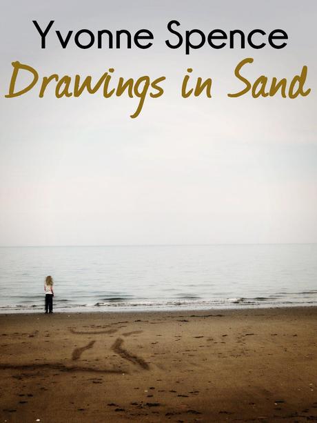
My daughter and I decided to use muted colours. We also used a limited range of colours, with the novel's title echoing the color of the sand. This was the result:

I've since learned that it's best to limit the number of colours you use in an ebook cover, so we got that right! But the longer this cover was up, the more I felt that while it reflected the emptiness the main character feels at the novel's opening, it didn't reflect her transformation. It didn't convey the sense of an uplifting book, yet that is one of the most important aspects of the book and one every reviewer has written about. Since the novel opens in midst of crisis and turmoil, an uplifting cover gives the reader the sense that things will get better.
So, my daughter and I started again, and here's the new cover.

According to Abigail Carter, in her article The Meaning of Color in Book Cover Design, blue is associated with wisdom and dependability. It is calming and inspiring and associated with spirituality and is one of the most popular colours overall. White suggests innocence, and is also calming. Yellow and orange convey warmth and optimism, while brown suggests stability. While Drawings In Sand is not an overtly spiritual book, reviewers have commented that, "I doubt very much that anyone who chooses to read Drawings in Sand by Yvonne Spence will not come away a better person because of it," (Jean Baldridge Yates) and "This book will help you heal from pain." (Marcy Goodfliesch.) A recent review on The Flyby Muse even considers it to be partially a self-help book.
So, it does seem give people a sense of support. For that I am very happy! I love to support and help. I hope the new cover will help reach a wider audience. Watch out for an offer coming up soon!

