 Contrast is the Key to Expansion
People always ask me "If I paint that room a dark color then the room will look smaller" or vice versa "Light colors will make it look bigger - right? " While in general these statements may be true it is really the creation of contrasts or lack of that diminishes or expands a room size.
Let's look at examples of this:
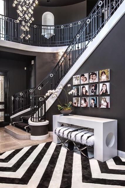
This foyer has a dark charcoal wall and ceiling with charcoal carpet as a runner on the stairs. While the dark color adds to the drama it is the white contrast trim that stops your eye and makes the room seem more intimate.
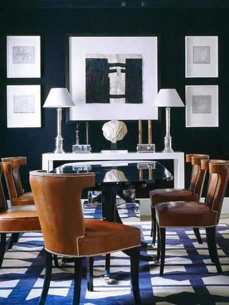
In this dining room it is the artwork that stops your eye on the navy wall which makes the dark color come closer to you.
On the opposite side less contrast in colors whether dark or light create spaces that recede.
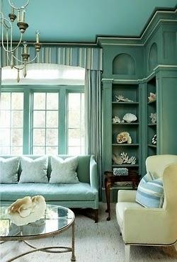
Here the room is different shades of the same blue green color. This allows your eye to travel around the room creating volume and room seems larger even though it is painted a darker color. Painting the ceiling a lighter shade of the walls is another trick to heightening the ceiling.
Again in this room the use of low contrast makes the colors recede creating a larger room. Low contrast doesn't have to mean white or neutral. Here the room is paint a soft green - trim, doors, cabinetry and walls.
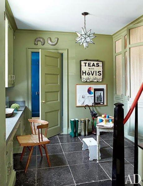
So remember " Contrast" when discussing expansion or diminishing a room size!
Happy Painting …..
