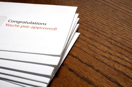

Most integrated marketers understand there's a lot about direct mail that seems counterintuitive. First of all, the medium itself still continues to outperform most digital tactics. And it's a technique that's been around for 60 years, that still works as well now as it did back in the day.
We're talking about the Johnson Box, a graphic preview on the outside of the envelope that gives recipients a tantalizing hint of what's inside. The copywriter who developed it, Frank Johnson, was (in)famous for writing direct mail letters that ran to four pages, which is probably why he needed to intrigue his audience. Some marketers have A/B tested direct mail with a Johnson Box, and saw a 220% increase compared to the control piece.
Besides giving you tips on how to use a Johnson Box to boost your open rates, we'll also run through best practices for its email equivalent, preview text.
Johnson Box Best Practices- Create an actual high-contrast box on the outside of the envelope.
- Use copy to pique the reader's interest.
- Johnson Boxes work particularly well with a typical #10 envelope, but experiment with other formats, too. Check with your mail vendor for other best practices.
- Johnson Boxes can also be used on the actual letter: it's a great way to draw attention to the offer or important points.
Preview text (also called a preheader) is the little snippet of text that follows the subject line of an email in most email programs. The overall effect is very similar to a Johnson Box - and like a Johnson Box, it can greatly influence your open rates.
Preheader Text Best Practices- While character counts vary by email client, your best bet is to keep it under 50 characters.
- Focus your key messages in the first 30 characters (because: mobile).
- Don't just use this text as a continuation of the subject line: preview text can also be a branding tool or function as a CTA.
- If you repeat the text of the subject line, readers may think it's an error and then assume that you are an untrustworthy or suspicious sender.
- Be playful but keep the text faithful to the content of your email. Otherwise, you risk losing your reader's trust.
- Make sure you preview the text - and the rest of your email, too. It really doesn't take much to lose your credibility, and it's so fast and easy to double-check your work. (Same goes for direct mail...and brochures, websites, and all your other communications!)
