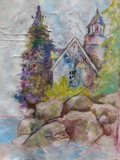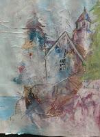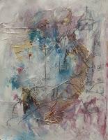


Working over a messy mixed media background I quickly drew in an image of a house on the cliff. Then proceeded to carve the image out and add a little brighter color to draw the eye in. This background was just muted enough as to not compete with the focal point instead it plays right into the weathered facade of the house. Perfect. I love it when a plan works out. Hope you enjoy.

