by Paul J. Pelkonen
(Yes, this is not a music review, but the second installment in a new series about visual art, called At an Exhibition.)

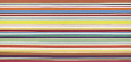
Do not attempt to adjust your television: Kenneth Noland's New Day.
Image courtesy the Whitney Museum, © 1967 the artist.
This collection featured artists who followed in the wake of the Abstract Expressionist movement, using color (the brighter the better) as their primary medium. There are examples of "drip" paintings (pouring paint directly onto the canvas, unusual geometries and optical illusion. Not everything is as it seems: Alvin Loving's Septahedron 34 looks like four separate canvases at first: the illusion of space created by the careful use of color and shade. Taken in at once, the exhibit overwhelms: three rooms with intense colorful experiences that batter at the senses.
The first room is an experience of muted shades. Sam Gilliam's Bow Form Construction is painted on an unstretched anvas, its images hidden from view by the two suspending ropes that tie off at either end of its long axis. One can peer into its billows and folds but there's very little of the original painting evident: the artist is encouraging you to delve into the third dimension of the painting but at the same time teasing the viewer and not letting them in. Marcia Hafif's 72, March 1965 makes a mysterious statement in three colors one associates with the Irish flag, and Alex Katz' Edwin features the sour lips and disgruntled face of his friend Edwin Denby, an art critic. Kay WalkingStick's April Contemplating May is a self-portrait in the muted pastels of Richard Diebenkorn's Ocean Park.

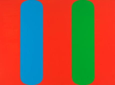
Ellsworth Kelly's Blue Green Red asks "which pill would you take?"
© 1964 Ellsworth Kelly, from the Whitney Collection.
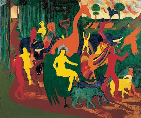
Opposite it, the magnificent expanse of Orange Mood by Helen Frankenthaler warms and soothes the eye. Frankenthaler's work violates everything you know about drip painting through washes of color that form a sense of serenity and peace. It is flanked by the only two figurative paintings in this room: Bob Thompson's Triumph of Bacchus, a bright pastoral with overwhelming colors and more animal figures revealing themselves the longer one stares, and Emma Amos' Baby, a pretty anachronism that recalls the color choices of Paul Gaugin. On the back corner, the searing reds and oranges of Josef Albers' Homage to the Square tugs at the eye, drawing one into its geometric maze.

More pleasing shapes: Bob Thompson's The Triumph of Bacchus.
Image © Bob Thompson from the Whitney Collection.
In the spirit of recursion, we end at the beginning. The outer hall is dominated by Kenneth Noland's New Day, another painting that divides colors into hard-edged lines. Taking up the whole wall by the elevators, this piece uses rigid parallel lines to form small spectra and repeated patterns that fill the canvas from right to left. It is almost too much to take in at once, and its placement here is a challenge to the viewer. Its attendants are Robert Reed's Plum Nellie, Sea Stone, swirls of midnight purple that surround a negative rectangle: as if a hole had been cut in the middle of the picture with the viewer invited to fill in the empty space. Negative white space also features in Carmen Herrera's Blanco y Verde. a single thin triangle of green on white that could be an approaching bird.
If you enjoyed this article, it's time to click over to Superconductor's Patreon page, and help support the cost of independent music journalism in New York City at the low cost of just $5/month.

