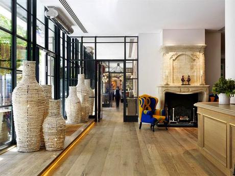
Front Desk and Foyer
bold upholstery, moroccan beaded vases, French limestone mantel
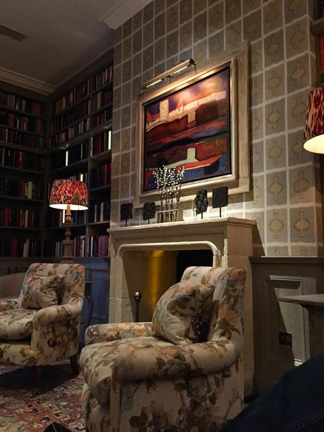
The Library off the Entry
patterned lampshades, wallpaper and upholster - all different
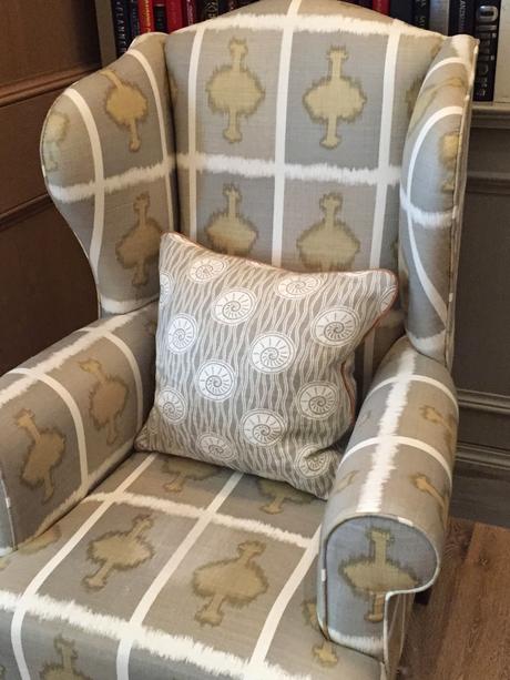
The wallpaper and the wing chair upholstery are repeated
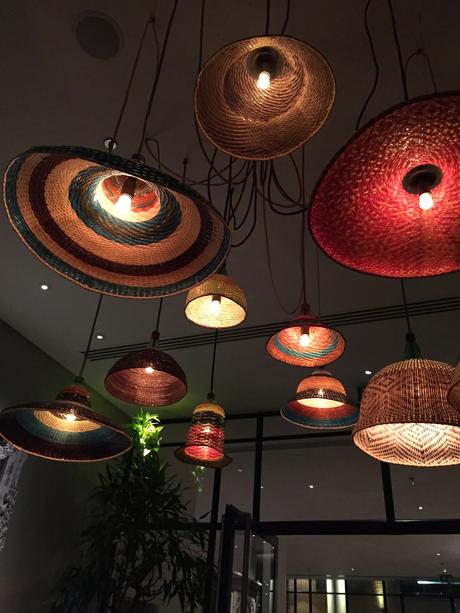
Multiple hanging woven baskets made into lanterns
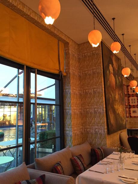
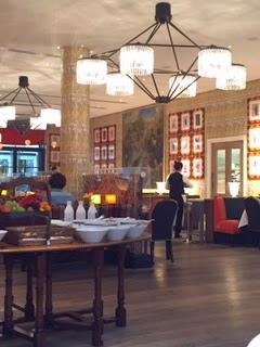
In the main dining room - egg shade pendants hanging in various heights as well as the roman shade behind them.
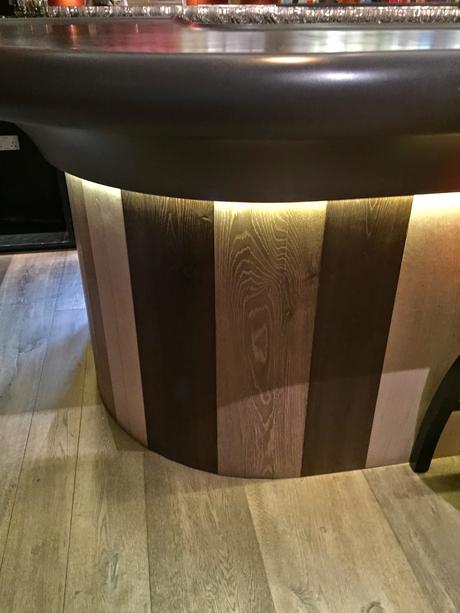
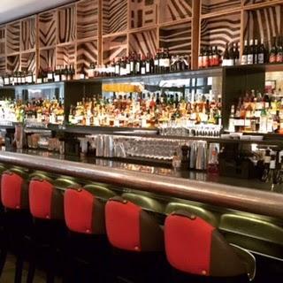
The main bar combines several wood in vertical stripes
On the ground level the hotel has a bowling alley, bar, dance space and spa.
fabric paneled walls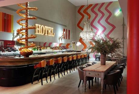
Jungle themed back bar and dance area
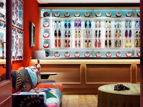
The bowling area - notice the framing on the left. Creatively custom with more pattern and color.
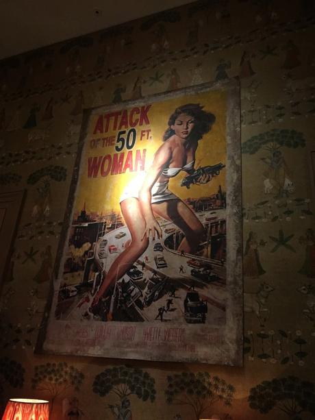
Large posters in the conference room area - whimsical and fun!
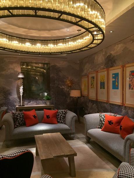
Conference Room #1
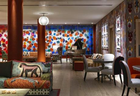
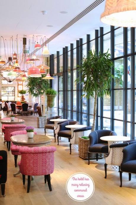
Back upstairs to the main dining area and tea area
I loved the use of fabrics on the chairs - always the backs were upholstered in a contrasting fabric.
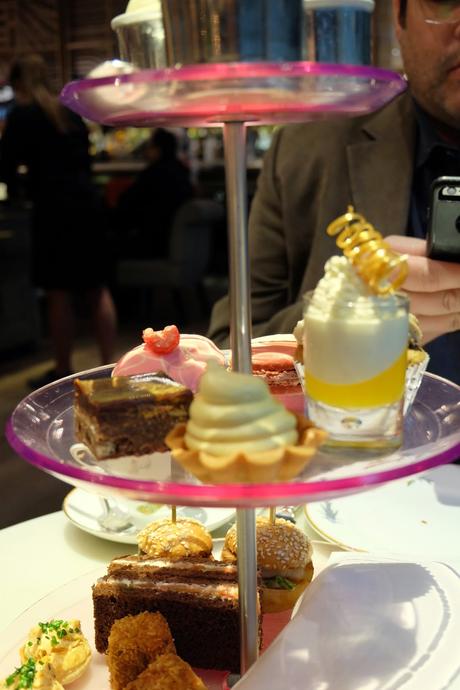
Loved our tea time treats!
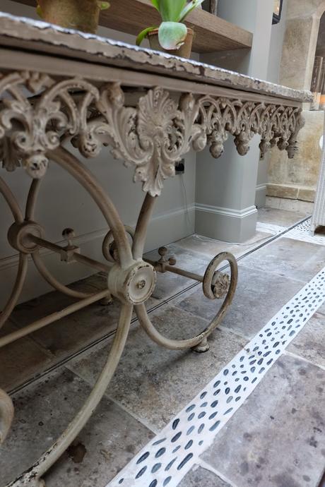
Use of pebbles within the floor tiles - mix of Morrocan and French
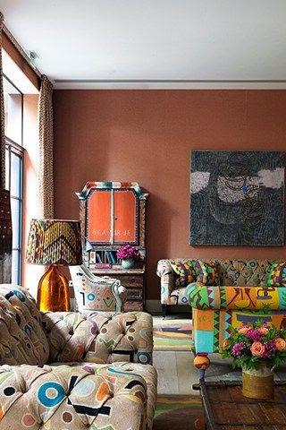
Back drawing room - check out the patterns and even the secretary is painted.
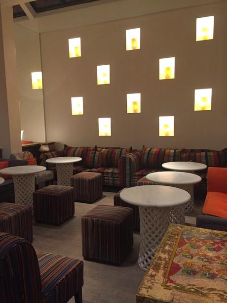
I loved the niches in the main dining area.
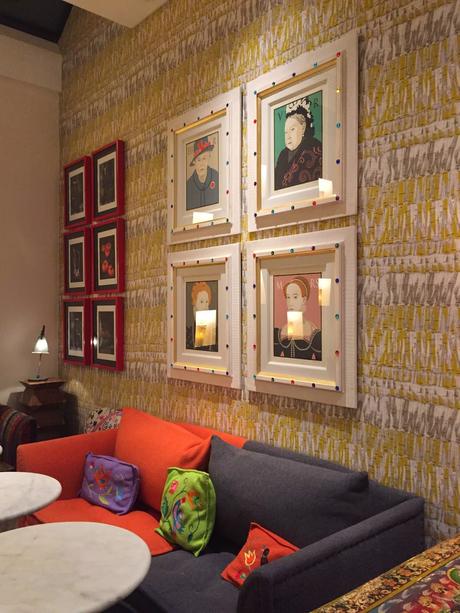
This wallpaper was really interesting - busy but solid at the same time. Great framing.
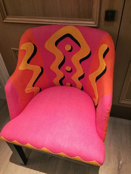
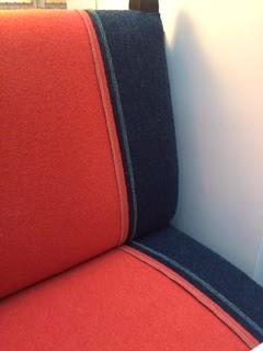
Bold upholstery choices with beautiful details around the edges.
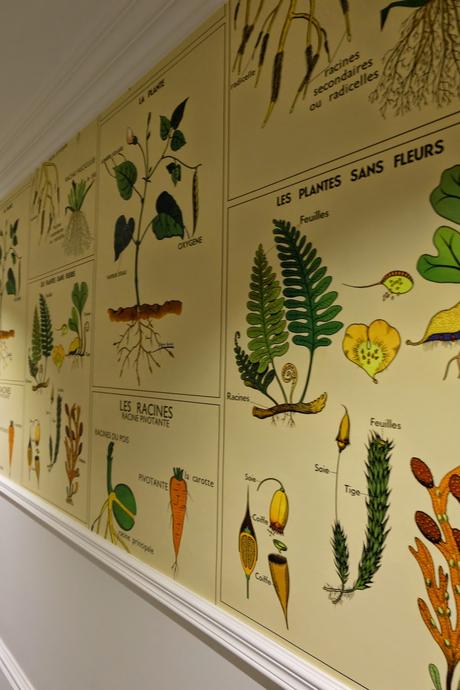
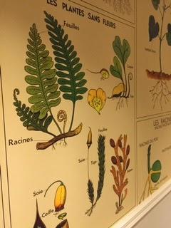
Main hallways were filled with this botanical print wallpaper.
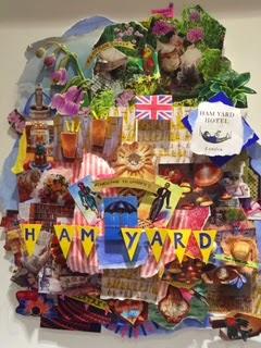
All the Art was clever and unusual. This was a collage in the elevator.
The use of wool fabrics and upholstery details were incredible. Solid fabrics with exposed stitching.
Here is a room view of that wallpaper.
Brilliant use of boxes and tribal prints at the bar.
This was design treat to see how Kit Kemp works her magic.
Happy Travels ……
