Having just returned from a fabulous trip to Europe, I stayed in some amazing hotels but The Ham Yard Hotel in London captured my attention.

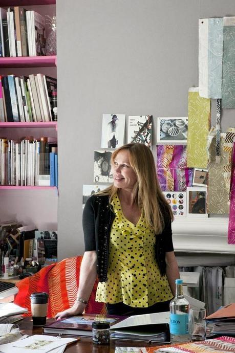
As my New Years goal is details, this hotel was full of design surprises and curious choices. I loved her layering skills - mixed up, unmatched but not too juvenile or garish.
Here is her design philosophy from Lonny Magazine: "My palette is diverse, but my style is about achieving a balance between what’s colorful and what’s neutral and restful. You need only one really inspiring piece in a room." Let's see how she achieves this by examining only the hotel bedrooms.
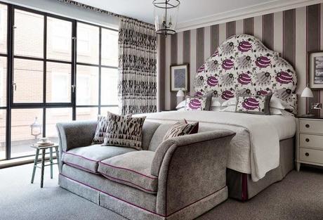
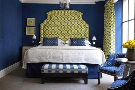
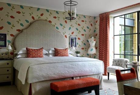
This room seems fairly matched up but look at the turquoise stool. The bed comfort level is amazing. Bold pattern on the headboard mixed with the graphic curtain pattern.
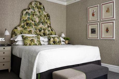
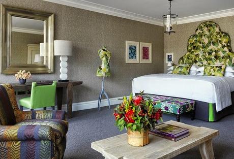
The next room has a bold wallpaper with marbled headboard fabric and then a multi patterned bench
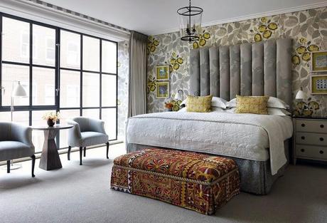
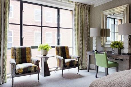
Then turn to the floral mixed with the yellow topped chairs with decorative flat braid. The artwork is interesting as well - unmatched to the room.
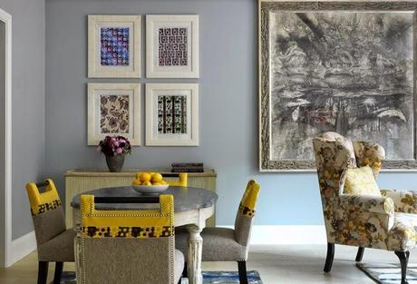
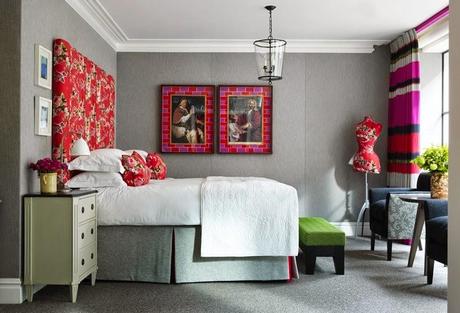
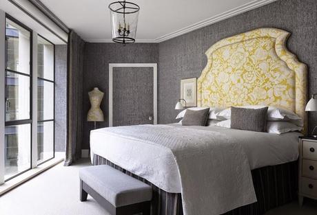
Grey walls, navy/pink dustskirt, orange red drapery fabric. Brilliantly mismatched
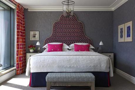
Again pattern upon pattern
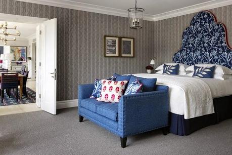
Peak and Boo pleats on the dustksirt in contrasting colors.
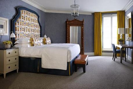
Boiled wool was everywhere with contrasting cords and mixed stripes - see the bench
Stripes at the window but larger stripe on the chairs
I just used the fabric on the pillows in a guest room. I mixed it with a brighter blue but here she has mixed with dark navy diamond pattern with the petite floral design and another print on the window. Clever!
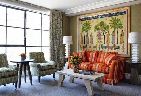
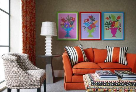
Wow - look at this sofa stripe. It really shows off the room and the art above. The other items in the room are more neutral but still mixed patterns.
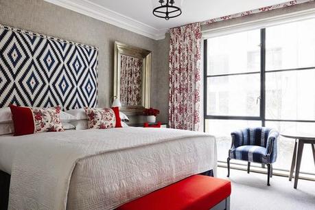
Even bolder here with floral headbaord, medallion bench fabric, striped chairs, and red and blue art work.
Red and pink striped draperies with a red floral headboard. A lime green bench to break up the hot colors and the neutral gray walls to cool it down and unify the room. Notice the floral on the side of the chair - that technique was everywhere. Even more pattern upon pattern.
The art was incredible too - perfectly picked and placed. Again mismatched and definitely original.
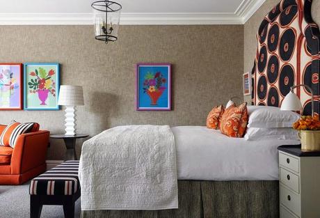
I loved the different headboard shapes in each room and how the design in each room is different. It makes me want to go back and stay in a different room.
Some rooms were simple but the attention to detail was the same - notice the upholstered door!
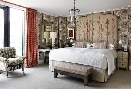
Gorgeous bird nest wallpaper and embroidered headboard fabrics - old fashion but at the same time modern.
Contrast that with a more modern bathroom - clean and sleek
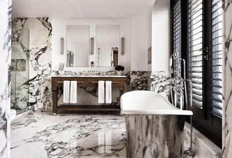
She is master at the mix - her creative choice of fabrics, attention to every detail. It is Brilliant design work!
Did you notice the dressmaker forms in every room covered the fabrics?
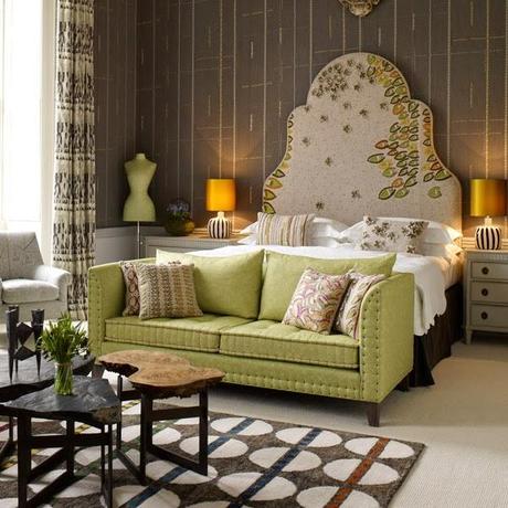
Next time we will look at the more public room. You are in for a treat. They are definitely a WOW factor!
