To me restaurants are all about the experience of the atmosphere and the food. What makes this design so brilliant?
1. scaleThe height of the ceiling and the oversized lanterns give that sense of drama to the room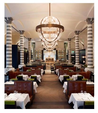
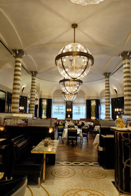
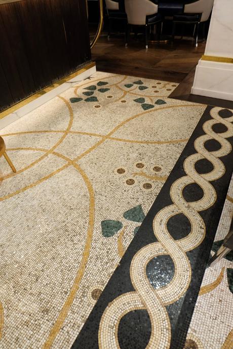
2. The attention to detail
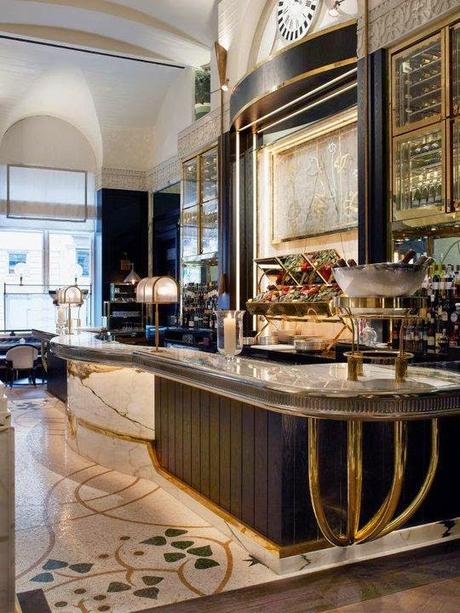
Beautifully crafted custom mosaics on the walls and floor Notice how they are juxtaposed to the classical moldings on the walls
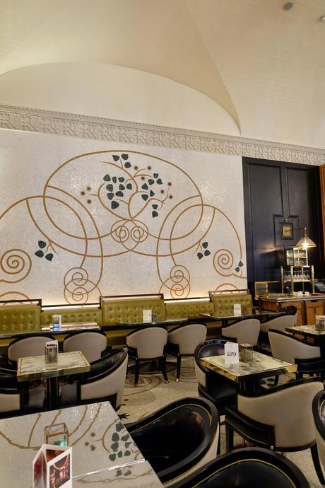
3. Reference to the past
David was clearly inspired by Italian interior with the striped columns reminiscent of the Sienna Cathedral but also the touch of Art Deco seen in the clock wall and the use of brass. The mix of different styles is subtle but still budding with creativity.
Love the barstool triangular shaped backs!
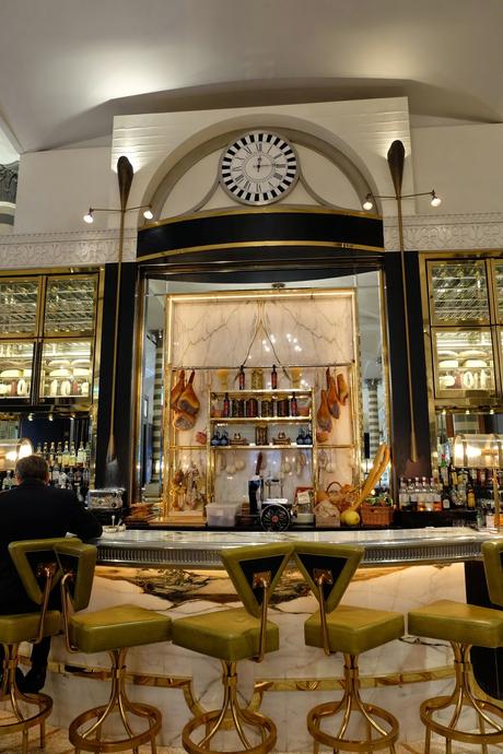
4. Custom Touches
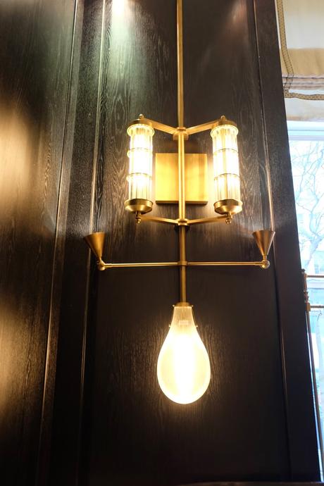
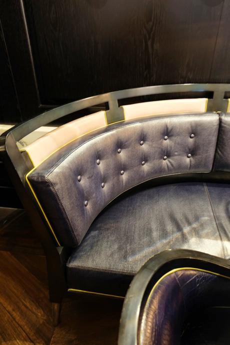
The light fixtures and the booth designs with the brass detail repeated through is lovely.
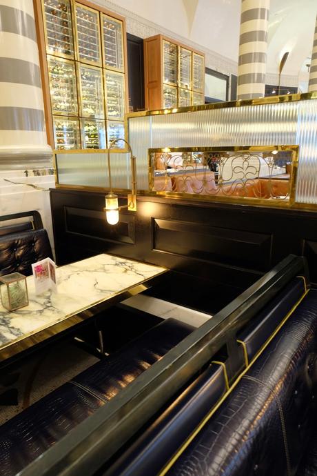
5. Sense of Textures
The shiny brass, black wood walls, tile, gloss striped columns, soft leather and the zinc bar. I love the mixture!
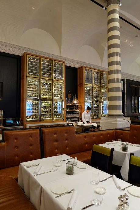
That fixture is to die for
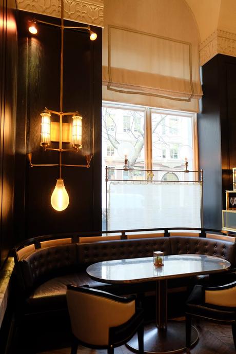
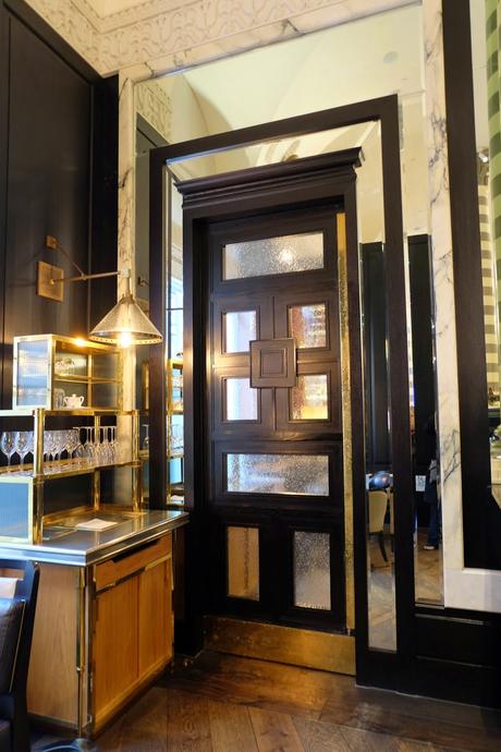
Who every said you can't mix metals? This bar was killer!
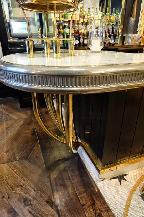
The curved detail on the banquette.
Not to mention the beautiful tiled ceiling. It was a glamorous and handsome at the same time.
This was another of our stops in my tour through Europe. Wait until we get to Italy!!
