huh?
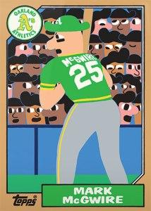
Recently, Topps released a set of baseball cards reproduced by various artists with their creative interpretations of iconic pieces of cardboard that were cherished throughout the years. I was given the Mark McGwire “1987 rookie card” by a friend and it gave me pause and seemed to be a head-scratcher. My opinion was that it was in the tradition of outsider art, or underground contemporary, which usually has the look as if an 8 year old or someone with a mental deficiency had created it: which is sometimes the case. It can be seen as aesthetically “bad” to most people, but to be fair, in some cases has multiple and sometimes disturbing meanings below the surface. The current appreciation and fervor around “outsider art” seemingly stems from an exhaustion with slick commercialism of much of the mainstream contemporary art world: a sort of anti-capitalism rebelliousness that found an audience and became what it rebelled against in the first place. Read: these guys and gals found a niche and are cashing in on the artistic equivalent of a skateboard or an energy drink. It simply exists to reaffirm commerce.
***
The creator in question, Keith Shore, an artist with formal and academic training, gained a modicum of buzz in the art world for creating the labels on a Danish beer bottle. That is a fine medium and I’m sure it was appreciated by many college kids with nothing to do on a Saturday night with a head full of ganja and the attention span of a gnat, but I wasn’t sure if the baseball card was the right medium for Shore’s “amateurish” style as this attempt at re-creating the most iconic piece of cardboard of my childhood failed miserably. Mind you, all of the above can be endlessly discussed, debated, dissected and put through the wringer to the point of jumping off a bridge to end the conversation. Besides,the point of this essay wasn’t to undermine the validity or definition of the “outsider” term itself, (I don’t have the time or interest) it was to confirm just how uninteresting and uninspired I found the ersatz art work to be. Ironically enough, the baseball card itself, once a worthless object created to entice children to buy bubble gum, could be seen through certain eyes as a form of pop art with a dash of unapologetic crass commercialism sprinkled in.
What a hypocrite.

