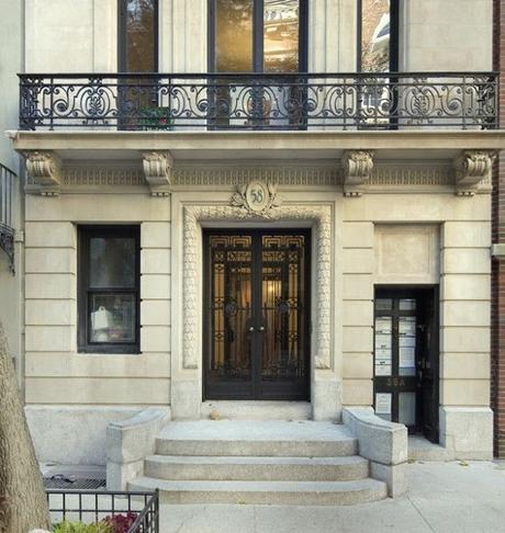
A beautiful exterior shot - love the detailing and ironwork.
One of my favorite rooms was the master bedroom by David Phoenix.
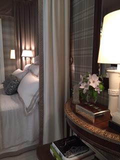
The upholstered walls and wallpapered ceiling. Neutral and rich at the same time.
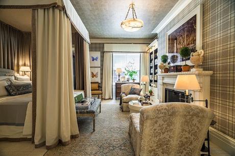
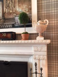
The fireplaces were original to the house.
I loved the linen bedding and the way the canopy was connected to the ceiling.
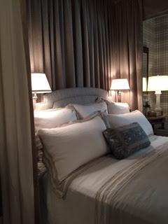
Detailing on the canopy side panels.
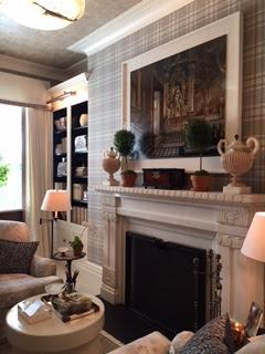
The inside of these bookcases are dark stained wood not black. They make a real statement in the room.
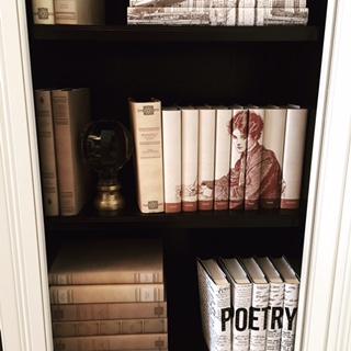
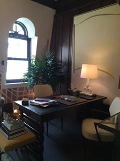
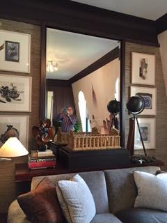
Here is the Alan Tanksley study - beautiful trim work
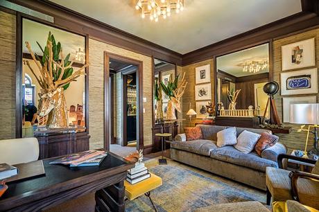
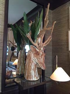
I loved these giraffe sculptures they made into planters.
Bedroom by Cathy Kincaid - light airy, blue and white porcelain, high gloss ceiling, nice detailing.
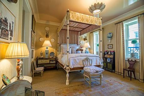
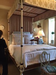
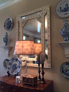
Beautiful details inside the canopy top
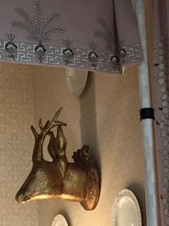
Trim on the drapery
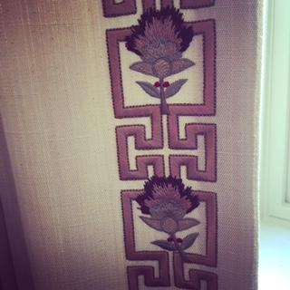
Tilton Fenwick back hall - I love hallways. They create such unusual and interesting spaces to design in. Here they used their fabric from Duralee on the walls
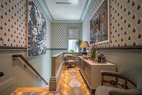
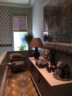
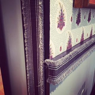
Notice the flat braid on the door jamb and chair rail.
Master Bath by Peter Sinnott
Orange detail stripe and accent color.
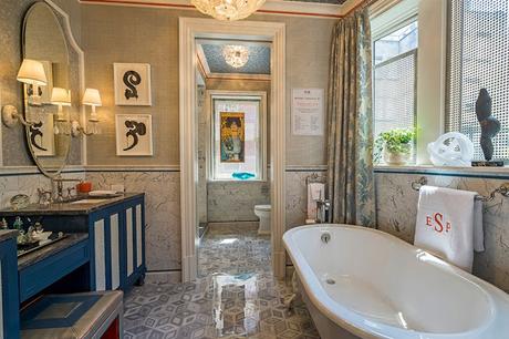
High gloss cabinets
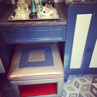
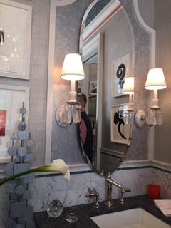
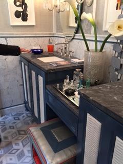
Textured ceiling and that orange stripe detail.
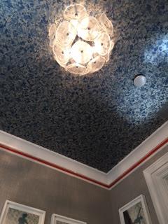
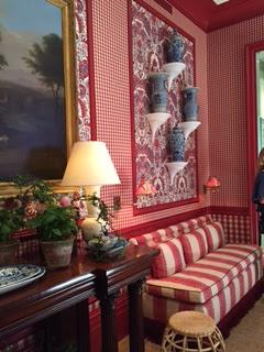
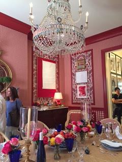
The Dining Room by Mark Sikes - red white and blue
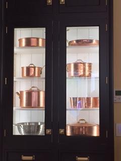
Kitchen by Christopher Peacock - the argyle style mosaic pattern over the range mixed with dark stained cabinets.
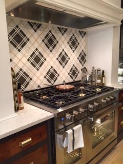
I loved the copper pot details.
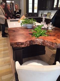
The end of the island had an organic tree trunk slab.
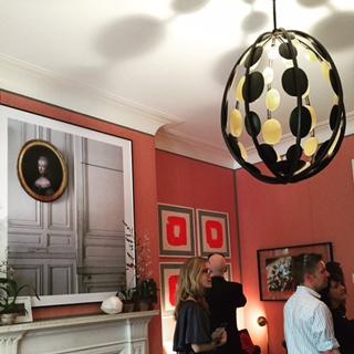
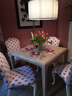
Bedroom by Alessandra Branca
Another red room - I loved the artwork.
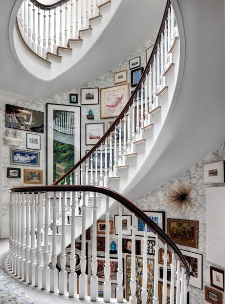
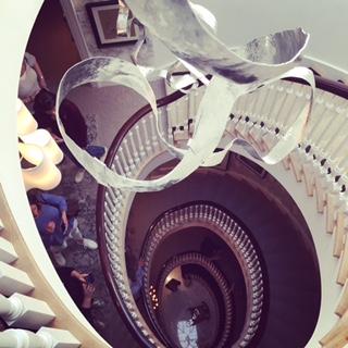
My favorite space was the 5 story staircase in the center of the house. Brilliantly done by Phillip Mitchell
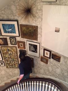
They used all of the art from the designers own collection and others in the firm. The art was hung salon style -Sculpture, oil, photography all mixed together over top of this textured wallpaper.
Looking down
My favorite piece - the lone photography in the big lucite frame.
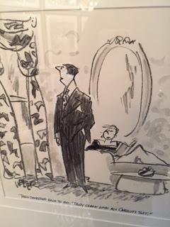
A funny cartoon on the art wall: "These draperies have to go. They clash with my Cerruti suit."
Looking UP...
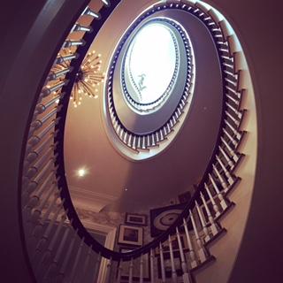
Another beautiful and inspiring Kips Bay house.
