Recently I wrote a bit about Art Deco and the 1920s, hopefully illustrating why I like the style of the period. But why is this relevant to weddings today? Although quite popular at the moment it’s a style you can use throughout the day to make your wedding a little bit unique from others which you may have been to. Also it’s not a strong theme such as demanding everyone dress up as Superheroes.
Art Deco styling can easily be reflected in small touches in items like flowers, jewellery and stationery. Many collections feature 1920s, 1930s and Art Deco inspired dresses. Designers like Jenny Packham, Sassi Holford and Yolan Cris all have dresses that either are based on 20s style designs or use elements in them which are very evocative of the time and its style of design. I think the style can be quite opulent in look. It is a bit of an antidote to the prevalence of the distressed, shabby chic, make do and mend influences which have been strong for the last few years while still being a ‘vintage’ theme.
Art Deco Wedding Invitations and Stationery Design
From a stationery perspective it’s very easy to make simple stationery with the look and style of the period, this is due to numerous fonts which I think look very interesting. Many of them are also relatively easy to read. These include the likes of Broadway Engraved BD, Parisian BT, PlazaDReg and BernhardFashion BT. Fonts like Eccentric Std and Harrington somewhat bridge Art Nouveau and Art Deco by being a bit more curvy but still feeling of the period.
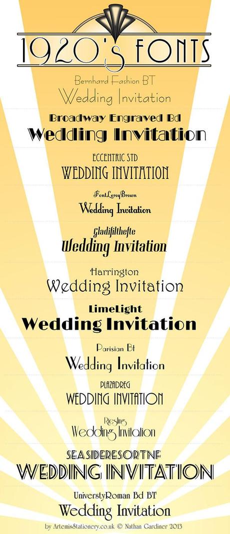
1920’s and Art Deco Fonts — by Nathan from Artemis Stationery
If you’re making stationery yourself, art deco fonts are very stylish so you can base your design on the words and the fonts and there will be enough interest if you lay it out well. From the point of view of colours really anything goes, though black and gold are two which work very well together. But it’s not a style to limit itself to a small color palette.
Examples from Artemis Stationery
At Artemis Stationery I have numerous designs that work well with 1920s or Art Deco styling. All of the stationery by Artemis Stationery is handmade.
Bespoke Wedding Stationery Collections
Bologna
Bologna is very Art Deco although I have used a few flowers to slightly soften the style in the foreground. It’s inspired by some of the designs in the lobby of the Chrysler Building in New York and other architectural features from New York. Here we have shown an A5 invitation mounted in black and ivory as well as a blue place name.
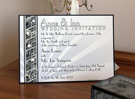
New York inspired Art Deci Bologna A5 Invitation mounted in black and Ivory
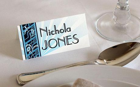
Bologna art deco style place name
See more New York style Art Deco wedding stationery.
Capri
Capri is very Art Deco influenced, especially if you look carefully at the design which uses a lot of symmetry and 1920s inspired design elements. Used with Swarovski crystals it can also look very glamorous and reflect both the design and the glamour of the age.
Capri can work well with script fonts but for the full Art Deco effect PlazaDReg should be chosen, while Eccentric Std also works and gives it a period and little bit more of a natural feel. Shown here are a sign and card invitation in a pastel blue. The feature font use is PlazaDReg. Then there is a booklet invitation using Reisling, I like this font as it has a lot of straight lines complimented and contrasted by a few flourishing curves. The last image of Capri is a menu in three languages that used Eccentric std.
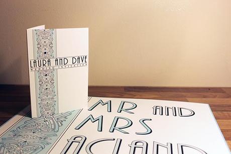
Capri Art Deco wedding sign and invitation with swarovski crystals
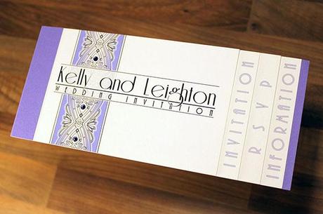
Capri Art Deco wedding invitation booklet
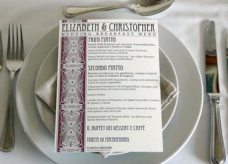
Capri A5 Menu
See more of this sophisticated bespoke wedding stationery collection.
Miami
Miami uses a classic Art Deco sun ray design as the background. It’s hugely flexible working brilliantly in practically any color from big and bold to light and pastel. Fonts can be similarly varied and it can work well with some script fonts to provide a contrast. The booklet invitation example below in orange and brown, and the place name both show a script font used to contrast with the Art Deco design. It also makes the Bride and Groom’s names really stand out. There is also a table name and order of service shown using only Art Deco fonts.
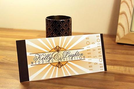
Miami Art Deco Wedding Invitation Booklet
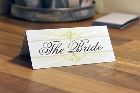
Miami art deco style wedding place name
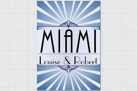
Miami Table table name design
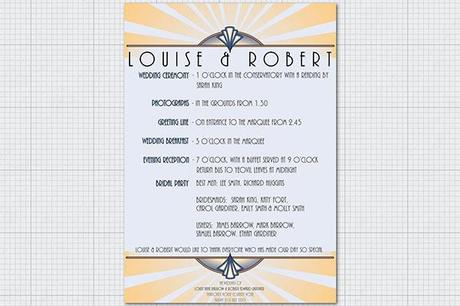
Art Deco Order of the Day or Program in blue and orange
More of this sunny take on classic Art Deco can be seen on the main wedding stationery site
Genoa
Genoa and Padua are both very adaptable designs. Genoa is a design based on the first letters of the Bride and Groom’s names and can be done in any font. So if an Art Deco feel is selected it will look very Art Deco. Padua works in a similar way, except in this case it uses first names.
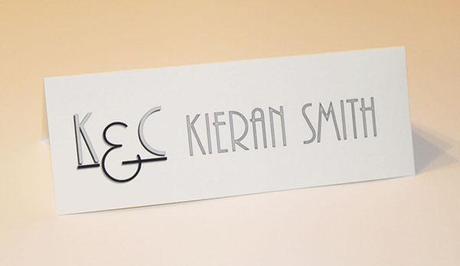
Genoa art deco place name
Numerous other designs also work really with Art Deco fonts. Sienna is an example where the basic design isn’t really Art Deco but does take a bit of inspiration from the arts and crafts movement. Used with a font like PlazaDReg it will look really effective.
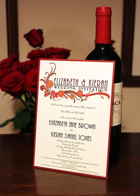
A5 Mounted Invite Sienna with art deco fonts
All of our bespoke wedding stationery collections start with a base design. When that is chosen I work with each client to adapt the design to the types of stationery items they want to use, of which there is a wide variety. Together with the client all of the colours, fonts, wordings and layouts are adapted to suit their particular needs, likes and dislikes.
It’s a real collaborative process that makes for really personalised wedding stationery that is as unique as each of my fantastic clients. There is an example of how this process worked with one client on my wedding stationery blog.

