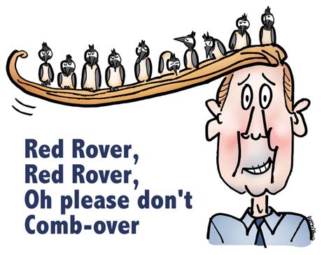
 Why do comb-overs make us shake our heads and snicker?
Because someone’s faking it. They’re not comfortable with themselves, so we’re not comfortable with them.

We want to say: Be yourself. Don’t spend time on something that looks bad and doesn’t work.

Brands do comb-overs, too. Here are 10 telltale signs of a comb-over brand:


1. They use stock photos because they’re “good enough.”

Even though they’re generic. Even though people yawn and scroll past them. Even though other companies use the same photos.


2. They use jargon that might be misunderstood. You have to speak the customer’s language, not your own.

You win people over by being human and likable, not technocratic and remote.


3. They try to “fit in.” They take their cue from other brands. They say the same things other brands say. This is one of the harder comb-overs to spot.

Why? Because brands that play it “safe” don’t get noticed at all.


4. They steer clear of humor. They think it makes them look unprofessional. They don’t understand that humor is more than telling jokes. It’s doing business with a smile and a light touch. It gets people to lower their shields.

Clive James said it best: “Common sense and a sense of humor are the same thing, moving at different speeds. A sense of humor is just common sense, dancing. Those who lack humor are without judgment and should be trusted with nothing.” 

5. They let analytics and efficiency define their scope. Analytics and efficiency are both good things, but they encourage “safe” marketing: repeating what’s already worked, spending as little as possible.

To get noticed, brands need to take risks. Effective marketing can create customers.


6. They stand for… a good product or service– and that’s all. It’s not enough to set you apart. People today are bombarded with choice and competing truths.

A brand’s “truth” (philosophy) can help it stand out and attract customers.


7. They think there are only so many ways to tell a story. There’s always a fresh way. And that’s a good thing because times change, and brand stories need to be refreshed and retold.

That’s why it pays to hire collaborators who can see the stories with fresh eyes.


8. They believe in detail-stuffing: always cram as much information as possible into posts and infographics. Bad mistake. If it’s not eye-friendly, people will scroll by.

Less is more (read Lincoln’s Gettysburg Address). White space is your friend. Think long, write short.


9. They rely on “influencers” to create all their buzz. Sure, influencers are nice-to-have. Any brand would be glad to have an industry expert or “thought leader” give them a shout-out.

But the most credible testimonials come from advocates— satisfied customers. And happy employees are some of the best brand advocates a company can have.


