This is the weekend edition of TheMarioBlog and will be updated as needed. The next blog post is Monday, June 8, when I will be reporting from Copenhagen, Denmark.

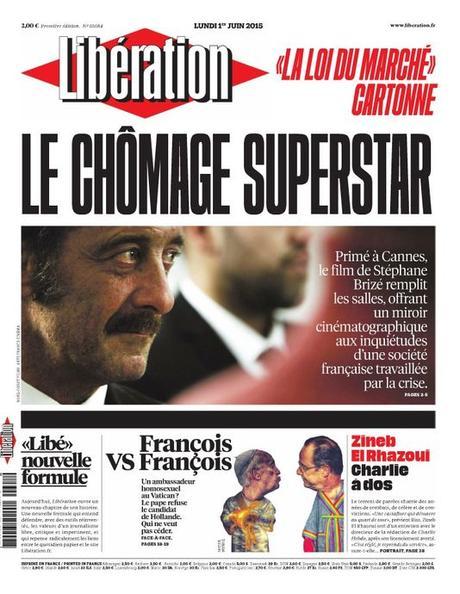


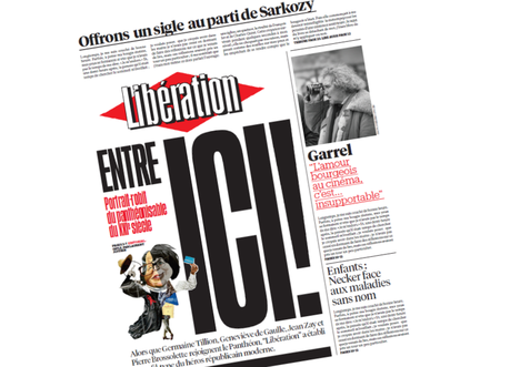

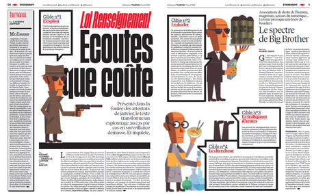

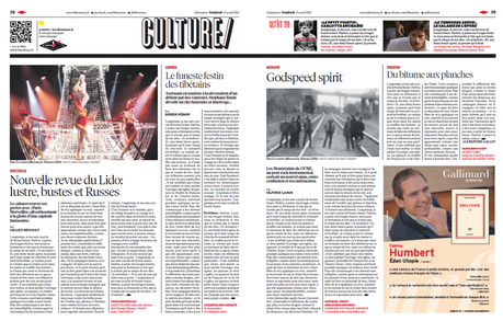

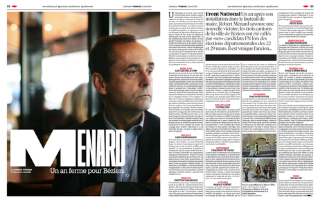

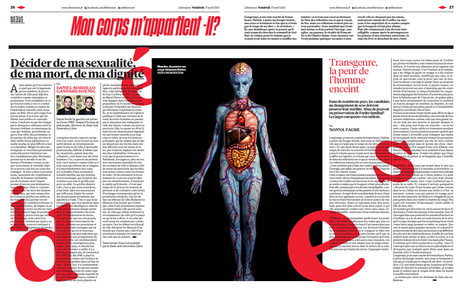


It is another redesign and reinvention for the venerable Liberation, the French daily and darling of left leaning intellectuals, founded in 1973 by Jean Paul Sartre.
With new owners, new hopes and in the middle of yet another crisis, Liberation emerges with a bolder, more magazinish look, the result of their work with the talented Spanish designer Javier Errea in collaboration with Yorgo Tloupas.
Liberation’s editor in chief Laurent Joffrin published a note about the changes:
“This project consists in creating new formulas, as Libe continues to defend the values of a free press that is critical, impertinent, that stops to analyze the changes in the world of the 21st century, looks for new solutions, and fights for a better world and for that which is right and more free.”
Joffrin added that the new Liberation is a newspaper that seeks to offer more depth, reactive, with original journalistic angles and new sections that appeal to readers and simplify the process of reading.
Among the highlights:
—A new font, Libé Sans, has been specifically created for this new Libé by the French type designer Jean-Baptiste Levée. In addition, the new formula uses destacan Tiempos (from Kris Sowersby) for text; Produkt, of Christian Schwartz, for complimentary texts, and also Graphique Pro and Windsor for logos and signage.
—Four pages daily devoted to themes of the day, with various angles that will amplify and explain topics.
—Expresso—4-5 pages devoted to longer pieces, where Liberation writers take a look at current events.
—Long pieces will appear, presented in a graphic and magazine-style design, via a series of double pages.
--New pages of opinion and debate.
--A revamped weeekend Libé, expanding coverage of music, books, travel and food.
--For its online edition, a paywall with a limited number of free articles. Objective: to have 7 million unique visitors in 2017, as compared to the current 2.74 million.
Writing in his website, designer Javier Errea describes the new Libe as "more textual".
"The new Libé is a newspaper for the big stories, with a thematic unity that is emphasized through the use of double pages from start to finish. Liberation goes all out to become a newspaper to be read and to be enjoyed thoroughly in a relaxed way, with plenty of calm. The only part of the newspaper that is fast paced is the Expresso section."
A conversation with the designer: Javier Errea

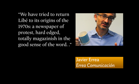
I have known Javier Errea since he attended The Poynter Institute for Media Studies as a Summer Poynter Fellow as well as The University of South Florida. It was obvious then that Javier was a major talent and his current work globally makes us all proud.
I am an admirer of his work and truly like what he has done for Liberation, so I reached out to him for a short 3-minute interview:
Mario:
What was the main goal for the Liberation project?
Javier:
We have tried to return Libé to its origins of the 1970s: a newspaper of protest, hard edged, totally magazinish in the good sense of the word. In other words, no soft content, but hard news analysis, insight. The double page becomes the minimum unit for stories.
Mario
Tell me about this new font created just for Liberation
Javier
The new typography, LibeSans is the key graphic element of the new model. It is rich in variety, from the extracondensed to the extended and the round. It allows for numerous levels and voices, different tones. It also gives the newspaper that edge, sort of pop, of alternative publication, which has always been the sould of Libé
Mario:
How about the weekend edition?
Javier:
The weekend edition is even more graphic, with many pages devoted to music, design, books and free time, all composed in the round version of the Libe Sans font. The monthly magazine, Next, also approximates the protesting spirit of Libé .
Mario:
How about the front page and change?
Javier:
This is a very demanding model where the margin of error is greater than before, a newspaper more compact and elegant. The front page will continue to be poster like, but not necessarily so. Variety will be the key. We have also prepared models that are more text driven, more to be read, if the editor feels such approach is needed.
Mario interview for CNN En Español
CNN interview: For those who can follow Spanish, here is my interview for CNN En Español with Juan Carlos Lopez. It is based on a discussion of how Cuban newspapers of the future might be (if freedom of the press ever comes). My partners in creative crime were the superbly talented and good friends Ana Lense Larrauri and Nuri J Ducassi.
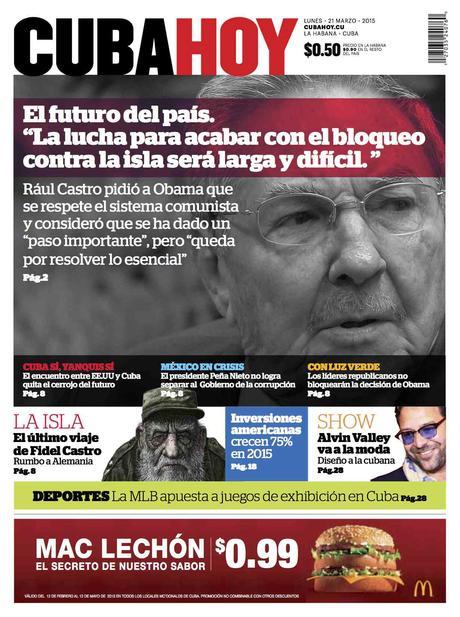
The three titles are Cuba Hoy (a popular, down market tabloid), Havana 24/7 (English language daily), La Rampa (a contemporary newspaper of news and analysis for the middle class)
http://www.cnn.com/videos/spanish/2015/06/03/exp-cnne-directo-interview-mario-garcia.cnn

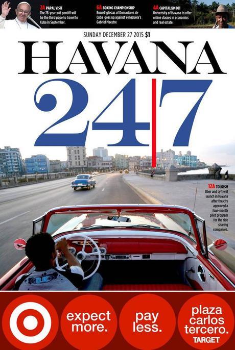
Havana 24/7, designed by Ana Lense Larrauri (art director, The Miami Herald)

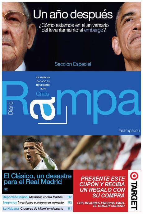
La Rampa, designed by Nuri Ducassi (consulting creative director, The Toronto Star)
