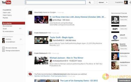
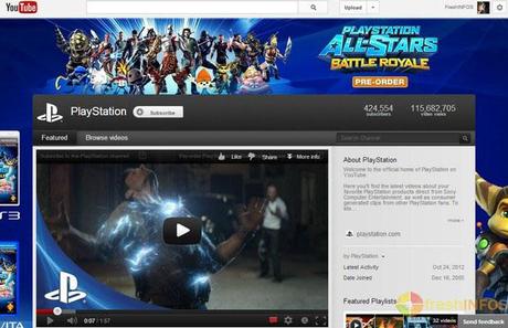
Google has already started rolling out the brand-new redesigned interface for its’ most popular video-sharing website, YouTube. When I logged-in to my YouTube account today, everything looked surprisingly so simple and clean. It didn’t take much time for me to realize that the cool new Google+-styled revamp has already arrived on YouTube, which I’ve mentioned to you in an earlier post.

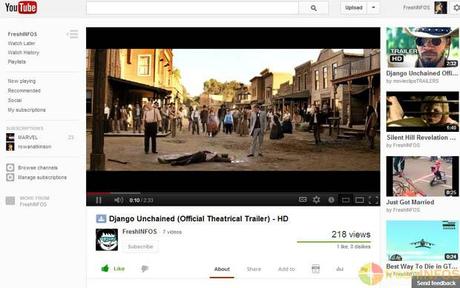
Freshly revamped YouTube works more closely with Google+ social network to bring you a more personalized experience, with a minimal and a cleaner look. Homepage has been updated to show a bigger preview of the videos, which comes curated according to friends-activity on Google+. Suggestions on the right-side panel now shows more relevant videos to the topic you are viewing and the side-bar on the left gives you easy access to more features while it automatically hides when you’re watching videos.

New update will roll-out to everyone around the world, eventually. If it’s not available for you yet, you can enable it right now. Just follow the instructions provided over at OMG!Chrome. I haven’t tried it out, so proceed with caution.

(All the images, trademarks, logo’s shown on this post are the property of their respective owners)
Roshan Jerad Perera

