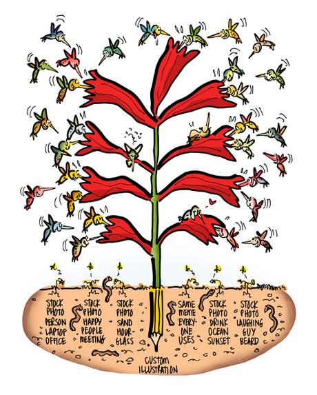
 I count 32 hummingbirds in the above illustration.
Hmmm.

I mean, Hummmm.
What’s going on??

Well, it’s a competition to see who can attract the most visitors.

The custom illustration (with the pencil root) is the clear winner.

The losers, down there with the worms, include 5 stock photos and The Same Meme Everyone Uses.

Let’s take a closer look at the losers, and why they lost.

Person At Laptop

Two examples.

I’ve seen this young woman biting her pencil many times. What’s causing her pretend anxiety??

Then there’s the barely-glimpsed-person at a laptop with a cup of coffee. Whoa!– a china cup instead of a mug. Pretty radical…


 Happy People At Meeting


How many times have you seen happy people gathered around a computer?

Why are they all so happy??

What the heck are they looking at??


 Sand Through The Hourglass


One of the great stock photo cliches.

The one of the right kills me: a disembodied hand holding an hourglass with red sand shot against a distracting faux stone wall– nice!!


 The Same Meme Everyone Uses


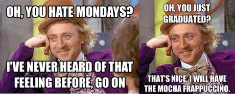
I’m talking about the Gene Wilder-Willie Wonka meme. It even has its own Wikipedia entry, Condescending Wonka.

There are hundreds of them: same screen-grab, different words.

They’re funny, but they’re all sarcastic and condescending– which makes them a little dicey for a business blog.


 The Drink By The Ocean At Sunset


Millions of variations.

How about a toast (clink!) or a Mason jar on Sunset Bay??


 The Laughing Guy With The Beard


I have to admit, I get a kick out of this guy. He’s everywhere.
His most popular shot seems to be Hey Look, I Have A Post-It Note On My Head. I wish I had a nickel for every time I’ve seen it.


He can do a phone and a laptop at the same time, and he can also combine Happy People with Workplace Diversity.


Well, maybe except for the creepy hand with the hourglass.

So why are they all losers when it comes to header images?

Because stock photos are essentially invisible. We scroll right past them.

We know they’re fake. Just window dressing.

We know that look.
We see them over and over again because so many people use the same or similar photos.

People use them because they’re free or cheap. Strictly a pro forma thing: a blog post needs a header image, so slap one in whether it attracts visitors or not.
 The Advantages Of A Custom Image


Why create or commission a custom image for your brand?

1. Because they get people to stop scrolling. They attract attention because they’re different.

2. They’re customized for your brand and target audience. By contrast, stock images are generic.

3. They help you tell your story in new ways. Illustration is visual storytelling.
4. Commission an image, and you get a collaborator. Someone who will see things with fresh eyes and contribute new ideas.

5. A custom image can act as a talk trigger, creating word of mouth.
6. A custom image will reflect and amplify the copy to better communicate your brand message to the reader.

7. A custom image can create what marketing expert Andrew Davis calls a curiosity gap, and make the reader want to know more.

8. Ideally a custom image can be broken into spot images and repurposed. It’s a matter of design, so you need to discuss it ahead of time with the person creating the image for you.

Not everyone knows how to create a custom image, not everyone can afford to commission one.

I understand that.

But a custom illustration might be more affordable than you think.
I provide free estimates and a range of options.


