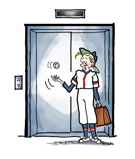
Everyone knows what an elevator pitch is, right?

It’s a capsule summary of what you do. Short and sweet. It’s what you tell people at parties and networking events.

I contributed to an article called Tips for Perfecting Your Elevator Pitch.
It was written by Marisa Sanfilippo, and it’s excellent.

Marissa writes that:

An elevator pitch is a sales pitch that is typically 30 seconds long.
Legend has it that it originated in Hollywood when a screenwriter would “catch an unsuspecting executive
on an elevator ride.”


I’ve since had second thoughts about it, but here’s the original:

“My name’s Mark Armstrong. I’m an illustrator.
“I do business as Mark Armstrong Illustration – clever name, right?
“I help brands get noticed and connect with people.
“I specialize in humor, which helps humanize a brand and makes it easier to relate to.
“Humor also gets people to drop their shields long enough to hear what you have to say.
“I also illustrate books and do editorial work for magazines.
“Mark Armstrong Illustration, at your service!”
So reading it now, what don’t I like about it?

Too long

Could I really roll that out in 30 seconds?

I doubt it. It’s too long. A clear case of trying to squeeze in too much information.

Sounds stilted

It doesn’t sound like something you’d actually say to someone. Sounds like what it is: formal and rehearsed!!

Hard to remember

Once you formalize a pitch and rehearse it, you run the risk of drawing a blank– like an actor who forgets his lines. You can’t think how it starts, or what the next line is.

Mixed message

The line about books and editorial work distracts from “I
help brands.”

I do all those things, but I’m hitting someone I just met with too much information. It’s hard to process and file away.

Rarely used

I work out of my home in rural New Hampshire. I meet most of my prospects online.

I’m going to be sending them a written pitch. I don’t have occasion to use my spoken pitch very often, so it doesn’t spring readily to mind.

An Alternative Approach

So what would I suggest at this point for an elevator pitch?

Instead of memorizing a little speech, memorize 3 words that sum you up, words you can string together in a sentence.

For me, the 3 words would be: illustration-humor-brands.
I’d string them together like this: “I’m an illustrator, I specialize in humor, I help brands connect with people.”
And I’d stop there and hope I’d said just enough to make the person curious enough to ask what brands I’ve done work for, or some other question.


Another advantage of just remembering 3 words: they can serve as prompts if someone asks for more info.

For me, the prompts would work something like this:

Illustration: “Marketing’s become very visual. Illustrations get noticed, stock photos don’t.”

Humor: “I don’t mean jokes or standup comedy. I mean humor that puts people at ease and gets them to drop their shields.”


