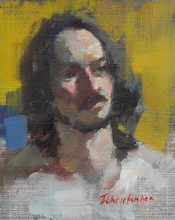
Male Model
10 x 8
Original (sorry about the poor white balance)
The model at this week's figure drop in had a character-filled face that invited portraiture, and I regret not tackling a larger painting. I used some tiny brushes where I'd much rather have used big, expressive ones, but I'm still pleased with how this eventually turned out.Increasingly, I've realized that it's too much to ask that a painting is finished after just one session. It may seem done, but usually that just means that I've run out of ideas or become too tired to make any more decisions. That's when I have to stop and put some time and distance between myself and the work before I ruin it with thoughtless marks.
When I looked at the painting the next day, I was both tentatively pleased and deeply bored. It had some good light and dynamic paint, but the dark, undeveloped background felt old fashioned and uninspiring. So, since there was nothing to lose - I didn't love it - I scraped back the hair and background, mixed up a couple of high chroma colours, and tested them behind the head.
After a couple of false attempts with less extravagant colours, I finally dove in and accepted that warm yellow was the best choice. It brought out a nice piece of greyed yellow in the brow area, and found an echo in the reflected light in the chin. And as soon as I applied it, it lifted both the painting and my boredom. I added some blue on a whim, and that pleased me, too.
Every painting gets a lot of chances in my studio. I work at them until they please me, or until I've killed them. Either way, I learn something, take some chances, and try to avoid boring myself and viewers.
Happy painting!

