This is the weekend edition of TheMarioBlog and will be updated as needed.
A new blog post is scheduled for Monday, July 23.
TAKEAWAY: Now that Yahoo! has named its new CEO, can we expect her to clean up the design of the cluttered and chaotic Yahoo website? PLUS: It’s Vogue the iPad app—and stylish it is

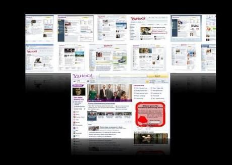
Yahoo! home pages through the years, including the most recent version, redesigned in 2006

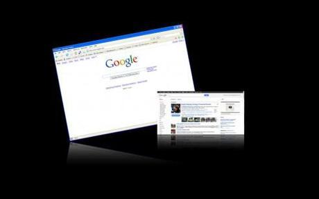
The cleaner and more aesthetically pleasing Google home page look
“Can Marissa Mayer save Yahoo!?” proclaims a teaser headline in Wednesday’s Financial Times.
My question would be: Will Marissa Mayer’s first major decision involve redesigning the cluttered Yahoo! website?
I am sure many people are going to be watching carefully to see what the answer is to those two questions.
Yahoo! this week appointed Ms. Mayer as its chief executive officer, a position that has changed names quickly and often. In fact, Ms. Mayer is the fifth full time CEO of Yahoo in five years.
Ms. Mayer comes to Yahoo! from Google, where she has spent her entire 13-year career and where, according to a story in the International Herald Tribune, “the clean look of the search engine was credited to Ms. Mayer’s sense of aesthetics.”
If that is so, Ms. Mayer is likely to mobilize the company’s designers around her to redesign what is one of the most cluttered, chaotic and difficult to navigate websites.
In fact, I often turn the word Yahoo into a verb when discussing website design and say things like “Please let’s not Yahoosize the process here.”
To Yahoosize the design of a website is to turn it into the window of a hardware store, with every possible hammer, nail and paint brush on display. Yahoo has done that to perfection.
Much has changed in how we approach website design since the arrival of Yahoo! on the scene in 1996. Today, those who browse through the Internet expect a cleaner environment on the screen, with a greater sense of hierarchy, some gentle uses of white space and navigation that is intuitive and painless.
But, who knows? Perhaps the “clutter” look is part of Yahoo’s DNA. In reviewing the history of Yahoo!, we read that t!he Web site started out as “Jerry and David’s Guide to the World Wide Web” (for its founders, David Filo and Jerry Yang ) but eventually received a new moniker with the help of a dictionary. The name Yahoo! is an acronym for “Yet Another Hierarchical Officious Oracle,“ but Filo and Yang insist they selected the name because they liked the general definition of a yahoo: “rude, unsophisticated, uncouth.“
It will be grand to watch the process as Ms. Mayer sets priorities for the company. We hope one of the first will be the deYahoosizing of Yahoo!.
Tall order among the many other challenges faced by the new CEO with the sense of aesthetics.
Of related interest:
Yahoo! creates new editors-in-chief for news, finance
http://www.capitalnewyork.com/article/media/2012/07/6227435/yahoo-creates-new-editors-chief-news-finance
Stylish new app for fashion icon Vogue magazine

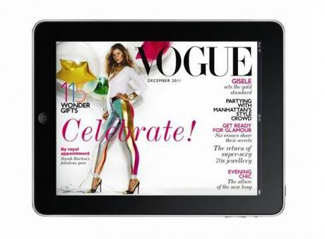
The new Vogue magazine app
Vogue
http://www.economistgroup.com/leanback/lean-back-reading/reimagining-vogue-for-the-tablet/
First paragraph:
The challenge inherent in repurposing a magazine of Vogue‘s design and visual excellence onto a tablet device is pretty daunting. Vogue is a Conde Nast icon, achieving worldwide recognition for the depth of its journalism, the quality of its photography and the beauty of its design. Bringing the demanding aesthetic of a centuries old brand to a new digital edition, on hardware that didn’t exist until a few years ago, using software tools that have only just been developed, is a risky business.
My take:
Quite good use of multi media here, but the long narratives prevail, too, and obviously the designers have managed to include tons of pop ups without overwhelming the reader. However, we already know that there is a certain amount of visual overload in the printed versions of fashion magazines—as when 14 pairs of boots, 12 types of facial creams and five big handbags all land on a single page. Readers of these mags are used to that. What I like here is that, while the abundantly populated pages of the print Vogue remain, maybe one or two items are selected to do the pop up thing. Good idea. This app has something for everyone, and students of magazine app design should take a look, but, remember, this is a monthly: don’t try this at home if you are producing a daily app. Good job, Vogue.
Weekend reads
Why the Washington Post will never have a paywall
http://gigaom.com/2012/07/18/why-the-washington-post-will-never-have-a-paywall/
Highlight of comments from Washington Post CEO and controlling shareholder Don Graham
In response to a question about why the Post remains steadfast in its opposition to paywalls, Graham said that a subscription option like the New York Times or Wall Street Journaloffers wouldn’t make sense for the paper for one simple reason: because the vast majority of its digital readership comes from outside the print newspaper’s circulation area, and therefore there isn’t any way to tie an online subscription to the print publication the way most of the Post‘s competitors do.
How Bloomberg can still run Washington
http://blogs.reuters.com/jackshafer/2012/07/19/how-bloomberg-can-still-run-washington/
Highlight: Jack Shafer’s recommendation
So until the CEO of the Earth slot opens, Mr. Mayor, I’ve got a terrific idea for the last act: Convince the Washington Post Co’s CEO, Donald E. Graham, that he should spin off hisWashington Post division and sell it to you.
iPad prototype from early 2000s revealed in Jony Ive deposition
http://www.theverge.com/2012/7/18/3167065/ipad-prototype-revealed-deposition-documents
First paragraph:
After the iPad launched, Steve Jobs eventually revealed that Apple actually started development on what would become the iPad prior to its work on the iPhone — but we’re now getting some details on just how long it was in development. Network World recently got its hands on portions of a deposition Apple designer Jony Ive gave at Samsung’s request this past December, and he revealed that Apple was working on tablet prototypes “sometime between 2002 and 2004.“ What’s more, the documents contained some grainy but revealing photos of a tablet computer prototype known as the “035 mockup or prototype” which Jony Ive dates to that same early-2000’s period.

