I completed an editorial assignment last week, and it sparked the idea for today’s blog post.
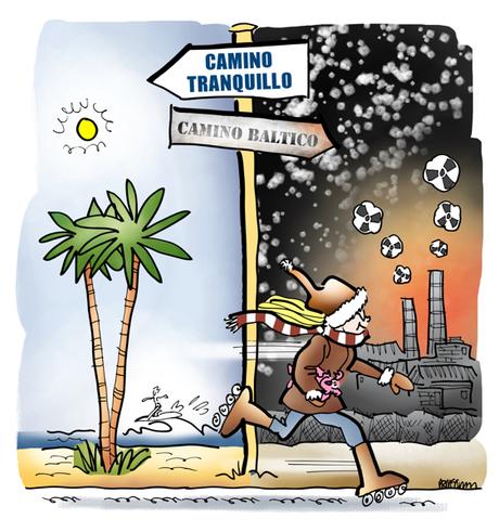
Synopsis: It’s 1998. A California woman, a college senior, is working as an intern at the San Diego Union-Tribune. She spots a flyer in the lobby: REPORTERS NEEDED IN FORMER USSR. She decides to embark on a great adventure.

I was a California native who had spent the last four years in sunny, self-absorbed Southern California. I was tall and athletic with a perpetual smile. I rode my bike or rollerblades everywhere, worked as a waitress at a bakery restaurant, and went for runs on the beach.
I lived on a street with a Spanish name that translated to “quiet road” and survived on frozen yogurt and bagels. The former USSR was about as far from Camino Tranquillo as it gets.


I started out doing magazine illustration. As magazines declined, I shifted over to marketing and advertising art. But I still do editorial work, and I do book illustration as well.

be a specialist– don’t try to market yourself as someone who does several different things.


▶︎ Both have the same goal: to get people’s attention, and get them to read the story.

▶︎ Both are created for a particular target audience. (By contrast, stock art is generic.)

▶︎ In both cases, the art is created specifically for the story.
▶︎ Editorial and marketing art both prioritize getting noticed, which means being different.

▶︎ Both help you find new ways to tell your story, which is essential to growing your audience.

▶︎ Both reflect on you and your brand. You cannot deliver a great user experience by tacking on generic art.

▶︎ Getting noticed means taking risks, which means the art has to stand out. True for both editorial and marketing art.

▶︎ Both kinds require rough sketches and revisions– because some ideas are better than others.

▶︎ Both kinds of art can act as a talk trigger, creating word of mouth.

▶︎ Both kinds of art need to inform the copy, and help communicate it to the reader.

▶︎ Both need to create what marketing expert Andrew Davis calls a curiosity gap, and make the reader want to know more.

▶︎ Both seek to inspire loyalty; to make your brand or publication a lifestyle choice.


