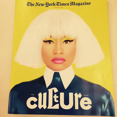

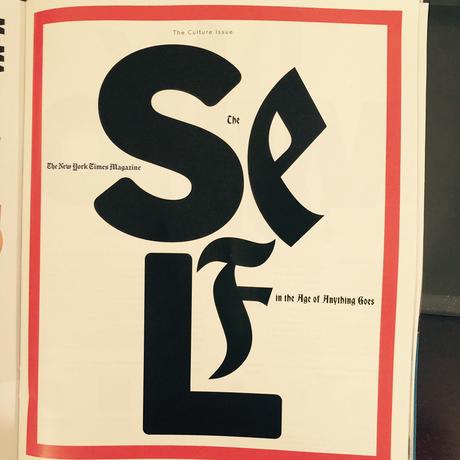


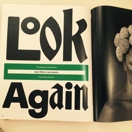

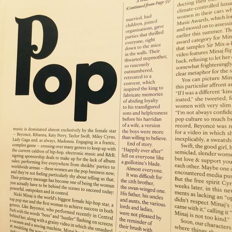
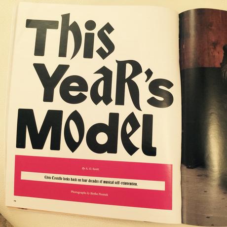

Bravo for those art directors (and editors) at The New York Times Magazine for how they let type carried the day for their cover story.
Readers of TheMarioBlog know how much we like "type attacks"---those moments when a designer decides to let the letters do it. Not that the photos and the text don't play a key role here, but it is type as protagonist, without a doubt.
I an only imagine the deliberations between editors and designers before they decided to go with this type attack. In this case, however, it is a story with attitude (an opening spread carries a headline that reads: Who Do You Think You Are?), so why not let the design also show a bit of an attitude?
We like what we see here.

