
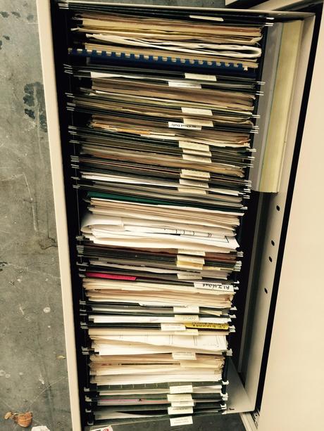




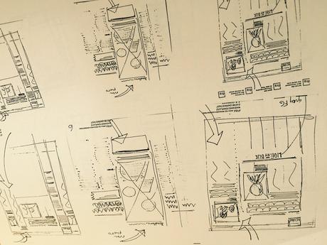
Folder after folder: revealing thought processes of projects completed many years ago

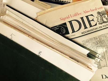

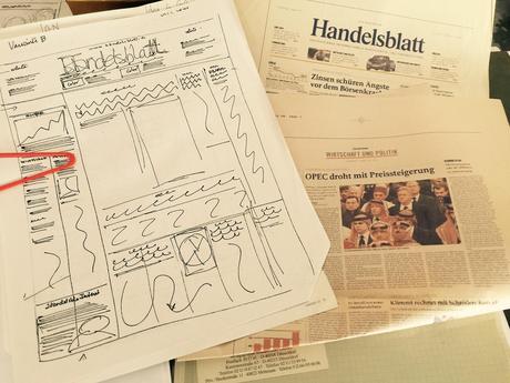

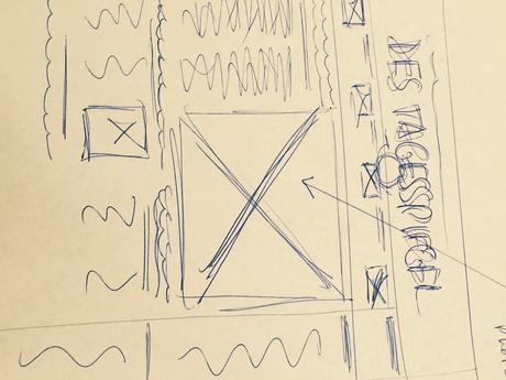

Die Zeit of Germany: the fattest set of folders in the collection

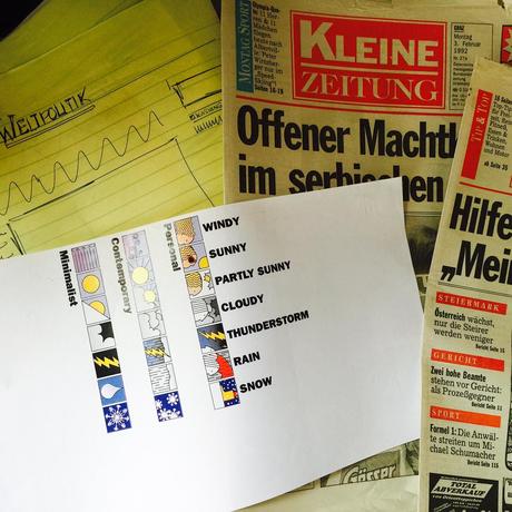
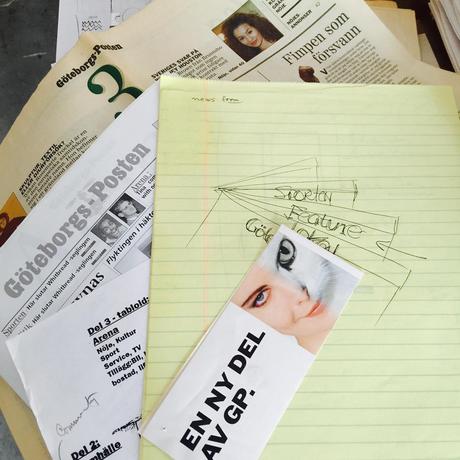


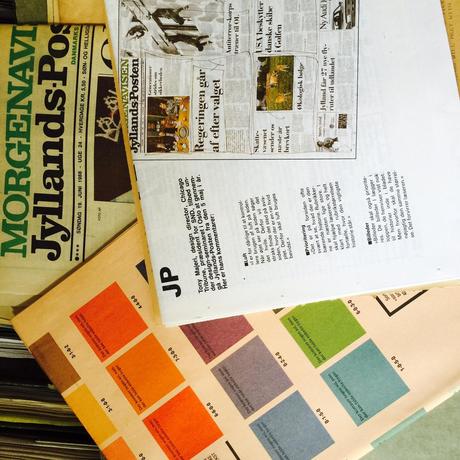

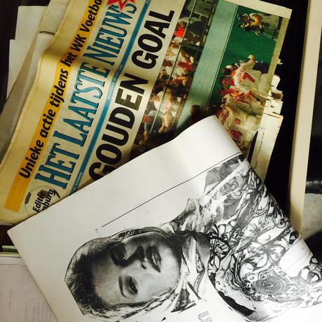
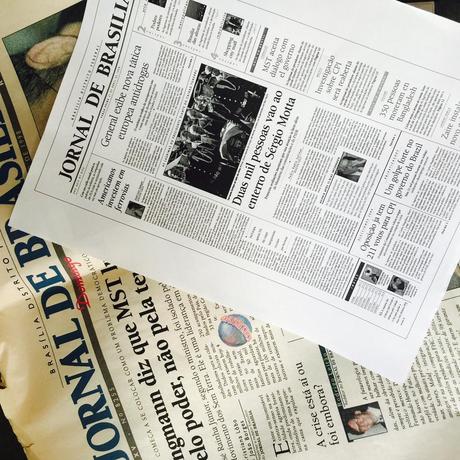

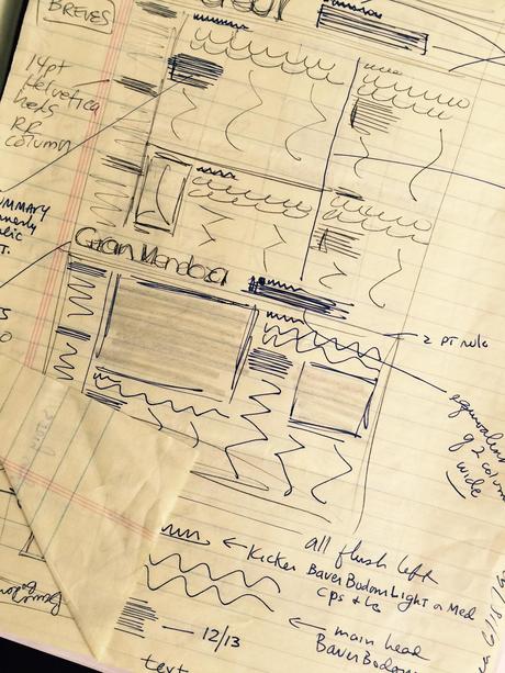
From sketches to color palettes and miniature dummies: every detail documented

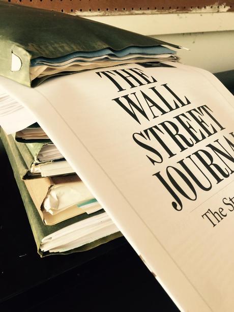
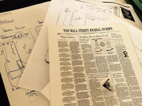


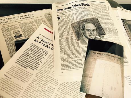
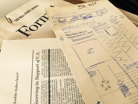

The Wall Street Journal: most memorable and definitely most scrutinized; the clips tell the story of how the media covered it
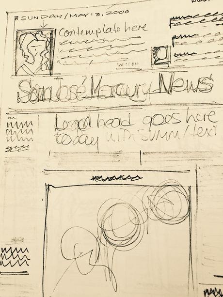
I don't know if there is such a thing as "the art of sketching". But I do know that we worked harder at it in those days where sketching by hand was the only way.
Today, while I still do the occasional sketch by hand, I do turn to my iPad and Paper 53 (a favorite app) to complete a lot of spontaneous sketching. It is practical. The iPad is there and I can plug it on to a projector and show clients and/or students a concept and get their reaction, all in a matter of seconds.
Call me nostalgic, perhaps, but, oh, how I have enjoyed stopping in the midst of the race to get the files packed and out of the house, simply to look at all those folders, each with the name of a project that commanded my attention sometimes 30, or 20, or 15 years ago. I have been blessed with well organized and detail minded assistants along the way, starting with the late Martha Daughtry, then the now retired Toni Lewis, and my current one, Ana Barravecchio. All have erred on the side of "better put that last scrap of paper' in the project folder. Remembering is much easier because of their efforts.
This past weekend, as I reviewed these folders, the sketches made each come alive. If this had been one of those colorful animated movies, each green folder (and the occasional yellow or blue one) would assume a personality and start jumping out of the filing cabinet to sing a song or tell a story.
As in real life, some projects have a longer narrative than others: my two fattest multiple folders, Die Zeit (of Germany) and The Wall Street Journal. Those happen to be memorable projects and those fat folders brought to mind the challenges of the most difficult project ever (Die Zeit), and the one that got the most coverage and scrutiny (The Wall Street Journal).
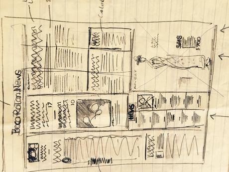
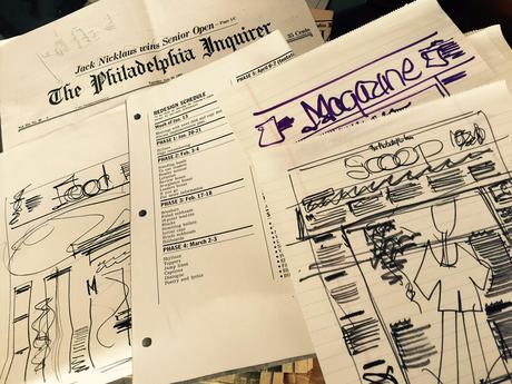
Along the way, a parade of great projects. From California's Irvine World News (don't you love the ambitious name?) to the iconic The Philadelphia Inquirer, sketches that reminded me of what was happening when that newspaper went for a redesign. Each sketch consisted of more than x's for type, lines for body type, and boxes for pictures and illustrations. The sketches prompted images of editors--from the cantankerous to the collaborative ones (no photos needed, as their faces emerged from behind the columns of dummy type).
There was Denmark's Arhus Stifstidende and its "kick" in the grid, inspired by a group of young Danes kicking a soccer ball outside my hotel window as I sketched the first concepts.
And, is that The Boca Raton News? It is, one of the most talked about projects of the 80s, as Knight Ridder ventured out into the most Quixotic of newspaper managers' perpectual challenge: to attract the elusive young readers. It was the K-R 25-43 project.
All of which makes me remember that I must do more hand sketching for my current projects. I will also put more emphasis on it with my Columbia University students this Spring semester.
I love the practical and functional aspects of sketching on my iPad using Paper 53: you can doodle and show it to a group by simply connecting to a projector.
But I doubt that those sketches will jump out of a folder 15 or 30 years from now and stage a parade like the one my hand drawn sketches entertained me with.

