
I often tell students in my Columbia class that they must work hard to secure that the most direct, visual and quick way of telling a story is the best.
I also mention that simplicity, or, as in this case, minimalism, are usually not what comes naturally first when we start sketching. The designer faced with a concept, usually the pitch of a story, is going to start sketching many options. The first burst of ideas is usually a "group" of ideas, and we quickly put all of them down, sometimes refusing to let go of the ones that are not so practical or efficient.
That is why I love how IKEA carried the message of price and this table home so quickly, in terms with which the average consumer can identify: the cost of three cups of coffee. As it happens, 59 kroners, or the price of 3 cups of coffee, is the price of this US$7.26 table.
Argentina's La Nacion


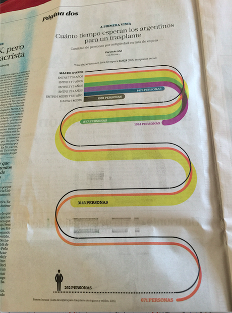
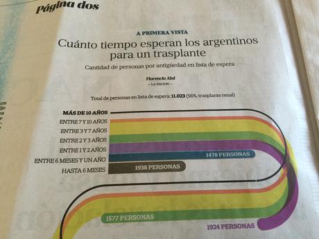
Here is a Page 2 graphic that tells the story of how long Argentineans wait for a transplant. I thought this was easy to follow, direct and a functional way to tell this story.
La Nacion published this Saturday, June 11, 2016

