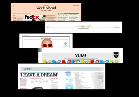

It may not be the most exciting topic for a designer and an editor to discuss: those folio lines that appear at the top of a page and tell you the date, the name of the publication and assorted other utilities, including what the content of the page is.
That is why folios are the subject of my blog today.
I am aware that publishers of printed newspapers are doing all they can to economize, to merge content, to abandon sections and to create a smaller package where sectionalizing becomes difficult.
Folio lines to the rescue.
If you are doing away with a section and merging it with another, what do you call that page?
Should that folio line be more visible, as it becomes a navigator (as we have become accustomed in digital platforms)?
And if more folios will serve as “umbrellas” to cover a variety of stories——let’s say a local story next to a business story next to a political story, for example—should we find names for those folios that are less genetic than the always vague and tired “News”.
We learn from such digital start ups as Quartz that perhaps “obsessions” taps into our minds and resonates with more emphasis than “features,” for example.
All of this has been the subject of our workshop at The Province in Vancouver this week. It’s “Folio Wednesday” I told the team, half jokingly, but not really. It was good to spend time considering the visual and content possibilities of folios.
They are not just single, unforgettable lines atop the page that we can ignore. They can come to the rescue, become navigators to guide readers of print thru a process with which they are familiar in digital, and can look good, too.
What's the most interesting folio you ever saw?
If you have designed, or seen, a very interesting, groundbreaking folio, please pass it along! Thanks in advance

