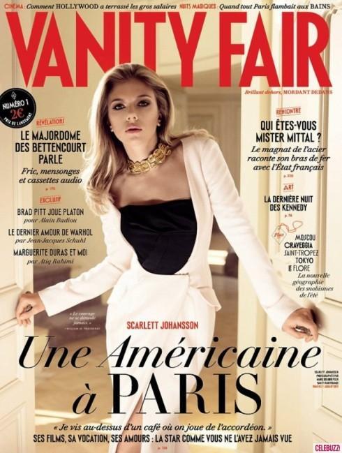
TAKEAWAY: It’s finally here. After months of rumors and speculations about Vanity Fair’s coming out with a French edition, the magazine has produced its first edition “en francais” labeled Numero 1, Juillet 2013.
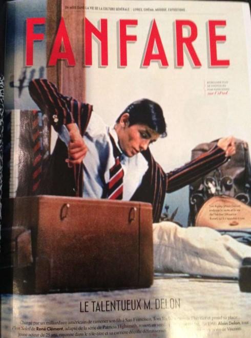
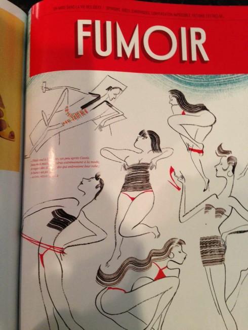
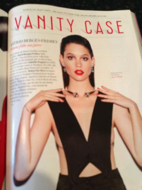
These are the three main sections of the new Vanity Fair France
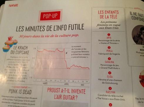
Pages that emphasize short items, aimed at “finger reading”, appear in all sections—a nod to the editors’ awareness of how popular these items are with readers
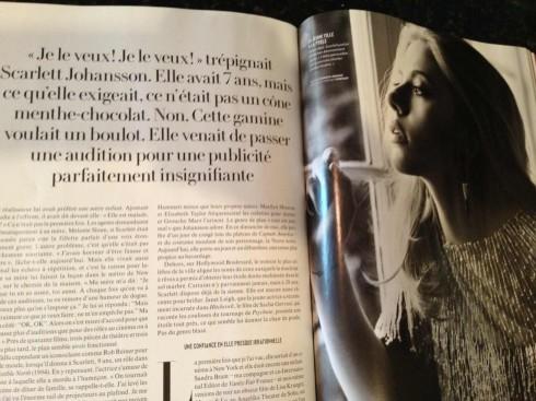
Type is used elegantly throughout, almost identical to the American version of Vanity Fair
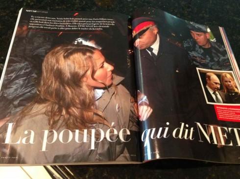
Toward the end of this first edition, an aggressive, double page photo for a reportage. In fact, some of the biggest and most interesting series of photos appear at the end of the magazine
There are no surprises in the look & feel—pure Vanity Fair in its use of type, page architecture, and content rhythm. A surprise for me: the choice of Scarlett Johansson, the American actress, for its first French cover. Not that Scarlett is not just glorious as she appears opening the doors to this new Vanity Fair France venture, in a sexy white (and black) dress, but why not a French personality, instead?
Perhaps Vanity Fair wants to remind French readers that it is a top US magazine brand, and that readers are likely to find translations from the American edition (supposedly 20% of the content will be translations, with 80% original French content).
The 20 journalists hired to produce the Vanity Fair France have plenty of challenges ahead, including the usual ones, such as getting busy and digitally minded readers to turn to yet one more publication in the crowded French magazine market, but also to find content every month that will be unique, represent the Vanity Fair brand, and that will ultimately be as purely French as it can be.
Following its US model closely, the Vanity Fair France edition has three main sections:
“Fanfare”, covering culture, with much emphasis on the cinema, books and music, and a combination of short-and-middle-sized stories. For the most, single pages with lots of “finger reading” possibilities, including lists, as in a guide to pop and rock festivals.
“Fumoir”, which I find the best section, covering fiction, politics, opinion and social oriented pieces. In this first issue a segment of an unpublished novel by Jean Jacques Schuhl titled Un Derniere Amour D’Andy Warhol (A last love of Andy Warhol)
“Vanity Case”, which highlights fashion and lifestyle, with an interesting section on the Art de Vivre, or the art of living, complete with such essentials as a secret garden or the best Japanese restaurants.
Condé Nast France is investing 15 million euros or $19.7 million in the magazine’s launch.
It’s always great to celebrate the birth of a new publication, especially because, in the process, its arrival prompts all those competing magazines to take a look at what they do, how they do it, and ways to improve and to rethink themselves.
Memo to all those editors as they face the formidable competition of Vanity Fair: emphasize your uniqueness, capitalize on what your publication can do better than anyone else (including Vanity Fair), and welcome this new competitor as a way to keep you and your team on your toes.
As Vanity Fair ignites a bonfire of American vanities for the French to enjoy. It is perhaps the headline on the cover of this first issue of the Vanity Fair France that says it best: An American in Paris.
And from the old magazines’ archives…..
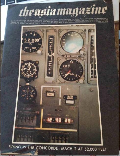
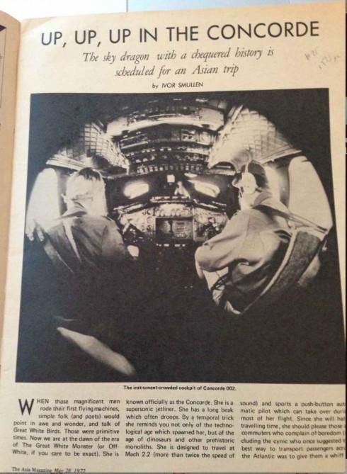
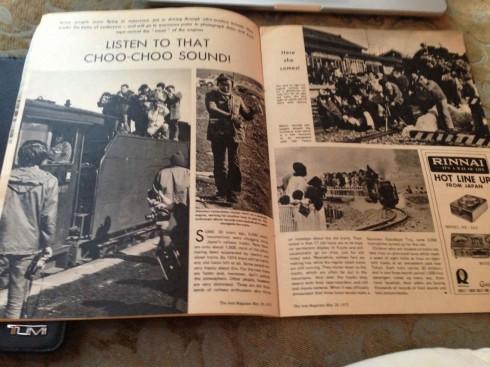
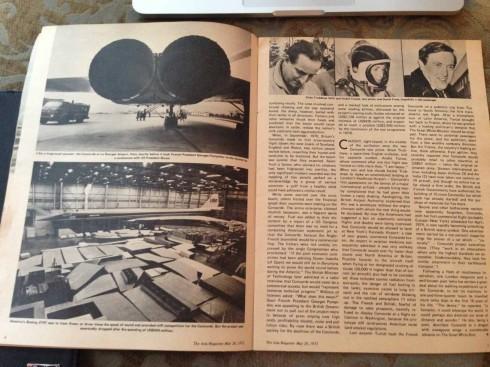
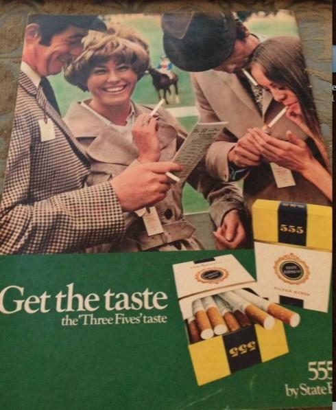
Pages from The Asia Magazine of 1972
Friend and colleague J.Ford Huffman is always a man for a nose to anything of interest that may appear in a gallery, or an estate sale. I am lucky that he often sends me some of his finds, as was the case with this May 28, 1972, of The Asia Magazine, published by The Manila Times in the Philippines.
J. Ford knows that I enjoyed my three flights on the now- defunct but always memorable, Concorde, that stylish skinny aircraft with the pointed nose. This 1972 edition has a Flying in the Concorde: Mach 2 at 52,000 feet cover story.
The format of this magazine is a true A4, slightly larger than an iPad, almost all black and white, except for some double pages and the ad for cigarettes in the back cover.
J. Ford is right when he writes me that the magazine is quite well-designed for its time. I agree. Photos are used well, a three-column grid is adhered to and content pacing is more than adequate.
So, on a day when we salute the arrival of a new magazine, Vanity Fair France, it is good to look back at The Asia Magazine, one that probably thrived at at time not so long ago chronologically, but centuries away technically.

