TAKEAWAY: It is, by all standards, an iconic newspaper: USA TODAY has inspired a generation of journalists and designers globally with its color, use of graphics and short stories. Now, 30 years later, it unveils its major redesign of consequence Sept. 14. This week, TheMarioBlog, this blog will take a look back and reminisce about USA TODAY and how it has forever changed our idea of newspaper design. Part 4 today: My own memories of howUSA TODAY impacted my work, in both positive and negative ways.
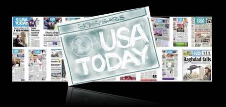
USA TODAY is planning a major relaunch of its newspaper, website and mobile platforms, complete with a new logo this Friday, September 14, the day before the newspaper turns 30.
In anticipation, I have decided to devote TheMarioBlog this week to highlight the impact that USA TODAY has had on the way we look at newspaper design and visual storytelling. To that effect, I am talking to those who were directly involved with its creation, as well as people in our industry, veterans and newcomers, for their assessment of how this iconic and game changing publication carved a line in the timeline of newspaper design history: before and after USA TODAY.
A launch like no other in 1982
I remember it well: the buzz about this new newspaper that Gannett was ready to introduce.
Not a seminar of 1981-82 began without someone’s proudly announcing that he had seen a front page prototype of this new newspaper, and what a revolution it would be.
Then the day came: September 15, 1982. USA TODAY was born, a new baby wrapped in blue. It was not all color at first, as J Ford Huffman, one of the pioneers involved in the creation reminds me;
“For a long while Life and Money were blue. Blue nameplates and only spot-blue color. The paper was introduced market by market—the first being Washington-Baltimore—and only later were the presses able to accommodate red, green, blue and “royal” , as Al Neuharth, the newspaper’s creator, called it,” J Ford says.
But the real surprise was the most colorful blanket around the baby: a weather map that on that early fall day was mostly red, yellow and orange. Not that all the colors
The world of newspaper design would never be the same. Still even today, newspaper design seminars in four corners of this now interconnected world seldom end without someone someone’s mentioning how USA TODAY made him do something—-a color weather map, a column of briefs, or color coding of sections.
Ironically, USA TODAY has never electrified the industry through its digital offerings, although they are very much out there. Indeed, USA TODAY is a multi platform media environment, but what we think of when we try to visualize USA TODAY is its print product, the one that yanked sleepY editors, reporters, designers and journalism professors out of their visual lethargy one day in 1982.
They called it the McPaper
Pity those pioneer USA TODAY team of editors and designers who had to expose themselves to microscopic inspection of what they had created.
McPaper it was condescendingly called.
What they said: “What is the world coming to: only briefs?”
What they did: Brief columns were fabricated overnight, as in factory assembly line, and landed on the pages of US newspapers everywhere, then the world.
What they said: “This is not a real newspaper if it does not come out on weekends. Newspapers of consequence do not take days off.”
What they did: That was 30 years ago. Today, it is chic and practical to publish less than daily. Those guys were visionaries in more ways than just their color visions.
What they said: “Too much space devoted to the weather”.
What they did: The map of the US moved to the front of the stage, dressed in color and ready for a Fourth of July parade any day of the year.
What they said: “This paper will not last. It can’t. It is too fluffy. Those cover stories belong in Time or Newsweek.”
What they did: The so-called “invisible” or ‘honey” story moved to the front of many newspapers worldwide. Today, it is the way to go.
What they said: “A newspaper without its own, unique editorial voice, is not really a newspaper.”
(True, USA TODAY has an editorial page, but it offers the editorial board’s view and an opposing view, something that some diehards considered too fluffly and condescending to the readers.)
What they did: There are many daily newspapers with no distinct editorial opinion. Meanwhile, if one reads media blogs today, there is a sense that USA TODAY is a “liberal rag” that serves the interest of the Democratic party.
Regardless of your view about USA TODAY, political or otherwise, to deny that any of us in this business did not study USA TODAY in detail would be dishonest.
The study in irony
As the years passed, and as USA TODAY grew in circulation and acceptance—-yes, acceptance by the non believers—-it decided that it was ready to be a more substantial meal than just what a McPaper offered.
If, in the early stages, the lead piece was not more than 25 inches of text, ten years into its run, USA TODAY began to let the main story run longer. That was Ok, too, a sign that its journalists and editors were becoming more comfortable in their own tutti frutti color skin.
Meanwhile, as USA TODAY evolved journalistically and visually, but without departing too far from its original concept, the real revolution was taking in newspapers elsewhere, greatly inspired by what USA TODAY had shown them could be possible.
I was there to watch it and to participate in it.
Without USA TODAY, newspapers such as The New York Times, The Wall Street Journal, Die Zeit (of Germany) would have not stepped into the color boutique as readily and with a smile on their front pages.
For two of those titles, I was there, and I know that USA TODAY had both positive and negative impact.
I cannot tell you how many times in my career post-1982 I have heard both editors and readers tell me: I do not want this newspaper to turn into another fluffy USA TODAY.
Each time I would be the reassuring father: Don’t worry, we will not replicate USA TODAY.
And in our next workshop, we would be discussing section color coding, more briefs, and better utilization of graphics.
When we first introduced color for The Wall Street Journal Europe I will never forget a short but to-the-point note from a reader in Belgium who wrote me:
Dear Sir Designer: If I wanted to see USA TODAY at my doorstep daily, I would move to Ohio.
Ouch number 1.
But you did not have to fly to Belgium for such reactions.
Following a redesign of that jewel of regional US journalism, the wonderful Des Moines Register, with the savvy Geneva Overholser as editor, we added more color here and there, much to the chagrin of a reader, a farmer, who sent me a box with a shredded version of a Sunday edition of the Register and a note:
“I liked my Register like it was, not this USA Today copy”
Ouch number 2.
Stirring the color pot
In spite of these ouches, life went on, The Wall Street Journal, the Des Moines Register, and dozens and hundreds of other newspapers marched with all their instruments down the USA TODAY parade.
Those guys at USA TODAY had managed to stir the color pot and we watched with interest. It was unquestionable that they knew what they were doing. Readers wanted color on every page. Readers wanted stories told through graphics. Readers liked numbers and statistics, and, yes, sometimes they could be as trivial as the number of left handed tennis players, but we sipped our coffee and knew that we could use that information at the next cocktail party.
Whether you liked it, loved it or loathed USA TODAY, I know that for us in this business, the launch of this transforming newspaper defined the discussion in terms of before and after USA TODAY.
That is why we all wait, like children who count the days until Santa Claus arrives Friday, Sept. 14, the day when USA TODAY will unveil its first major redesign in 30 years.
Will this be another occasion for USA TODAY to draw a line in the sand and show us how it is done? Except that this time around,USA TODAY needs to pave the way for how a modern media company operates in a multi platform world.
Even the McDonald restaurants of today are not what they used to be. The tastes and menus have changed. The demand is for healthier and lighter fare, and McDonald aims to please.
Will the McPaper do so too?
Experts tell us about their USA TODAY experiences
John Bodette, St. Cloud Times (and in original USA TODAY editorial team)
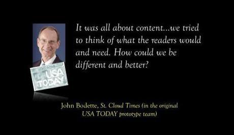

John Bodette in his office at the St. Cloud Times, in Minnesota, where he proudly displays USA TODAY prototypes. (St. Cloud Times photo by David Schwarz)
It’s hard to believe that it has been 30 years since the launch of USA Today.
My small role in the great enterprise was to help create the first prototype of the nation’s newspaper. I was on loan from the St. Cloud Times. Our paper had completed a redesign with Mario Garcia and the new look received a positive reaction from our readers. Shortly after that launch, I found myself in Washington with a small group of other editors.
Our task was to turn 48 blank pages into a national newspaper.
Wow!What a challenge. What a great experience. I worked on the project for more than six months.
Some of my memories (there are enough to fill a book but I won’t):
· We had to build our own infrastructure to produce pages. This was before desktop publishing. We had to use the paste-up method (ask your elders). We built the prototype process from the ground up.
· It was all about content. We did loads of research. In looking at each content area, we tried to think of what the readers would want and need. Then how could we be different and better than anyone else.
· Color pages were a big deal. Design and infographics were essential to providing information and setting us apart.
· We constantly had to revise the prototypes.
· You never knew when it was good enough.
· It was a secret project, so you couldn’t talk about it outside the group.
· One telling moment happened the day President Reagan was shot outside a Washington hotel. We spent that night brainstorming what we would have done with that story in USA Today. We designed front pages.
Congratulations to everyone at USA Today.
Lucie Lacava: Lacava Design
Lucie: USA TODAY was organized and polished
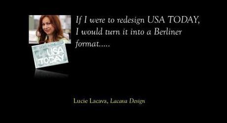
When USA Today first launched I had just graduated from University and was working at my first newspaper job in the advertising department of The Gazette in Montreal. I remember liking the new paper because it was well organized, polished, and tightly formatted, unlike most newspapers at the time. The weather map and the quality and quantity of infographics were much talked about in the industry. Within a year a position opened up in The Gazette editorial department to design infographics for Page One, and I jumped at the opportunity.
If I were to redesign USA Today I would propose the format change to Berliner. As for the logo it would look like an app icon, but proportionally bigger. One logo design for all platforms.
Our previous blog posts about USA TODAY:
USA TODAY turns 30: Part 1—Looking into the attic for those early sketches
http://www.garciamedia.com/blog/articles/usa_today_turns_30-part_1-looking_into_the_attic_for_those_early_sketches
USA TODAY turns 30: Part 2—USA TODAY turns 30-Part 2—-A newspaper that influenced all of us
http://www.garciamedia.com/blog/articles/usa_today_turns_30-part_2—-a_newspaper_that_influenced_all_of_us
USA TODAY turns 30: Part 3—USA TODAY turns 30-Part 2—-A weather map that created a global tsunami
http://www.garciamedia.com/blog/articles/usa_today_turns_30-part_3—a_weather_map_that_created_a_global_tsunami
Chatting with Tyler Brulé on Monocle Radio’s new show, The Stack
Listen to my chat with Tyler Brulé about future of print in Monocle Radio’s The Stack here:
http://www.monocle.com/24/shows/stack/
Sign up to get information on my new digital book
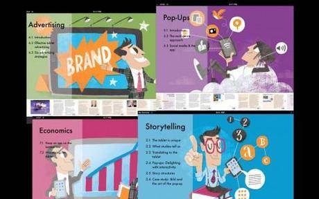
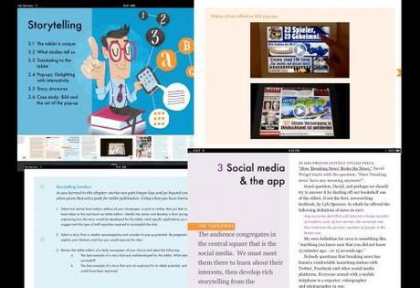
Assorted screens from the book: top, chapter openers all of which are color coded and carry illustrations by Luis Vazquez, of the Gulf News of Dubai; second image, opener of Storytelling chapter, and two inside screens.
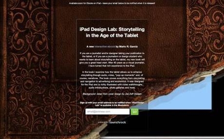
As we get closer to publication date for The iPad Lab: Storytelling in the Age of the Tablet, we are now set up so that you can give us your email address and you will automatically be informed when the book is ready for download.
Now you can leave your email address so that you will be updated and informed the moment the book is read for download.
Simply go here:
http://ipaddesignlab.com
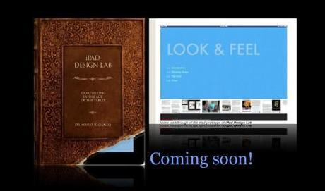
Video walkthrough of the iPad prototype of iPad Design Lab
SND Scandinavia Space 2012 conference
Still time to get a spot to attend the SNDS conference in Copenhagen, Sept. 27-29;
For more information:
SNDS workshop ever. Read all about SPACE 2012 here:
http://snds.org/get-your-own-space-guide/#more-1852
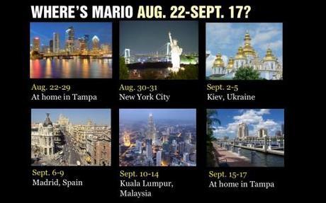
Mario Garcia’s upcoming speaking engagements:
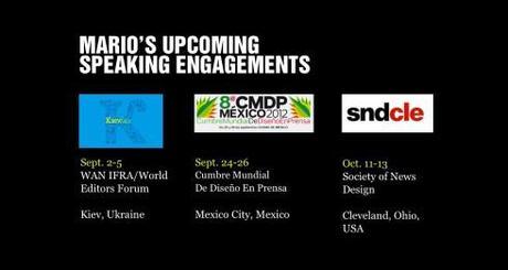
Cumbre Mundial de Diseño en Prensa 2012: Mexico City; September 24-26
http://www.cmdprensa.com/mx2012/
SND (Society of News Design) Cleveland; Oct. 11-13
http://cle.snd.org/
1st Middle East News Design Conference
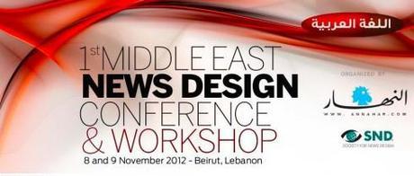
It promises to be a great program, and a historic one, too: the first SND Middle East gathering. Put it on your calendars: November 8 & 9, in Beirut, Lebanon. Sponsored by An-Nahar and SND.
For more information:
http://www.snd20events.com/conference/

