Evening traders/investors,
Today, I have a retrospective post. (Heck, all technical analysis posts have to do with history!) I will show you all a chart of the Dow Jones Industrial Average, and how the maxim of history repeating itself is ever-present.
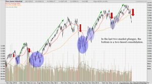
Ever since the last months of 2009 (the year the market bottomed), the Dow (and other US indices) has gone through a certain cyclical pattern. In other words, a general pattern of price action has happened again and again: the market experiences a drastic drop (in red arrows); then some sort of bottoming, rangebound pattern forms - usually some kind of inverted head and shoulders; and finally, the market goes on a quiet but steady rally. Take a look at the chart I uploaded below. You may not strictly classify it as a cycle of some sort since the wavelengths, amplitude, and what not are not the same. But, the general repeating pattern is a still a sight to behold. As a chartist, the chart looks beautiful – as it should always look so in hindsight. This is a good example of history repeating itself. Of course, price action cannot be the exact same thing all the time – if it is, then we will all be chartists and instant millionaires. But in general, history proves history repeating itself as true. Also, just by looking at the short-term trends, we see that markets drop fast – very fast – and markets rally slower, oftentimes with hesitation because the media tugs at our fear and doubt. We all know this as a phenomenon of the market. But, it is good to sometimes take a good, hard look at the chart and remind ourselves of how old principles, adages, and maxims continue to prevail in the markets.

In the rally at the last portion of the chart above, you will see that the rally did not exactly last long enough or big enough for trend-following gains. Whatever fundamentals were out there in the last two weeks sent markets down significantly. Clearly, the volatile rally we had over the second half of this year is over. And, in the Dow’s case, almost all upside from May has been eaten up. After what I have written so far, and the chart I uploaded above, it would seem that I am implying a market bottom around the corner, and a consolidation before a huge move up again. I am not a cycle investor/trader, so I cannot say I am looking for that to happen (although I am hoping at the back of my mind, just so that it proves technical analysis to be so useful in trading) . But, it does puts the recent downside into perspective. Is it a bull trap, since overall, we are in an uptrend (for US indices at least)? Or is it for real this time?
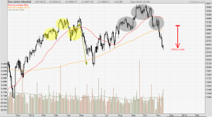
While I do not indulge in heavy speculation of what pattern will happen, I take what I se presently on the chart. The Dow broke down from a nice-looking head and shoulders pattern a week ago. I am not sure why but I did not catch it. A projection based on the height of the pattern would have been around 12,500. And, the Dow hit that in last week’s trading. In general, I believe a short rebound occurs when a price objective is hit. There is no psychology behind this “theory” but my experience tells me it happens a good number of times. So, I am going to be looking for consolidation in the short-term ahead. Maybe the market is gearing up for a Santa rally or a January rally! Who knows? Only time will tell. If the market continues to show weakness, I will look at some stocks to short.

All analyses, recommendations, discussions and other information herein are published for general information. Readers should not rely solely on the information published on this blog and should seek independent financial advice prior to making any investment decision. The publisher accepts no liability for any loss whatsoever arising from any use of the information published herein.
