36. Arsenal Away
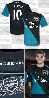
Why it sucks: The design. Really I can't believe this shirt didn't fall into the bottom 10 - let alone last. Andrei Arshavin likened them to "jockey silks". Shockingly, he wasn't included in the launch photo shoot.
The upside: High quality photography and an excellent marketing campaign might have convinced an individual or two not to hate this shirt like everyone else. Not enough to buy one, mind you.
35. Fulham Away
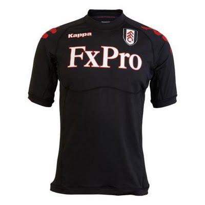
Why it sucks: Last I checked, most male soccer players weren't in need of a built in sports bra. And as far as the average fan, Under Armour-styled base layers isn't typically a good look.
The upside: In all seriousness, Fulham will look sharp on the field in these all-blacks.
34. Wolves Home
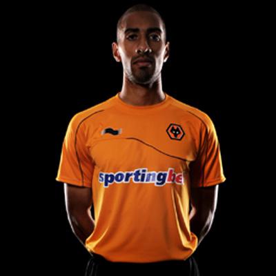
Why it sucks: As my appreciation for the soccer kit subculture grows, I am increasingly more able to compartmentalize the shirt sponsor. This one, however, is just too tragic.
The upside: This shirt, much like it's away counterpart, would be an attractive look without the sponsor. The off-kilter pinstripe at the front of the shirt creates an almost-3D effect, which is unique and surprisingly appealing.
33. Everton Away
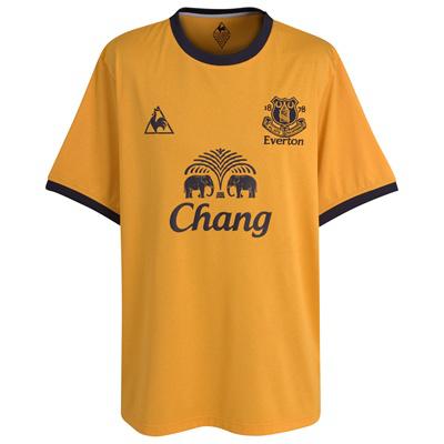
Why it sucks: The color is a very pale, very tepid yellow. If you're going to dabble in the bright colored kits, specifically yellow, you have to pay that extra five to 10 cents for a rich looking material.
The upside: It's a decent look, and the accent color is - well I can't really tell what the accent color is, but it looks pretty good. Also the elephants. They're fun.
32. Sunderland Home
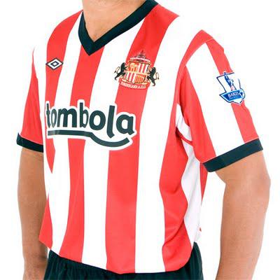
Why it sucks: This shirt looks like it belongs in a cartoon. It doesn't look bad, per se, it just looks like a caricature of itself. The black trim is bold and stands out - maybe too much.
The upside: Unlike several kits I've criticized thus far, it does have a very rich look to it. It sticks with the tradition of the Black Cats, who have worn vertical red/white stripes since 1887.
31. Liverpool Home
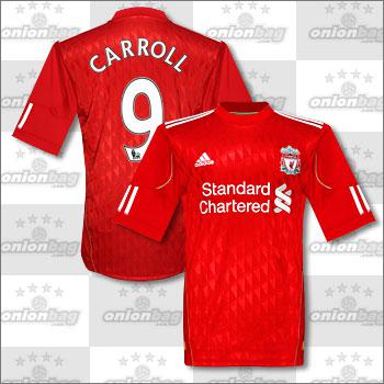
Why it sucks: This shirt is boring and revolting all at the same time. It's never a good idea to throw shiny material into the mix.
The upside: The upright, half turtle neck looks like it might restrict air flow to the brain, which could help the team forget
30. Wigan Third
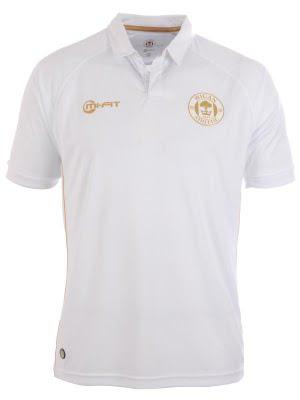
Why it sucks: This shirt is the epitome of an afterthought. It is a white polo. I'm still trying to figure out why Wigan, of all clubs, needs a third kit.
The upside: Even after the sponsor is added to the shirt, it will still look like a very plain, white polo.
29. Tottenham Home
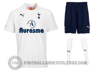
Why it sucks: Just like Wigan, above, there is really nothing to touch on with this shirt.
The upside: Autonomy, the parent brand of Aurasma, is using Tottenham as a platform to help introduce it's newest technology - highlighting the breadth of English football.
28. Fulham Home
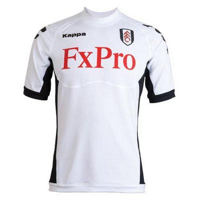
Why it sucks: The template is identical to the Fulham away kit at #35 - sports bra and all.
The upside: This shirt earns its spot atop the plain white kits due entirely to it's black undercarriage, which at the very least breaks up the monotony of the 'absence of color'.
27. Manchester City Away
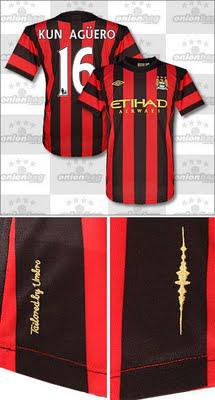
Why it sucks: It's a combination of the vertical stripes and the gold accent color. Sure City have worn red and black on past away kits, but United would never be caught dead in powder blue.
The upside: Red and black on the kit, Ethiad translating to "United" on the front - this is getting comical.
26. Blackburn Home
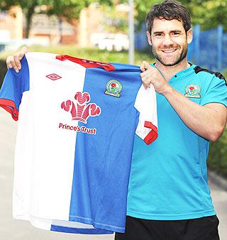 Why it sucks: The sponsor.
The upside: I hate dropping this kit so low in the rankings. I've always loved the Blackburn split blue/white design, and I especially love the addition of the red trim. If it weren't for the three-headed snake sponsor-monster, this shirt may have wound up in the top 10.
--------------------------------------------------
Check back next week for the conclusion of the countdown as we break into the top 25.
Speaking of kits, do you enjoy free stuff? I'm getting ahead of myself. Check out The Toast's weekly pick'em contest where you could win a free EPL jersey from onionbag.com. Click here for details.
