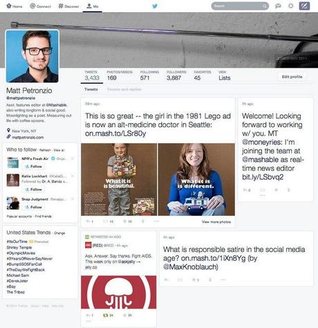
Mashable’s Matt Petronzio was one of the first Tweeps to spot this new redesigned profile page on his Twitter account. New design surprisingly look a lot like a Facebook profile, which takes the full length of the screen, featuring photos and content cards in Pinterest-like design.

Despite being familiar to Facebook and Pinterest, the design actually fits well for Twitter since it nicely showcase the number of followers, tweets and others below the header image with profile photo and bio on the top-left. This leaves more space for reading tweets and less scrolling.
Read Also: Mark Zuckerberg Shares an Inspiring Story on Facebook’s 10th Anniversary
It only took a couple of months for Twitter to roll-out the current refreshed design for everyone. Depending on the feedback from users, the company will let us use this brand new user interface very soon.
So, are you guys excited?
[Source, Photo: Mashable / Featured photo - Flickr user trekkyandy]
(All images, trademarks shown on this post are the property of their respective owners)
Follow @nrjperera - Roshan Jerad Perera

