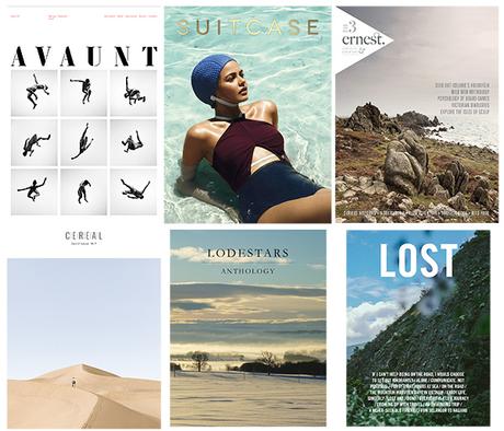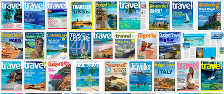

The new print travel magazines bear no resemblance to what we have come to accept as travel magazines (below). Photo courtesy of the Financial Times (weekend edition June 19-21)


Their covers are minimalist at best: the single image of a paradisiac spot somewhere int he globe. The logos are bare and sit on top of the cover photo as if asking permission to do so. They rarely sell more than one story (destination) on the cover, and they are thriving.
Say hello to the new generation of travel magazines in print: Avaunt, Lodestars, Lost, Global. They are nothing like what travel magazines have gotten us accustomed to: the window of the hardware store on the cover, selling more destinations than Ryanair and covering the cover photo with so many headlines that once is not likely to buy a ticket to get to that destination anytime soon.
Instead, many of the new breed of print magazines are inspired by their web predecessors. Indeed, web giving way to print. A new and welcome phenomenon.
Not only are these print travel magazines thriving, but, according to a piece in the Financial Times, they are "gaining the upper hand".
In fact, rather than the anticipated closures, at least 15 new travel titles have launched in the past three years in the UK alone. Some are tiny, selling only a few thousands copies; others have print runs of up to 45,000; several more are due to launch later this year...
These new magazines share a distinct look and approach, their similarities emphasising how different they are to the glossy mainstream titles. Produced by independents rather than big publishing houses, they are typically quarterly or biannual rather than monthly, and usually cost at least £10. Many have gnomic one-word names; covers are simple and striking, stripped of attention-grabbing cover lines; the paper is usually heavy, expensive and matt.
Inside, designers and editors have free rein, abandoning standard templates to create what some will see as indulgent, others will find fresh and engaging.
I read with interest a reference to "slow journalism" as a reason why these magazines are doing so well. So, in the midst of the journalism of interruptions, the journalism of everywhereness and at a glance journalism, we apparently seek refuge in slow journalism to remind us of a time when armchair travellers dreamed of exotic locations via the printed pages of a magazine.
Lean back never sounded (or looked) so good.

