Good design needs to be original, simple, legible, cohesive and versatile. It’s not an easy task. That’s why good logos don’t come cheap. If you want to look well-established as you’re setting up a new business or rebranding your salon, going through the process of designing a salon logo is inevitable. You will first define your mission statement, giving you a better idea of what your logo should represent and then, look for inspiration in existing designs. Question is: what style of design will be geared to make the most impact?
Thinking About Having A Salon Logo Designed?
Funny enough, I’ve been working on a personal project recently, and needed a logo designed. I had no idea where to start, but thankfully, I’m surrounded by talented and creative artists. However, I well know not everyone has that chance, and navigating through the process of getting a logo designed can be arduous without someone steering you in the right direction.
Before we describe some of the best design trends this year, you should know that they usually take inspiration from the past. For instance, seeing as simplicity ruled in 2016, it was clear that simple shapes, lines and such were here to stay in 2017. So while this year’s trends might not be revolutionary, they’re what stands out the most – hence what has the most impact potential on your future audience.
Related | Designing The Best Logo For Your Salon Style
Getting Inspired: Current Design Trends
Below are some of the top 10 popular trends thus far in 2017. So if you’re rebranding or opening a new salon, it could be a good idea to look for inspiration within these styles.
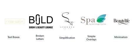
Text Boxes
- communicates clarity and functionality
- the box highlights the importance of the brand name
- allows for a seamless use on images
- can express a brand’s technical personality
Broken Letters
- used to accentuate certain letters and communicate a particular value (for example breaking an “o” open to communicate openness)
Simplification
- portrays uncluttered aesthetics
- communicates clarity and precision
- logo easily scalable to small sizes
Simple overlays
- simple
- portrays a sense of transparency (nature of the business, values)
- where objects meet suggest strength
- tends to work with geometric shapes
Minimalism
- used to say more with less, removes unnecessary details
- eye-catching
- purpose-driven
- communicates clarity and comfort
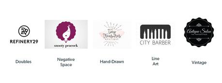
Doubles
- they’re a mix of various past trends
- can be used to picture acronyms
- simple, clean and clear
- gives a perspective that line art doesn’t
Negative Space
- one of 2017’s breakout trends
- based on dual-imagery
- positive and negative space each compete for the viewer’s attention
Hand-Drawn
- used to project innovation and uniqueness
- quirky, but also chic
- emanates warmth, authenticity and personality
Line Art
- features a consistent thickness of lines
- usually, uses one colour
- fun, modern and laid back
Vintage
- still a very common trend, but can mistakenly give the impression of an out-dated brand
- grabs attention through emotions (nostalgia, memories)
- can convey a sense of authenticity and authority
So there you have it! If you have found these design trends explanations helpful, then keep an eye on this section as we’ll be covering the ins and out of writing a detailed salon logo brief in the coming months! While we’re at it – if you’re looking into point-of-sale software providers that can help with your marketing, stock management and retention tools, why not give Phorest Salon Software a try?
Click below and take a tour!
 Click the image to access the Phorest Salon Software interactive demo.
Thanks for reading!
#LetsGrow


