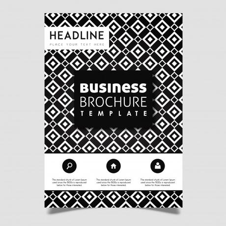
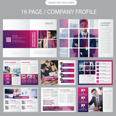
Designing a brochure for a company profile can be rewarding. Since there’s nothing best than creating something that you can hold, touch and read. Additionally, the design is just an arrangement of texture; however, designing a picture-perfect brochure can get taxing and intimidating.
You can get thousands of exquisite and fine-looking brochure templates and flyer templates at one dedicated place if you choose MagicByte Solutions over any other brochure designing company. In this article, we will share some useful tips for improving your brochure design. Have a Look!

Figure out Print Specifications
Just like designing for the screen, you need to know your budget when it comes to printing a brochure. Since this factor can impact size, quantity, effects and paper stock. Focus on specifications for the brochure so that you move towards what you need from the start. Also, pay heed to paper size, folds, and check the capability of the printer too.

Know Your Audience
Bear in mind, the shape and distribution of a brochure design should define the audience who will actually receive and consume it. You have to cater to interactive designs. Also, look at the factor of comfort, make sure your brochure fits the size criteria so that it is easy to carry. And on the other hand, for key partners or stakeholders, the thicker and more robust the brochure is with multiple pages, the more it will be appropriate.

Use High-Quality Paper
Whatever paper choice you make, it will impact how users receive the design. The heavier the stock papers will be, it will allow for more flexibility with color and printing techniques. However, anything that is super amazing and impressive costs more. But that also doesn’t mean the thick paper is always better.
Key Takeaway:Before picking a paper stock and style, think about the message for which the brochure is designed to convey.
Can’t Ignore Call-To-Action Button
You just can’t afford to miss out on elements that are left off in printed brochure publishing. Consider what the goal of the brochure is. What should users do when they check out your call-to-action button? Try to convey a clear message of what you want from your customers and what actions you are expecting from them when you see a brochure. Also, the more pages your brochure will have, the more repetition of CTA should be there. If you don’t get it how to make the optimum use of the call-to-action button, then the best thing for you will be hiring a professional brochure designing company.

Always Go With A Visual Theme
What have you decided on whether you will go with white or multiple colors? Would you focus on a single design or multiple versions? Instead of confusing users, you should stick to one theme. Even the cover and inside pages should follow the same theme.
In a nutshell, a solid theme sets the tone for the brochure and provides a trouble-free user experience for the audience.
Conclusion
Although brochure designing may seem intimidating, but it is a lot of fun as there are plenty of options with extended scope. Especially for those who are creative and does it for a living, we mean brochure designing company. Instead of being extra, go with a simpler design as it is easier to grasp. Moreover, minimal and straightforward themes are cost-effective and budget-friendly. Furthermore, if you’re looking forward to PSD to Opencart conversion, then also you can count on MagicByte Solutions.
