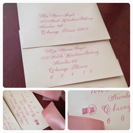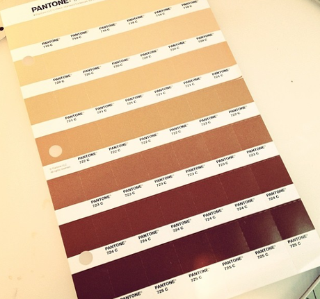

I've had to do some ink color matching early in the season and thought it would be a good time to offer some tips on things you can do to make sure your envelopes, invitations, etc. come out the way you'd like them. All of our communication is so remote now that there may be a feeling that some of what you see on screen will look just that way in its physical form. This is just simply untrue. You have to actively pursue an accurate color match and here are three ways:
- Provide your stationer or calligrapher with a Pantone color to reference. They can grab a detachable chip and either use it while mixing inks, set up their print files with the color, or if its a digital job, everyone knows where you are trying to go so you can get as close as possible.
- Provide a David's Bridal color swatch color for them to reference. Even if they do not own the particular swatch, they are affordable and are accessible. The same is true of your actual reception linens...
- Provide a satin ribbon, sample of another piece of printed matter or any other element from your wedding or special event. As long as what you hand over is ink on some type of substrate, it will be a great tool for your vendor.
I'll see you guys again soon!
--ct

