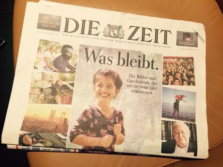


I am a curious observer of newspaper design trends. It is an old habit to break after having done this since my early days in college. That is why I find it fascinating to stand in front of one of those kiosks in European and Asian cities, where the eye delights with the variety of printed publications waiting to be picked up. In Paris, specifically, I love to see how magazines are displayed, not to mention that some of the covers are displayed on rotating giant screens on the side of the kiosks , to make the seduction process faster and more impactful.
Lately, I am beginning to see---especially with European newspapers---a tendency for more pictorial presentations on Page One. Indeed, some of these front pages have the look and feel of home pages. Imagine my surprise seeing the front page of that always wonderful newspaper, Die Zeit, and its December 30th edition: only photos above the fold. Remember, this is a newspaper which which I had the amazing honor of working in 1994, when it did not ever put photos on the front page (only caricatures).
Then there is the front page of Israel's Yedioth Ahronoth, offering a full pictorial navigator to the inside---already with what looks like "cards" that could be easily translated to mobile platforms.

