Come on, admit it: you’ve checked out a few of those free photo sites.
And if you blog, you’ve probably used some of them: slap
one in for your header image, and you’re good to go.

Almost too easy, isn’t it?

Gotta be a catch, right?

Well, yes…


Your blog is part of your brand, and if you use stock images, you’re taking some risks.

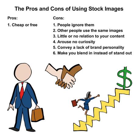
Eye-tracking studies show that people ignore purely decorative images. They pay attention to real people, but ignore generic stock people.

And there’s nothing to stop your competitors from using the same images– which means you have no creative control.
Not a situation that inspires trust.

To quote creative director Vic Polkinghorne:

“If someone else is doing something similar to what you’re doing, or looks or sounds like you, you’re both in trouble.”
And it takes time, looking through free images, trying to
find a match. Odds are, you’ll settle for an image that only vaguely relates to your content.

Which tells readers you’re a brand that’s willing to take shortcuts.
Stock images are bland and generic, so they arouse no curiosity. That’s a mistake.

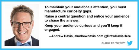
Marketing expert Andrew Davis says the key to successful content is creating a curiosity gap: something that makes the reader want to read on and know more.

He puts it this way: “Raise a central question and entice your audience to chase the answer.”

A custom image created expressly for your content will do that. A stock image entices no one.


Stock images diminish your authenticity because they’re “someone else’s vision, someone else’s interpretation of the idea, concept, emotion you’re trying to convey.”

You really wouldn’t want to be associated with any of these people, would you?


