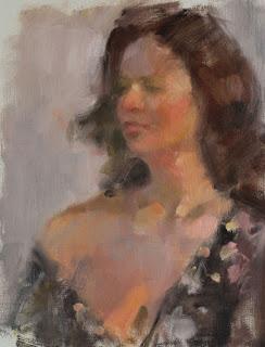
Tanned Model
16 x 12
The palette uses cad red light or medium, yellow ochre, ivory black, and white. It's great for conveying powerful reds and strong darks, but don't ask for a spring green or a blue, summer sky. Ivory black acts like a blue in this scheme, but it's more like the illusion of blue, than the color itself. Add to this the fact that all of the pigments are opaque and prone to making mud, and you can see that it really was a challenge.
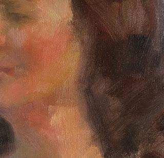
Our model had a deep tan and was under warm lights in a white-walled studio. That meant that we had to mix an array of orange from light to dark and warm to cool to show the planes of her body, as well as figure out how to paint the effect of the cool wall color reflecting off the areas of skin that weren't under the lights. Her chest was still very warm from the tan, but cool on top of that from the walls. It was a mind bender.
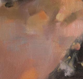
I chose to drape a greyed purple over a coolish version of her flesh color to show the reflected walls, and I pumped as much warm orange and red into the light as I could.


It did the job, but I'm going to study Zorn's work this week to see how I could have done it differently. I can't recall a single tanned model in his pale roster, but I'm sure to learn something anyway, and I'll be building some color skills.
Happy painting!

