This is the weekend edition of TheMarioBlog and will be updated as needed. The new blog post is Monday, July 20.

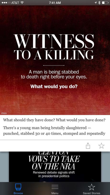
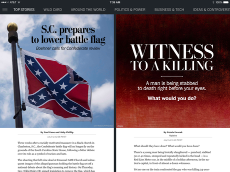

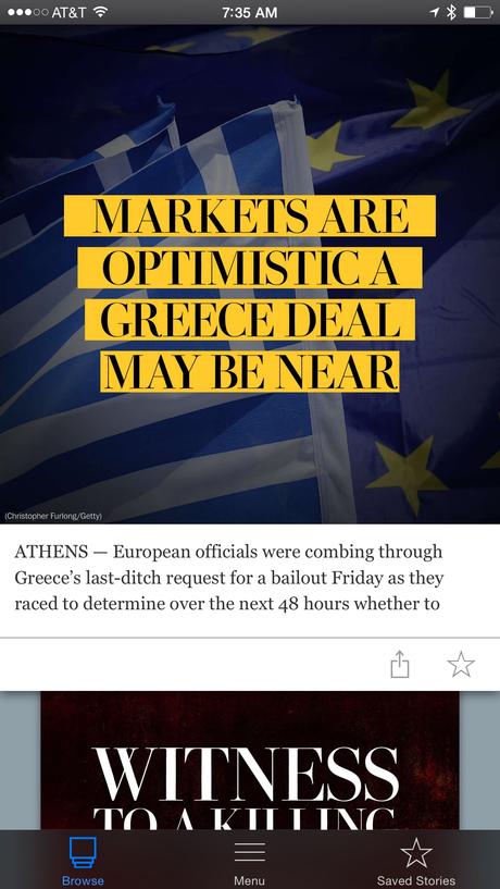


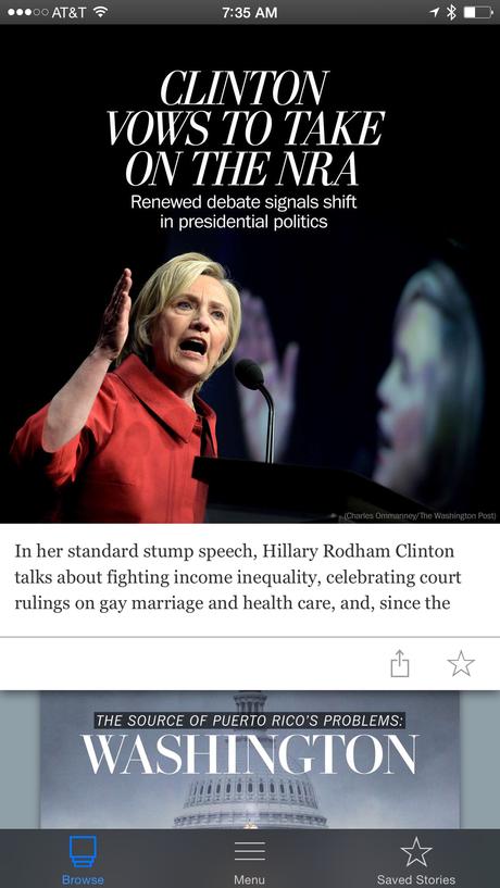
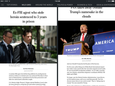

Here is an app that all students of storytelling and design need to check out. It is free for a month, too. The Washington Post has expanded its new App to iPhone, iPad and iPod touch.
Two things stand out: first, the design is appealing, crisp and relies on beautiful use of typography to seduce us into reading stories that range from the newsy (S.C. prepares to lower battle flag) to the more lean back (How Much Will the Seas Rise?). Second, the app has been tailored to each device, giving readers a seamless, easy-to-use experience whether they are reading on their iPhone, iPad or iPod touch. I found myself enjoying the Post's app as much on my iPhone as on my iPad.
Simplicity prevails here, not just for the design, but also for the navigation. Six categories allow us to choose which way we want to go: Top Stories, Wild Card, Around the World, Politics & Power, Business & Tech, Ideas & Controversies.
All in all, a perfect example of how to bring information, both of the lean forward and lean back mode, to an audience that is relying on mobile devices more each day to consume information. I must add that The Washington Post's approach to the Apple Watch is one of my very favorites, too.
Good work at The Post. I am sure Jeff Bezos is quite proud of how far the already legendary and always excellent Post has come since he acquired it.
It is also a testament to the good work of the Digital team, headed by Cory Haik, executive producer and senior editor, Julia Beizer, director of mobile and Chris Meighan, design director, Mobile Innovations Team.
A chat with Chris Meighan
Mario: I would like to hear from you in terms of what makes the “design” of the app so special visually.
I think that it starts with the UX which is very clean and intuitive, and allows us to spotlight each story through our card-stack structure. When it comes to content design, we are giving each story a unique display treatment. The design also benefits tremendously from the close working relationship our editors, designers and producers have. We craft headlines and choose images that are specific to our products. All of our content in “TOP STORIES” features custom treatments which are created by our team of four designers. Same goes for our “DON’T MISS” and “BACKSTORY” sections. The majority of the rest of the stories in the app feature one of several templates that our team has created for the producers to execute. This puts us in a unique position to give each of our stories a bold entry point.
Mario: How do you find designing for mobile different from designing for online and, of course, print (did you ever do print design yourself?).
Almost all of my career has been spent on the print-side, working across all sections. Before joining the Mobile Innovations Team, I was the Deputy Design Director for the print-side of The Post. When this team was created almost a year ago, our leadership was looking to bring some of the energy and visual story telling of our print product over to what began as a tablet project. I think my transition from print to digital has been fairly seamless. The biggest challenge has been learning how to create designs that scale across all screens and operating systems. I firmly believe that the same editorial design principles hold true across all platforms, just with mobile/web you are often working at a much more accelerated pace.
Mario: Also, what is the design process like: how long does it take to get a story from conception to implementation?
We publish stories at varying paces. For most of our daily content, we team with editors and producers on a rolling budget throughout the day that as a group we tackle for immediate publication. We are usually creating our custom treatments in anywhere from 5 minutes (if it’s breaking news) to 30 minutes (if it’s a more elaborate illustration or concept). We typically produce 30 to 40 treatments throughout the course of a day.

