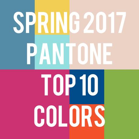
...so true! Color has the power to express and emote so many emotions and feelings. Colors are such an integral part of our lives and identity. They exude so much about our personality and aura, isn't it? I personally feel that colors are the host to imagination and a new world. They can bring ideas alive and encourage our moods to stay fresh, active and creative.
When we design our homes, colors are an indispensable part of it and convey a lot about our ideas and emotions. Also, colors affect and impact our lives to a large extent. They can influence our thinking and imagination.
Hence, for the designers who work on making our house look and be a beautiful home, work hard on defining and arranging the colors appropriately. It thus becomes important for them to choose the right colors under the right shade and execute them accordingly in print media.
Pantone which is known for encouraging the designers across the world to organize their color sheets, thus motivating them to build better homes and thus better memories. Pantone comes with the Pantone Formula Guide, which is one of the best-selling color formula guide in the world of creativity. Pantone Formula Guide is the best chart for Pantone Colors and an essential must-have tool for every designers and professionals who are involved in the business of color consultation and color intelligence. It is the more evolved and enhanced version of the old edition GP1601.

One can get inspired by the wide range of 1867 colors and fill the designs with optimum colors. The color palette is composed of primary and accent colors which can work blend smoothly with each other and also be used to create new blend of colors and illustrations. Buyers on the other hand are offered with more than the standard CMYK and RGB colors, which makes it the best and most preferred color palette book. The colors are printed on substrate paper stock, thus making it well suited for printing purpose.
Each color code in the Pantone Guide comes with not only ink formulations but also designated, coordinating numbers, which helps one to create the most accurate color on printed materials. It is thus regarded as the most trusted book in terms of spot-color printing and branding.
This formula guide is extensively used in a number of areas which include paper printing, chemical testing, plastics, pharmaceuticals, among others.
All the products are thus authentic and are widely supported by a network of PANTONE Licenses across the globe.

What are the contents of the Guide?
- It comes with two guides: Pantone Coated-C and Pantone Uncoated-U, and has 1,867 colors to the palette
- Each page consists of 7 colors
A lot of buyers like designers, creative artists and professional review and recommend, saying that the Pantone Formula Guide Book has inspired many creative professionals and added life to their designs and ideas. Many buyers strongly recommend the inspiration that one can get from this color palette and the level of accuracy that is achieved through the Pantone Color Guide.
The Pantone Color Guide comes in two variants- coated and un-coated and can be used to help one accurately identify the colors and use it to achieve the best of results. The various arenas in which this color guide is termed useful includes, logo and branding, packaging of goods, spot color printing, graphic designing, painting, color sampling to name a few.
Newest features?
- Pantone has thus added an additional set of 112 colors in the year 2016, thus making the total count of the shades or colors to 1867
- Also, another update to the Pantone Color Guide is that earlier, the buyers had to incur additional charges to buy the software, which is now provided with the product. This software is a breath of fresh air in the field of design as it helps in integrating the latest Pantone Color Libraries into the design applications which can then directly be used for color-sampling.
Benefits of the Pantone Color Guide?
- The Pantone Color Guide comprises of solid colors in a special coated format which makes it appear rich and bright, while the Pantone PMS colors come in uncoated solid color format
- The colors are arranged in a chromatic pattern for ease in identification of different color families. The guide has an index for quick identification and access of colors
- Also, it has convenient fan-like packaging which makes it easy to carry and conduct the various design experiments. It has a light indicator tool which signals if the current light condition is suitable for color matching and evaluation
- DesignInfo offers a free cover to the Pantone Color Guide to protect it from dust or any form of physical damage
It is a must have for designers and strongly recommended!

