Purchase the book on the iBookstore
“iPad Design Lab” trailer on Vimeo.
The EPUB version of book is HERE:
Now available: The EPUB version of iPad Design Lab: Storytelling in the Age of the Tablet, ready for download via Amazon.com for Kindle:
http://tinyurl.com/8u99txw.
Read the Society of Publication Designers’ review of The iPad Design Lab here:
http://www.spd.org/2012/10/must-read-ipad-design-lab.php
Read the review from Dr. Pegie Stark Adam in her blog
http://pegiestarkadam.com/
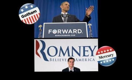
TAKEAWAY: It is more than just serif versus sans serif here. It is Obama versus Romney. It is Democrats versus Republicans. And we should know today what the choice of the people is.The blog today takes a look at the typographic choices that the campaign of these two presidential candidates made, as in Gotham and Mercury.

If you are like me, you are very happy that the Presidential Election is almost over. No matter whether you favor President Obama or Gov. Mitt Romney, the important thing is that you will not have to hear one more political pundit anticipating results or analyzing how swing states will vote. Not to mention no more of those offensive ads from both sides of the aisle. Amen.
But, to complete the Presidential Election cycle, I ask you to turn to my colleague
%0A">
%0A">
%0A">
%0A">
%0A">
%0A">
%0A" title="Roger Black’s excellent blog">Roger Black’s excellent blog about the campaign and typographic choices made by the candidates’ teams.
Just as a preview: Roger did not at all favor what he called “the toothpaste RRR logo” for the Romney/Ryan ticket:
It had all the quality of a logo on the “For Sale” signs of a big realtor in Ohio. (Maybe that was the idea.)
Not that Roger was very impressed with President Obama’s visuals for the 2012 campaign. In fact, he expresses disappointment over the fact that the Obama team “softened” its visual theme compared to the 2008 campaign.
Meanwhile, at Hoefler & Frere-Jones….
It will be difficult for the guys at Hoefler & Frere Jones to cast a vote, it appears. Fonts created by their foundry have been chosen by both Romney and Obama teams for their visual statements.
Continuing the signature voice of its 2008 campaign, Obama for America kept Gotham as its typographic keystone, this year adding our Sentinel typeface as a companion slab serif.
The GOP chose fonts from H&FJ as well, the Romney campaign settling on Mercury for its serif and Whitney for its sans.
Makes one wonder why both campaigns went straight to the same type foundry—-although we can understand why (one of the best type selection portfolios anywhere in the world, and one we visit often ourselves).
How lucky can a type design studio get? Well, perhaps not 100% lucky, as Jonathan Hoefler writes me in an email:
While Romney’s using Whitney and Mercury for his campaign’s typography, that Romney logo is in Trajan
Of related interest:
Gotham vs. Mercury: the Presidential campaign
http://www.salon.com/2012/07/23/gotham_vs_mercury_the_presidential_campaign%E2%80%99s_real_issues_salpart/
Obama’s new fonts
http://observatory.designobserver.com/entry.html?entry=35148
The 2012 presidential campaign in 24 magazine covers (but missing http://i.huffpost.com/gen/645987/thumbs/o-BUSINESSWEEK-900.jpg?5)
http://www.buzzfeed.com/hunterschwarz/the-2012-presidential-campaign-in-24-magazine-cove-6zgv
SND: Election 2012: Inside The Washington Post’s digital efforts
http://www.snd.org/2012/11/election-2012-inside-the-washington-posts-digital-efforts/
America: Elect! The action-packed journey to U.S. election day in graphic novel form
http://www.guardian.co.uk/world/interactive/2012/nov/06/america-elect-graphic-novel
Presidential Campaign Posters: Two Hundred Years of Election Art
http://amzn.to/RDH07f
The design of the last campaign: Designing Obama
http://www.designing-obama.com/
Of interest
Teenage CEO of Summly wants to ‘Cliff Note’ the news
http://news.cnet.com/8301-1023_3-57543369-93/teenage-ceo-of-summly-wants-to-cliff-note-the-news/


