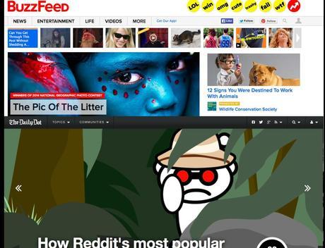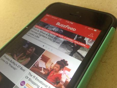


Two items in the news remind us that, indeed, the two tempos is the way to go with the planning, creating and designing of content for mobile platforms. Both Buzz Feed and The Daily Dot are reportedly working on new products.
BuzzFeed editor-in-chief Ben Smith has said that what they are working on will be a guide through the noise of news in social media. I like the reference to noise for what I refer to as the constant flow of information, or the raw meat that we throw at our audiences all day long, saving the cooked steak for a lean back reading experience via a different platform, be it via online, the tablet or even print. In Smith's analogy, if noise is the 24/7 dissemination of news, then the opposite, quiet, is the territory of the more lean back curated experience of the proposed magazine.
I hear from a variety of sources about projects in progress that will do exactly the same: create curated editions for publication at specific times of the day, with emphasis on the early morning which is the time we know people connect to check what has happened while they slept.
I particularly liked this quote from Buzz Feed's Smith. He believes that "news organizations today have a responsibility to curate news feeds for their audiences that are separate from the central task of reporting and news production — a belief which will also inform his hiring decision."
The Daily Dot to publish magazine
The Daily Dot has announced that it will start publishing a weekly digital magazine, The Kernel ,taking a deep look at current events with in-depth reporting on today’s Internet communities.
Daily Dot CEO Nick White said that that’s exactly the point: A magazine with longer features and deeper reporting is the perfect counterpart to the daily-news cycle, which trades depth and rigor for speed and scoops.
Again, tempo one is the daily, tempo two is a lean back publication that will include longer pieces.
Of related interest: the two tempos
http://www.garciamedia.com/blog/two_tempos_rhythms_for_storytelling_in_the_digital_age
http://www.garciamedia.com/blog/more_validation_for_the_two_tempos_for_storytelling_in_a_digital_world
Mario's Hearst Digital Media Professor Lecture, Columbia University School of Journalism
https://www.youtube.com/watch?v=aS1IPYalTt0
Of interest:
BuzzFeed is building a new mobile app just for news — theirs and everyone else’s » Nieman Journalism Lab
http://www.niemanlab.org/2014/07/buzzfeed-is-building-a-new-mobile-app-just-for-news-theirs-and-everyone-elses
Fonts as economic development indicators?
http://qz.com/237851/what-fonts-tell-us-about-the-global-economics-of-the-internet/
Highlight:
What fonts tell us about the economics of the internet. Fonts are a kind of proxy for economic development, explains Nikhil Sonnad: As people get better internet connections and more spending power, they demand better type design. And we’re finally starting to see some really nice non-Latin fonts.
It's new website for The Chicago Tribune
http://my.chicagotribune.com/#section/-1/article/p2p-80955436/
Highlight:
The next-generation website, a key development in the continued digital evolution of the Chicago Tribune, features more multimedia content, endless scrolling and a mobile-first design.
The platform also offers important new revenue opportunities for the Tribune as it looks to shift dollars from print to digital sources. Premium content will be emphasized to encourage digital subscriptions, while clearly-marked native advertising and sponsored content will be incorporated.
Take a look:
http://www.chicagotribune.com

