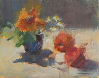
Orange and Blue
11 x 14
I can recall the changing quality of the light on my subject, and how flickers of color revealed and concealed themselves as time passed. As well, I remember the mental gymnastics that it took to acknowledge what my eyes were seeing, but paint something else because it better recreated the sensation of the scene. In the painting above - done at breakneck speed while the sun tracked across my studio through a skylight - I saw intense, highly saturated, hot orange along the top edge of the flower, but when I painted it that way, it didn't say "light" in the same way that a cooler, lighter color statement did. So objective reality had to be sacrificed to convey the deeper truth that I saw in the scene.
I firmly believe that painters will learn more from painting a simple piece of fruit every day, on different coloured papers, and in different light conditions, than they would by painting a photo every day. They'll discover how the world of light and color works, and how much they need to bend that knowledge to their artistic ends.
My latest Artsy article goes into greater depth about how human and camera views of the world differ. I hope you'll have a read.
Happy painting!

