Is it really the oldest trick? Probably not– but it’s up there.
You can always be sure of one thing, however: no matter how old a Photoshop trick is, there are always plenty of people who have never seen it.
I’ll call this one, How To Display An Image Thru Text. I had occasion to use it recently, and thought this would be a good time to share it. Let me show you how it works.
I did a humorous poster which involved several lines of text. Here’s the final.
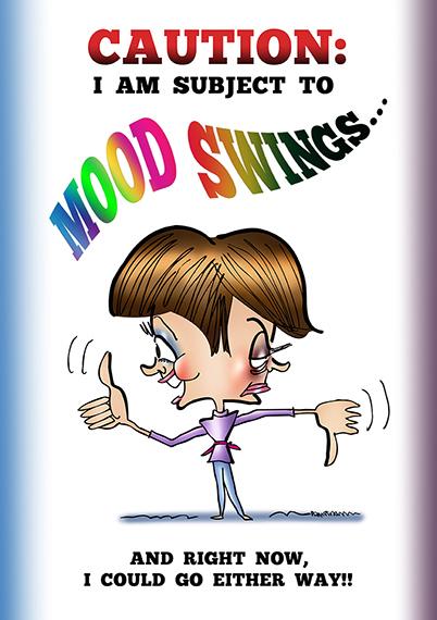
As you can see, some of the text is colored. It would be nice if I could add color to text without losing my original text layer. That way, I could experiment freely, and not have
to worry about making a mistake.
Fortunately, this little Photoshop trick gives me an easy way to do that.
Here’s what the original “Mood Swings” text looked like:
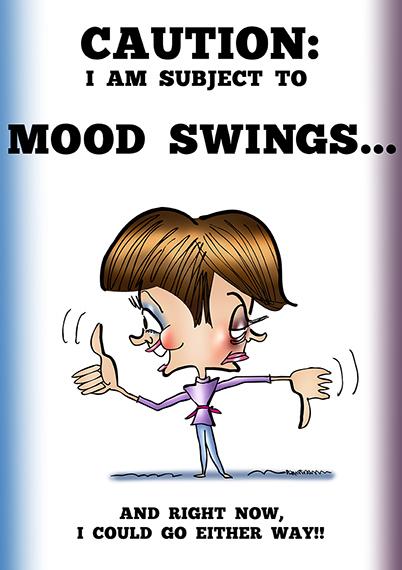
You can warp a Text layer, but your options are very limited. However, if you rasterize the Text layer first (convert it from a vector to a raster, pixel-based image), you can warp it using the much more powerful Edit>Transform>Warp tool.
That’s what I did here. I made a copy of the Text layer, hiding and saving the original. Then I rasterized the copy, and manipulated the text with the Warp tool.
(Note to PS users: I did not achieve the final result with a single application of the Warp tool. I applied the Warp tool several times. My final tweaks involved selecting “Mood” and “Swings,” and warping them separately.)
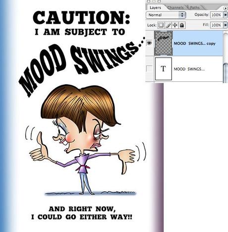
To color the text:
I created a new layer, and clipped it to my warped text layer. Then I made a rectangular selection on the new layer, which enclosed the warped text. Finally, I filled the selected area using a multi-colored gradient.
A clipped layer will “shine thru” the visible pixels of the layer it’s clipped to. The rest of the clipped layer is masked out.
That’s the trick, and here’s the result:
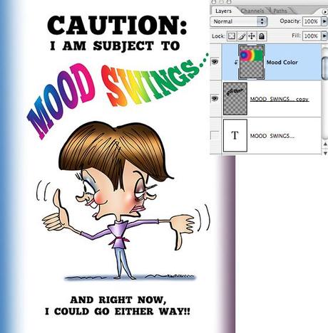
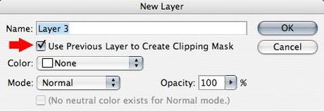
The easiest way to create a clipped layer is to indicate that’s what you want when you create the new layer.
You do this in the New Layer dialog box by checking the little box next to the (IMO) very confusing and unhelpful words, “Use Previous Layer to Create Clipping Mask.” What it should say is “Clip This New Layer to the Layer That’s Currently Selected.” Again, just my rowdy opinion.
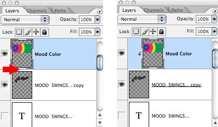
What if you forget to check the little box? Do you have to delete your new layer and start over? No.
Just go to the Layers Window and alt-click anywhere on the line dividing the new layer and the previous layer. This will automatically clip the new layer to the layer below it. A clipped layer will always display as indented with an arrow pointing down to the layer it’s clipped to, as shown on the right below:
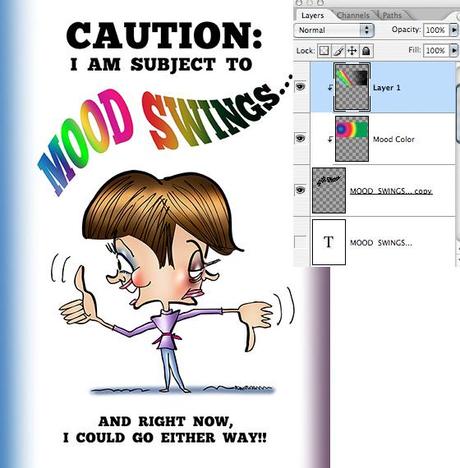
I wanted the colored text to swing from happy rainbow colors on the left, to gloomy black on the right.
I did this by adding a second clipped layer, and applying a right-to-left black gradient. I also decided to add an additional burst of rainbow color to the word “Mood” by applying
a circular gradient.
Here’s the result, with the corresponding Layers Window on the right:
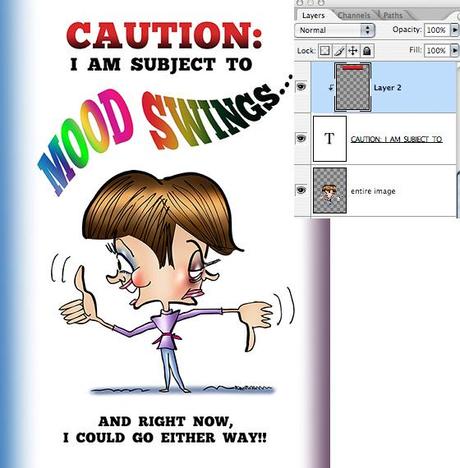
Finally, I used this same “old Photoshop trick” to color the word “Caution.” I clipped a new layer to my Caution text layer, made a rectangular selection, and applied a top-down, red-to-black gradient.
Worth noting: I did not warp the word “Caution,” so there was no need to rasterize that Text layer. (You can tell it’s still a Text layer by the capital “T” in the Layers Window below.)
Conclusion: this trick will work with any text– it doesn’t matter whether the Text layer’s been rasterized or not.
Most of my own Photoshop learning has come from reading several (sometimes, many) tutorials on the same subject. What isn’t clear in one, becomes clear in another.
If you’d like to see another take on the above subject, I highly recommend this tutorial by Steve Patterson.

* * * * * * * * * * * * * * * *

Had you seen this trick before?
Did you think a “clipped layer” was the part of your hair the barber already cut??
Hope you’ll leave a comment.
If you enjoyed this post, please click the Like button below.
If you’d like to share this post with others, please click Tweet or Facebook or one of the other Share buttons.

