Here's a confession: I am a total gadget hog. I love tech toys. No matter where I go, I'm usually attached to my smartphone or my iPad - sometimes both. So when I was offered the opportunity to review smartphones and tablets, I couldn't say "yes" fast enough. I was all over it. What was my first test subject? I'm glad you asked - it was the Nokia 900.
Design
When I opened the box, I immediately noticed it's size. It is larger than my current phone in length and width, however the weight didn't seem very different. The controls/buttons weren't really intuitive to me. There are 3 buttons on the right side, one is definitely for the volume, but the other two were confusing, there is no way to tell which one activates the display - absent reading a manual - which personally, I like to be able to jump right in with my devices without much of a learning curve.
As far as the size is concerned, it's a little large for me. I'm petite and have small hands so the width is a little awkward for me, definitely a good fit for someone with larger hands (jussayin'). I'm a busy mom, I have to be able to have a baby in one arm and my phone in the other and still make it work. With the Nokia 900, that just wasn't possible for me because of it's width. It was difficult for me to hold the phone and use my thumb to navigate the screens like I do with my current smartphone. Setup
Set up was pretty straight forward and intuitive. As soon you turn on the phone it automatically requests you to log in to your windows live account to go through the set up process, this can be bypassed but it will negatively impact the way your device works. Basically, it's a windows phone, so it wants you to have a Windows Live account (kinda like Apple and with the Apple ID), but this can be a turn off to someone who doesn't want a new account just to use the smartphone.
Display

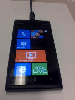
Nokia 900 Home Screen

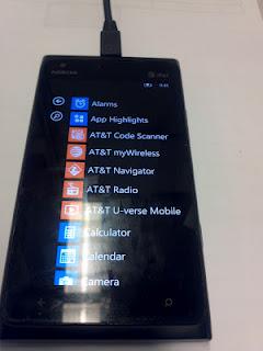
Nokia 900 Apps List
The lock screen is nice and bright, and displays at a quick glance - the date and time, as well as pending messages. The home screen is bright and colorful. Personally it's a bit busy for me, but it's pretty comprehenshive. From this main screen, you have the ability to make a call, check your Facebook, messages, email, mobile browser, games, calendar, pictures, music, news radio, news, and more, however, you do have to scroll in order to see all these options, I personally prefer smaller icons that can fit on one screen. On the next page, there is a list view of the apps from the previous page and a host of others. This is the main apps display for the device, which I would prefer in icon fashion. I can imagine after having this smartphone for a few weeks, one could pick up quite a few apps and a list view would be difficult to navigate. This is a very large display screen however, it seems that the sizing of the items displayed makes this more of a negative than a plus. For comparison, on my current smartphone displays 10 email messages on one screen, on the Nokia 900, only 5 are displayed, due to the larger font size for headings. On the other hand, the navigation allows you to slide the screen to view all, unread, urgent, etc., as apposed to going through a folder structure to locate these items, this is pretty helpful. Navigation The screen transitions are reminiscent of PowerPoint slides, which is kind of cool. Scrolling up and down works pretty much like most touch screen devices, the same with sliding left and right. No hiccups there.Productivity Tools I use my smartphone for business as well as for personal life, so it's awesome that the Offices suite comes preinstalled on the device. I love the ability to view and edit my documents on the go. As far as other apps go it's hit or miss.
I use my calendar extensively so, this feature is very important to me. The standard calendar which comes with the Nokia 900 was not up to my standards. The agenda view does a good job of showing current appointments. You can also slide the screen to see your to-do lists and your appointments for that given day. What I don't really like is the month view. When scheduling appointments I use the month view very often because it allows me to see the months appointments at a quick glance, however, on the Nokia, it is difficult to do this because the appointments are presented in list form, instead of graphically represented like in other calendar apps. You have to go into the day to tell what time the appointment is scheduled for. This makes it difficult to schedule appointments quickly.I also use several other apps to help me stay productive and connected.
The apps I found: Evernote Twitter kindle ebay facebook Google+ The apps I could not find: Hootsuite ColorNote MyDays Instagram My Favorite app on the device is the local scout - which uses your location to find things near you like restaurants bars, attractions, events, shopping, etc. I love that this comes already on the home screen.
All in all - it's an okay phone, but it won't be making my Christmas list.
