TAKEAWAY: It is some “subtle” changes at The New Yorker, but are they really? Classic publications seldom change subtly, not in the view of those inside.


I like very much what they have done with The New Yorker. The venerable magazine has introduced changes in its design for the first time in 13 years (although some would believe it if one told them that the last redesign was 40 years ago). The New York Times refers to the changes as “subtle” and so they are.
The question is: is there such a thing as subtle design changes for an institution such as The New Yorker?
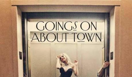
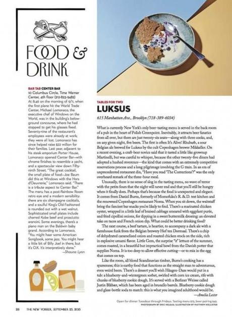
Led by its creative director, Wyatt Mitchell, the changes are primarily in the magazine’s table of contents, contributors page, “Goings On About Town,” Briefly Noted and Fiction sections.
As someone who has been involved with design changes inside iconic organizations akin to the revered New Yorker, I know that the word minor should never be used to describe the proceedings.
To hear David Remnick, the magazine’s editor, describe these changes “if the magazine fell on the floor and were three feet away, it would still be identifiable to longtime readers.“
That is what the publisher and editor of almost every project I have been involved with dreams of.
In more poetic terms, I had a publisher once tell me:
When you are finished with our newspaper, I want to make sure that if a couple of pages suddenly float down the river and a fisherman sees them, he will immediately be able to shout out the name of the newspaper because those pages will be so familiar, so part of his surroundings, that he does not have to read a word or see a logo to identify it.
Designers, too, aim for this type of instant recognition even after a redesign.
Although some editors might not believe it, most designers aim to please, as I am sure art director Wyatt Mitchell has done effectively at The New Yorker.
The good ones also make sure that they respect and salute the past (that’s what some refer to today as maintaining the publication’s DNA—a term I am getting quickly tired of!), and know that in this business there are no small or minor changes, that there is someone in authority for whom the changes are all profound, a little traumatic and come accompanied with the horrific fear of what the readers will say.
Yet, at the deepest level, every publisher and editor I ever met longs for dramatic visual changes under his/her watch, although they may never admit it.
And so, because “daring and adventurous” are the unspoken words, subtle is more politically correct, and we are all proud of that final product that can be described as subtle, respectful of the past, true to its DNA and all those good things.
In the case of The New Yorker, I think these are very relevant and robust changes, a reason to celebrate. And if I drop my copy of the new New Yorker on the floor, I am sure the editor would like for it to land on any section other than the Goings On About Town, the one with the most radical changes, but, at the same time, the one that would probably make me jump to pick up my copy and start reading it.
Of related interest:
How The New Yorker Redesigned For the First Time in 13 Years
http://gizmodo.com/how-the-new-yorker-redesigned-for-the-first-time-in-13-1325328771
Highlight:
The biggest changes are found in the “Goings On About Town” department, with new type treatments, spot illustrations and layouts that better accommodate photography (which was only first introduced to the magazine in 1992). The new visual vocabulary will gradually be expanded to other sections and be integrated across all platforms, Mitchell tells Gizmodo. “Ultimately we are looking to revitalize the printed magazine and its visual tradition, bring new life to its digital family members, and sharpen the brand that unites them—while carefully cultivating its continued legacy.“
The New Yorker Spruces Up a Stalwart of Print, Subtly
http://www.nytimes.com/2013/09/16/business/media/a-subtle-redesign-of-the-new-yorker.html?ref=media
Sign of the times
Why Reuters Ditched Its Big Web Push
http://www.buzzfeed.com/matthewzeitlin/why-reuters-ditched-its-big-web-push
Highlight:
In a memo sent to the company today, Reuters chief executive Andrew Rashbass announced that the company will end its Reuters Next project, a comprehensive reworking of the company’s legacy web product built around building streams of content, even from outside sources, tied to a specific news event. He also announced the departure of Jim Roberts, the executive editor of Reuters Digital and Daniele Codega, the design director — and Reuters insiders told BuzzFeed they expect another wave of layoffs soon.
Also related:
Take a look at the cancelled website here
http://preview.reuters.com/

