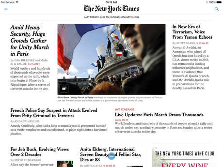


The tablet edition of the Sunday NY Times


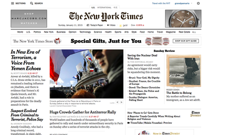
The online edition of the Sunday NY Times
It’s Sunday around 8:30 a.m. and I am preparing my second cup of coffee after looking out the window to see what kind of Sunday morning it will be if I want to run through my favorite path in Central Park.
The temptation to delay the run has nothing to do with the weather and much to do with this robust bunch of sections that are part of the Sunday New York Times.
The lure of print
Don’t take me run: I am not romancing print in this blog post.
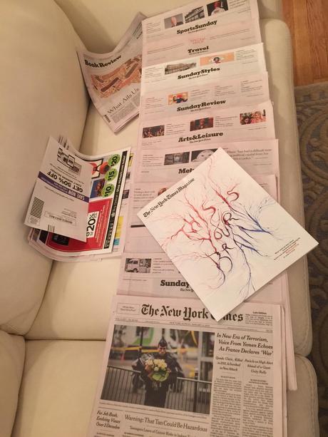
I am not going to go into poetic deviations here about the smell of newsprint, or that special sensation of my fingers touching ink on paper, or even the enjoyable sight of lying on my couch surrounded by sections that remind me what rich coverage of almost everything this great newspaper has.
Instead, and I have just come to this realization, I would like to compare the full effect of a totally grand product that I get from seeing all the sections of the printed newspaper together, which I don’t experience when I am reading the Times on my iPad.
I don’t miss the print edition Monday thru Saturday, however, for reasons that I could not explain. I read a few favorite sections on the tablet, I know where to locate them and I am in and out in about 12 minutes, sometimes 15. I have no particular interest Monday thru Saturday to know that the Times has MORE to offer me. In fact, I feel great that I don’t have a palpable sense of the size and scope of the daily, feeling less guilt for not getting thru it all, perhaps.
On Sunday I want the lean back experience and I want to see full page ads for films and theater (which are absent from the digital editions, by the way, and I wonder why this is!), and I want to see all those sections on the floor next to me when I am done. Feels like a great workout, too, because it is.
The Sunday Times in numbers


The January 11, 2015 edition included:
-11 sections, including a tabloid format Book Review
-The New York Times Magazine
-A total of 140 pages
-4 advertising inserts
Indeed, if I recall correctly, the Sunday Times used to be much more robust, but we know that print advertising has declined by more than 35% in the past 7 years, so this is no surprise.
And the questions
Each platform of the media quartet is different and we are constantly stating this. However, I wonder why some of the elements of the print edition have not transferred well to the digital in the case of The New York Times.
First, the sectionalizing. Couldn’t the tablet edition be more visually ambitious in providing us with the total experience of sections? Instead, the topics all appear to have the same impact as part of a practical, but not aesthetically pleasing, navigator column. There is no attempt to create hierarchy or transitions.
If I am not in New York City, I do read the Sunday edition in my tablet, of course. But it is not the same. Not that the print experience could be replicated digitally in its entirety. However, other publications, such as The Guardian, have taken more advanced steps to allow for sectioning to be more prevalent and easier to navigate through.
The Times does it well for the NYT Magazine, where one senses a change of visual pace upon entering, but not for the rest of the paper.
I am quite impressed with how the Times continues to improve its storytelling via digital offerings, which is why I remain surprised that the tablet edition remains in its 2010 mode.
For now, I still have two more sections of this Sunday’s Times to get through, and another cup of Joe to go with it.

