This is the weekend edition of TheMarioBlog and will be updated as needed. The next blog post is Monday, July 29
TAKEAWAY: Another sign that The New York Times is serious about its future in digital publishing is a survey sent to users like me, asking a number of pertinent questions that will help improve what it does now. PLUS: CNN and digital first

I just received an invitation to complete a survey from The New York Times to evaluate its digital experience.
With a headline that reads, Help Us Improve The New York Times Digital Experience, the short survey goes directly for that which counts, with a variety of questions that allow the user to evaluate each of the digital platforms of the Times: smartphones, tablet and online editions.
Among the best questions are those that deal with frequency of use by platform, and how much of the online edition we read on a mobile platform.
The question that was missing, and whose absence disappointed me, was about the tablet edition, which I believe needs to be updated, to include more multi media and pop ups. While the current tablet app is informative and, in my view, an essential news tablet app for content, it could be so much better if it exploited the potential of the tablet to its fullest. Right now the majority of the visuals shown are photos, taken from the print edition.
I am hoping the Times execs will realize how much users of the tablet edition would like it to advance to the next level. Unfortunately, there was no way for me to convey that in the survey.
So I have said it here!
Digital first for CNN, too

http://tech.fortune.cnn.com/2013/07/23/jeff-zucker-cnn/
It’s not only newspaper newsrooms that are raising the digital first flag. I am delighted to read this piece and see that new CNN boss, Jeff Zucker,is taking that news network the digital route as well. As he put it about the future of CNN:
“….we’re not going to care what screen you’re watching CNN on, as long as there’s a CNN red logo on whatever asset you’re accessing. And to us, mobile is probably the most important part of our future, but digital as a whole is where we’re concentrating everything.“
“It’s going to be digital first for CNN going forward. And that is as important a part of our strategy as anything.“
How I wish I would hear more newspaper and magazine publishers worldwide echo these words.
Pages we like


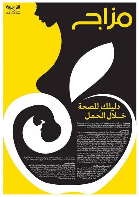
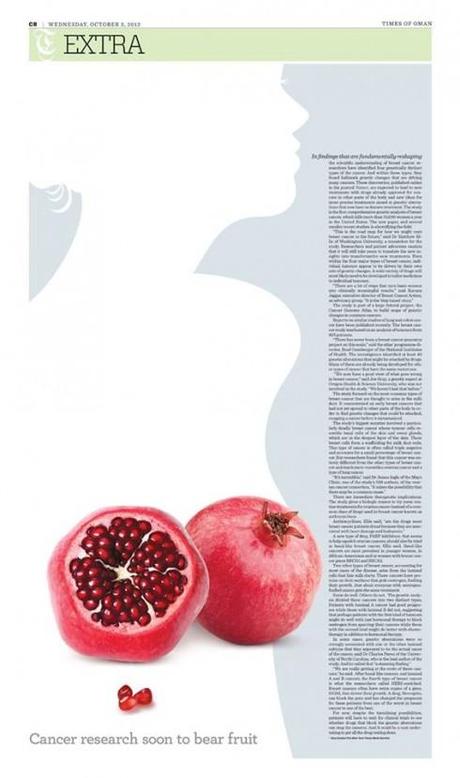
Two pages designed and illustrated by Osama Aljawish: Al Shabiba, Times of Oman
We often keep an eye on the exciting visual storytelling of Osama Aljawish, artist and designer for Al Shabiba, the sister newspaper to Times of Oman.
In this page, Osama takes up the subject of a health guide for women during pregnancy. We think he managed to put the content of the story across brilliantly well, while creating a poster-like visual presentation.
Osama is aware that some of the subjects his editors cover are sensitive and difficult to cover within the culture of his audience. In the second example shown here, Osama tackled the subject of breast cancer.
The challenge for me is how to present the design in a way that complies with the customs and traditions, so I tried not to present the breasts too prominently.

