
Here are covers showing Newsweek’s last redesign
In a
%0A">
%0A">
%0A">
%0A">
%0A" title="recent blog post">recent blog post here, I wrote that “If anyone can revive Newsweek magazine, it is legendary editor Tina Brown: now we will have a chance to see how she does it”
Now Tina Brown’s first effort is out with the March 14 edition and it looks and reads as if this may be a big story of the newsmagazine comeback of the decade.
Tina Brown’s new Newsweek packs the equivalent of a healthy and flavorful summer picnic basket between the covers of what is a still slim but much improved Newsweek. Is Tina Brown redefining the weekly newsmagazine genre with this new effort? Perhaps not. But, indeed, this is a major fine tuning. No, make that a total rethinking for a so far unfocused magazine that has had more than its share of mismanagement, bad luck, circulation and advertising drain.
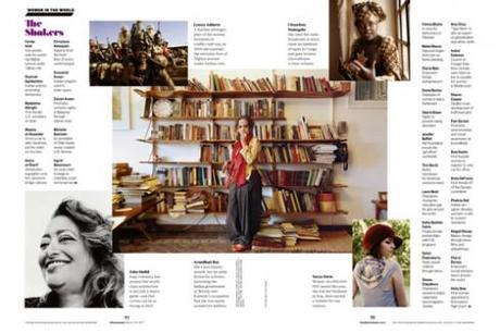
It is quite appropriate that this first issue under the editorial leadership of Tina Brown, who becomes the first ever woman editor in chief for the magazine, is dedicated to women, with the always necessary list: 150 Women Who Shake the World.
Make it 151, Tina, and put yourself in there. No need to be humble here. Perhaps you don’t have the weight of the world on your shoulders, like your cover subject, Hillary Clinton, seems to have. But if we are referring to the media world and how many will be watching what happens to your new Newsweek, then you are right up there with Hillary, with a title that could be Secretary of Media Survival.
Tina is aware that the world is watching what she does with every corner of the tired and left for dead Newsweek. In her introductory note, accompanied by a photo of a smiling, arms crossed Tina Brown, she writes that:
We’ve all heard the argument that a weekly newsmagazine has no role in today’s relentless, 24/7 news culture, in which digital blizzards of information come at us at blinding speed. In fact, I was one of the people making that argument when IAC’s chairman, Barry Diller, invited me in 2007 to found a news and opinion website that became THE DAILY BEAST, which, in a new joint venture, has allied with NEWSWEEK as brother and sister in cyberspace and in print. NEWSWEEK is now doubly lucky to have Mr. Diller partner with Dr. Harman in business leadership.And we get a glimpse of her philosophy about ink on paper, as opposed to things presented digitally:
What a magazine can offer readers is a path to understanding, a filter to sift out what’s important, a pause to learn things that the Web has no time to explain, a tool to go back over the things we think we know but can’t make sense of. A magazine allows the reader to play in a different key.
here is a time for the quick zap of news on the Web—and a time for the more interpretative pleasures of the printed page. Both of those rhythms are on display in the new structure of NEWSWEEK. Our front section NewsBeast reflects the fast tempo of Web culture. Omnivore, our new culture section, embraces the contemporary reader’s desire to graze, from a good new book to an exciting travel destination, from a must-see art exhibit to a must-have iPad case.
That first issue reviewed
I have enjoyed sampling this March 14 first edition thoroughly. I am in possession of the international edition, and it is obvious that the new Newsweek is a close sister to The Daily Beast, with its logo carrying the thedailybeast.com url. Inside the red boxed logo appears as part of the new table of contents.
What I like: I like the flow , the surprises, the destination pages, such as Omnivore; also the splendid use of photography with just a mini story, not just a caption, to accompany those double page photos.
There are the text driven pages, in this issue the Women in the World feature, which, in my view , is the best example to come in a long time of a story covered through the classic, long text format, along with the large photos and mini stories. I am wondering about the sustainability of such treatments, but I trust Tina’s team to pull it off. I also like that the tempo and the surprises are not all stacked up in the first 15 pages. One sees interesting use of type and graphics all the way to that last Omnivore section. I like that this new Newsweek makes no attempts to look like a website or app edition. It has the attributes that we associate with print, visually speaking, but it also has the navigational strategies that printnets who move easily from print to digital bring to anything they read.
The logo: I read that our friend and colleague Jim Parkinson(with whom we currently collaborate on at least three upcoming project logos) has worked with the new logo, based on the font Tilting. Parkinson reports that the Titling logo was “a perfect way to announce to the readers our new direction, as the whole inside has it running throughout. “ The familiar red box with the logo lettering has stayed.
The typography: The entire magazine’s design is based on two typefaces, Titling Gothic and Acta (designed by Dino de Santos).
Go here to read an interview with designer Dirk Barnett, who redesigned the new Newsweek.
http://www.spd.org/2011/03/first-look-the-newsweek-relaun.php
Also of interest:
What’s Not Hot? Newsweek.
Editor Tina Brown lays an egg in her redesign.
http://www.slate.com/id/2287526/
Tina Brown’s first issue of Newsweek features Hillary Clinton on its cover
http://www.poynter.org/latest-news/top-stories/121946/tina-browns-first-issue-of-newsweek-features-hillary-clinton-on-its-cover-as-focus-on-female-audience-intensifies/
Newsweek’s redesign: I am glad I didn’t judge it by its cover
http://www.poynter.org/latest-news/top-stories/122298/newsweek-redesign-glad-i-didnt-judge-it-by-its-cover…/
Newsweek’s cover delightfully absurd, but not sexist
http://www.poynter.org/latest-news/romenesko/99481/newsweek-cover-delightfully-absurd-but-not-sexist/
Tina Brown: I am now editor in chief of both Newsweek and The Daily Beast
http://www.poynter.org/latest-news/romenesko/108277/brown-im-now-editor-in-chief-of-both-newsweek-and-daily-beast/
TheMarioBlog post #728
Netherland’s NRC Handelsblad becomes tabloid
TAKEAWAY: In the Netherlands, this week NRC Handelsblad switched from broadsheet to tabloid. We show you before and after, and more to come with the revamped weekend edition as it premieres Saturday in the compact format. To be updated when NRC produces its first weekend edition as a tab.
One less broadsheet in the Netherlands
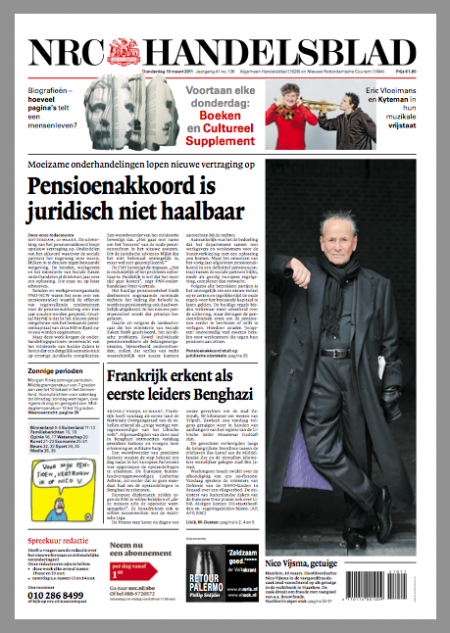
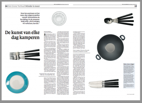
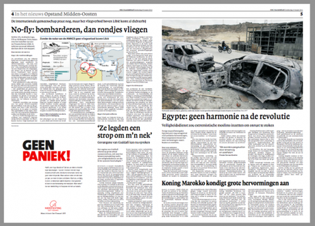
The pages above are from today’s edition of NRC Handelsblad in its new tabloid format
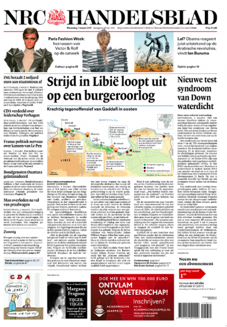
The new NRC Handelsblad front page (daily), six column format, tabloid format
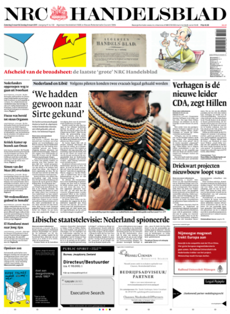
Last edition of the NRC Handelsblad in broadsheet format
With all the hoopla about iPad apps, we don’t hear much about broadsheet newspapers converting to tabloid format these days.
But, indeed, it is still happening—-as it should—-and this week another of the grand dame broadsheets, the Dutch financial daily, NRC Handelsblad
, abandoned its eight-column large format page for a fresh six-column tab.
Design director Jan Paul van der Wijk shares the before and after pages shown here, with the farewell edition of the broadsheet and the arrival of the new tabl.
I was invited to participate in this project, conducting a one-day workshop with the editors/designers in Rotterdam, where the newspaper is published. My involvement was more with the weekend edition, a very full, content driven package with various sections. Our task was how to pace the content of such a monumentally large product in a tabloid format where the natural divisions created by “separate sections” was not going to be a choice.
Jan Paul will send me materials on that weekend edition and we will update this blog to bring you the weekend product plus additional information.
For now, we do like what we see.
Notice that a decision was made here NOT to go with a miniposter cover on the daily front page. Instead, readers will find that the tabloid format front page is still familiar to what they saw in the broadsheet: stories to read that begin and end there, identical typography and just an easier to manage, less cluttered look all around.
Here is how design director Jan Paul van der Wijk describes the experience and he thanks his deputy Paula van Akkeren for the good work on the pages shown above:
For us, as designers, it was good fun working on a tabloid. We are already used to because of our other newspaper, nrc.next wich is published by the same editorial departement. I am until now very happy with the reactions of our readers. They are in a large majority very happy with the design that they found on their doorstep. We had a lot of reactions, and started a phone-in for our readers. Now we are working very hard on our Saturday-edition, and will keep you posted.
Detergents: from large to small containers…
While on the subject of less is best in terms of newspaper formats, I call your attention to an informative and provocative piece that comes from those guys at KubasPrimedia of Canada.
Author Len Kubas compares what the laundry detergent industry execs have experienced with the size of laundry detergent boxes (too big and cumbersome), and how they solved the problem (creating concentrated versions of their products). Using Procter & Gamble as the case study, Kubas shows that “Like most newspapers today, detergent manufacturers used to believe that bigger was better. “
Solution: to concentrate their product. “By concentrating the original product, detergent companies were able to provide consumers with equivalent wash loads in smaller, easier-to-handle containers for about the same price. Manufacturing, distribution, and sales costs were reduced, raising profitability and increasing efficiency across the entire supply chain.“
Kubas creates a word “benefitize” to describe the success story for the laundry detergent industry as it took a look at its product and found successful solutions:
“Benefitize” is not a proper word in the English language, but it is exactly what Proctor & Gamble’s marketers did. They changed the rules and moved from selling quantity by weight to selling benefits as wash loads, which is what their customers were really buying all along.
Then Kubas applies the benefitizing to newspapers:
The broadsheet newspaper is cumbersome, awkward to use, and inefficient in terms of costs and the revenue generated per unit of newsprint/labor consumed.
Apparently, many newspaper execs, including those at NRC Handelsblad, agree.
Go here to download pdf of the Kubas piece:
http://kubas.com/nrc/page5.html
Of interest today

Apple Is Opening A Pop-Up Store In Austin For SXSW
http://finance.yahoo.com/news/Apple-Is-Opening-A-PopUp-siliconalley-2596506916.html?x=0&.v=2
Appeal of iPad 2 Is a Matter of Emotions
http://www.nytimes.com/2011/03/10/technology/personaltech/10pogue.html?_r=1&partner=yahoofinance
Review: With iPad 2, Apple one-ups itself
http://finance.yahoo.com/news/Review-With-iPad-2-Apple-apf-3778973263.html?x=0&.v=1
- Magazines’ iPad Editions Struggle to Keep Your Attention, New Study Finds
http://adage.com/article/mediaworks/magazines-ipad-editions-struggle-attention/149307/
- Hearst’s Carey: Tablets Will Provide 25 Percent Of Magazines’ Circulation
http://paidcontent.org/article/419-media-summit-hearsts-carey-tablets-will-provide-25-percent-of-circ/
- Apple Offers Video Guided Tours of iPad 2
http://mashable.com/2011/03/09/ipad-2/
http://online.wsj.com/article/SB10001424052748704132204576190562423226044.html?ru=yahoo&mod=yahoo_hs

