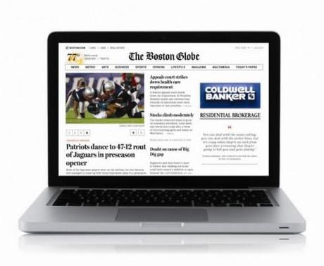
TAKEAWAY: Take a look at the new Boston Globe website, worthy of a second and third look by anyone interested in studying what a solid, attractive and informative newspaper website should look like.
Here is the new generation of news websites!


Typographically: crisp as in print edition, with Miller and Benton interplay
I discovered this wonderfully reinvented (don’t call it a redesign, please, because this is all new!) version of The Boston Globe website while in Copenhagen, sharing the stage with Ethan Marcotte, who was an integral part of remaking it. In fact, his participation here in the New Media Days conference was all about his concept of “responsive web design” and how he applied it to the Globe’s website.
Amazing stuff. Great presentation, and I have asked Ethan for an interview for the blog, coming soon, I hope.
If, as we think, the role of news websites is going to change dramatically as it becomes one more platform in the midst of a media quartet that includes mobile phones, online, print and tablets, then this new BostonGlobe.com offers a glimpse into the stylized, simple but attractive, “give me the headlines and texts that I need to update myself” look and feel that is the direction in which I see news websites moving.
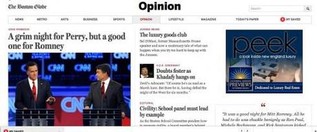
I like the fact that black and white play a key role (saying goodbye to all that overindulgence in blue of the Boston.com), and the typography matches that of the well known printed edition (Miller Headline and Benton Sans) via Webtype .
Go to the article reading page and the story flows in front of your eyes, with photo image, and a good navigator of other headlines in that section. All easy to grasp, surrounded by generous use of white space and a feeling that, although this may be a “lean forward” platform, the leaning is easy, comfortable, and may even invite for a little relaxation as one reads. This is no longer the window of the hardware store that Boston.com is: a million things staring at you.
And that is because now Boston.com and BostonGlobe.com are two different sites, with, obviously, different objectives. And different financial goals. While Boston.com is free, BostonGlobe.com will contain primarily the same stories that run in the newspaper and putting it behind a paywall. BostonGlobe.com will cost $3.99 a week, once a free trial has ended on Oct. 1.
Less is best?
One interesting feature of the new BostonGlobe.com is that there appears to be fewer links taking one in and out of stories.
Perhaps this is the new way of creating information architecture for news websites. Just as printed newspapers “scare” hurried readers when they publish six separate sections Monday thru Friday (readers don’t have the time for this), it is obvious that we are also somewhat overwhelmed with a screen that has has more places to go than a New York Subway System map.
But the BostonGlobe.com website appears to be the first to use design to unclutter the environment of the screen, offer fewer but more substantitve headlines, and remind the reader,in a gentle way, that not everything is important, but that which is has been curated and presented here.
The job of the editor becomes more important—-not to mention more challenging. This is what editing is all about. Perhaps the new BostonGlobe.com will be the example that sets the mode, the one event we will remember as the project that marked the moment, the before and after of how news websites used to be and how they should be.
Here is how a review of the BostonGlobe.com published in the Nieman Journalism Lab put it:
.
…. BostonGlobe.com seems to have chopped out somewhere in the neighborhood of half of the links on its pages. And when you’re a news organization that publishes over 120 items a day, just in the print newspaper, a certain amount of information density is both desirable and unavoidable. But BostonGlobe.com is betting on a quality reading experience over a pageview-wrangling one.
This is probably the most significant new website design in a long time. Make sure to take a look. We hope to complete an interview with Ethan Marcotte in the next few days. Stay tuned.

