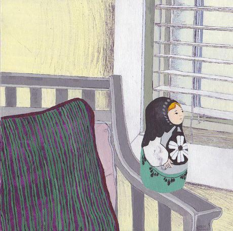
The Lives of Depressed Matryoshkas No. 2
Here’s the second piece in the project ‘The Lives of Depressed Matryoshkas’.
I hadn’t wanted to post this one just yet, but I’ve been struggling with two other draft posts for the past few days so I’m putting this one up. I was going to whip this one out during off days when I’m not sure what to write and my mind is drawing a blank but, clearly that won’t be the case today. I guess I categorize writing about art pieces that I’ve created as not causing me too much strain so why not post those easy ones on off days? But, this is an off day even if not for the rules I created.
I think this idea of a matryoshka looking out the window in that cliche depressed way was one of the first ideas I had long before I physically started the series. I had plenty of ideas I was just carrying around in my head for months, getting excited about using tem and I’ve basically forgotten about all of them. Yeah, you heard right. ALL OF THEM. You might think I’d be crushed but, the good thing is I think of new ones randomly (I guess) like that time I did in the very first post about this project. You’ll see what I’m talking about there if you don’t remember.
Very rarely will I not have a specific perspective, position, and action in my mind when thinking of how I want a piece to look. And…quite frequently the finished piece does not look like what I had in mind. But, conceptualizing what I want a piece to look like helps me not feel scattered when looking for references, and to take the first step towards creating it. Don’t get me wrong I get elements of what I’ve been thinking of in the finished piece, it’s just that most times I’ll find references that I really like and use that, can’t find the type of reference that I’m looking for, and often feel certain colors that I just have to use in the painting which basically tells the mood/color scheme I visualized “heh, sucks for you”.
All three of these things happened with this painting, with more of it being I can’t find the type of reference I’m looking for. I remember the idea was that everything in the scene would be matryoshka sized. Both the position of her and her chair would be slightly side profiled looking toward a window but you would see the background of the scene and a full view of the chair. I twisted the image around in my head, didn’t know what I’d use to fill up the background, thought an empty one seemed unappealing, looked for images of chairs, found many that I reluctantly thought of choosing, thought why not have it be a human sized chair, finally found an amazing reference, painted it in the colors I thought of along the way, didn’t really like how certain colors appeared to fade into each other, so I added ballpoint pen to certain parts and here we are. Same size as last time.
Oh, this video was the first time that I tried to play with cutting down audio and using a sound effect as an opening to my video. Both were very easy to maneuver. In the former, I snipped parts of the song “Never Known Love” by Thieves Like Us, which I first heard in Skins UK (I recommend you watch this show) to try to get the parts of the song I wanted. However, because the overall vid is only :30 secs I couldn’t include a certain part that I also liked. But what I got instead was that pang in sound at :27 secs that plays the same time it turns to black and shows my website name. I hadn’t even planned it so it was great watching it on playback. It reminded me of well, films and hearing sound shifts during a certain place in film. As for the sound effect, I used an old film projector sound effect at the beginning during the title sequence and to make way for showing the different stages of the piece.
That’s about it for the weekend. Well, depending on if I participate in the Illustration Friday challenge, but even if I do I may not post that until
Monday.
Happy Friday.
1st Installment: Lives of Depressed Matryoshkas No.1

